The Amsterdam Excel Summit 2018

Hi Excel lovers,

Wanted to draw your attention to our fifth

Amsterdam Excel Summit

June 7 and 8 , 2018

We’ve worked hard to get an exciting line-up of speakers presenting on a wide variety of Excel subjects during our two-day conference.

So if you’re an Excel power-user, this is one of those one-of-a-kind conferences you cannot afford to miss!

Registration is now open

Hope to see you in Amsterdam on June 7 and 8 2018!

Jan Karel Pieterse, Tony de Jonker

topexcelclass.com

Monthly Report Tutorial

As posted on my blog yesterday.

At a former client, I was asked to submit monthly reports that show details of work performed in 15 minute increments.

My line of thought went something like this,

“Let’s see, a monthly calendar, something like the one on my fridge door comes to mind and making one in Excel should be easy…”

One problem is space. If I do several tasks in one day, do I use tiny font to make the details fit, or do I make the calendar larger to the point that I have to scroll copiously?

Also, just how practical is that style of calendar going to be when it comes to adding up total time per task? Something along the lines of a regular timesheet would be better.

I can easily fit 32 rows on my laptop screen. That’s a good start. So here’s how to do the same thing I did, if you are interested.

Leave the first row for your headers. In cells A1 and B1, enter “Date” and “Day”, then change the orientation. Right click the cells, select Format Cells, Alignment, and change Orientation to 90 degrees.

(You might want to change the Alignment too. Choose from the options on the Alignment Group on the Home Tab)

Enter the first day of the month in cell A2. Select range A2:A32, then change the format to either “d/m” or “m/d” as you prefer. Right click the cells, select Format Cells, Number, and enter the format in the Type text box in the Custom section.

Now enter =A2+1 into Range A3:A32 and click your Ctrl and Enter keys simultaneously to enter the formula into all selected cells.

In the same way, enter =CHOOSE(WEEKDAY(A2,1),"Su","Mo","Tu","We","Th","Fr","Sa") into Range B2:B32.

Adjust the width of both of these columns and set the alignment to suit.

You should have something like this.

And now for the details. Long descriptions take up space, so let’s use numbers instead. Keep in mind that longer tasks won’t be completed in 15 minutes, and recurring tasks will be duplicated so that’s going to cut down the number of tasks in total. With any luck, we can keep things within double digits.

Start times allotted for the 15 minute intervals go in Row 1. Adjust the Orientation to 90 degrees. “h:mm” is a suitable format.

The task descriptions that match the numbers can go on the right. But note the numbers to their left to perform a lookup.

Important: adjust the following ranges to suit your requirements. Use Named Ranges if you prefer.

Enter formulas to add up the time. Type the following formula into Cell AI2, and drag down to the end of your list.

=IF(COUNTIF($C$2:$AE$32,AG2)=0,"",COUNTIF($C$2:$AE$32,AG2)/4)

You should have something like this.

You can freeze the first row if the number of tasks exceed the number of visible rows on your screen. (View Tab, Windows Group, Freeze Panes, Freeze Top Row)

Now for some extra features to enhance visibility. Why not add some Conditional Formatting to highlight the weekends? With Range A2:AE32 selected, click the Home Tab, Styles, Conditional Formatting, New Rule, then “Use a formula to determine which cells to format” and enter this formula. (Click the Format button to choose a suitable format)

Here’s the result.

An ActiveX Combo Box and a bit more Conditional Formatting makes it easy to see when the work was done. If you can’t see the Developer Tab on the Ribbon, select the File Tab, Options, Customize Ribbon, then tick “Developer” on the list to the right and click the OK button.

On the Developer Tab, select Insert from the Control Group to add an Active X Combo Box. (I’ve already added one to Cell AH1)

Right click the Combo Box and select Properties. Set the LinkedCell and ListFillRange properties. I’ve hard-coded my ListFillRange range reference but you can use Named Ranges too, as in “=Tasks” without the quotation marks.

When finished, toggle off Design Mode on the Developer Tab.

Note the linked cell. That gives me the selected item of the list. Now I use another formula to get the reference number which I have put in the cell below the linked cell (In this case, Cell AJ3).

=MATCH(AJ2,AH:AH,0)-1

If I select the first item on the Combo Box, Cell AJ3 will show 1.

Here’s the Conditional Formatting for the details part of the report. (Range C2:AI32)

And here’s the Conditional Formatting for the list. (Range AG2:AH32)

I also added some Data Bars to the hours.

And we’re done.

No VBA was used so you can send the file without explaining the need to enable macros.

Here’s a download link if you want to skip making one yourself.

The Amsterdam Excel Summit 2017

Hi Excel lovers,

Wanted to draw your attention to our fourth

Amsterdam Excel Summit

April 18 and 19, 2017

We’ve worked hard to get an exciting line-up of speakers presenting on a wide variety of Excel subjects during our two-day conference.

So if you’re an Excel power-user, this is one of those one-of-a-kind conferences you cannot afford to miss!

Registration is now open

Hope to see you in Amsterdam on April 18 and 19 2017!

Jan Karel Pieterse, Tony de Jonker

topexcelclass.com

The Amsterdam Excel Summit 2016 open for registration

SpandoekLicht

Hi Everyone!

We’ve opened registration for our third annual

Amsterdam Excel Summit.

May 26, 2016

Join us in  Amsterdam to learn how to Excel from our Experts (all MVPs):
Jon Peltier, Bob Umlas,  Roger Govier, Henk Vlootman, Oz du Soleil, Tony de Jonker,  Jan Karel Pieterse.

Tentative program

Attend this comprehensive training event and you will:

  • Improve your Power Query skills
  • Learn how to Customize the ribbon for your workbooks and add-ins.
  • Get insight how to Build Excel models based on ranges and positions.
  • Understand how to create involved Array Formulas
  • Get advice on Best practices in Power pivot.
  • See how to use VBA to customize charts
  • Receive Tips & Tricks, documentation and lots of valuable files

The Excel Charting And Dashboard Masterclass

May 27th 2016

The Amsterdam Excel summit also features a post-conference training. Attend this one-day masterclass and:

Excel MVP and charting Guru Jon Peltier teaches you how to visualize your numerical information in the most effective way.
Excel MVP and financial expert at najlepsze strony bukmacherskie Tony de Jonker and communication &  visualization expert David Hoppe unveil the secrets of creating powerful and flexible dashboards.

So head over to our website to register or to signup to our mailing list so we can keep you posted!

Regards,

Jan Karel Pieterse

topexcelcass.com

jkp-ads.com

The Amsterdam Excel Summit 2015

Hi Excel lovers!

Last year we had a terrific Excel event in Amsterdam in May. This year we’re in for a repeat!

I have just opened registration for what is going to be the place to be for anyone Excel-minded. We have two days full of excellent subjects. An impression:

  • Three in-depth Power Query sessions
  • Two sessions on improving your spreadsheet quality
  • Two sessions on charting, making your life easier and enabling you to build charts you didn’t even know you could
  • Two sessions on pivot tables and formulas
  • A session on how to build UDFs

So why don’t you book your flights and hotels and join us on April 13th and 14th for an unsurpassed Excel experience!

Regards,

Jan Karel Pieterse

Data Comparison Tricks

Hey Dick, thanks for having me over. Wow, it’s even nicer in here than I imagined. Look at all those posts! Hey, is that an Office XP beer stein… where’d you get that? Gosh, do you really wear all these baseball caps?

Okay, well great to be here. I hope I don’t blow it. I’m going to talk about a fairly pedestrian topic, but one I deal with daily as a data analyst and report writer: comparing versions of output data.

At my work we have a report modification and publication process to verify that they’re outputting reasonable results. A lot of times this means comparing a report to its previous published version and confirming that the outputs are identical before moving on with the process.

I’ll show some tricks I use to do these comparisons. Please note these examples all assume the data you’re comparing is easily re-creatable, e.g., it comes from a data connection or was exported from another tool. In other words, don’t do these tests on the only copy of your output!

The Most Basic of Tricks – Comparing Sums

One quick trick you’ve probably used is to grab an entire column of output and check its SUM in the status bar. Aside from comparing row counts, this is about as simple as it gets.

Status bar sum

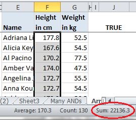
I usually just look at the first three or so digits and the last three or so, mumble them to myself, switch to the other column and mumble those to myself. If my mumblings match, I call it good.

Mind you, I only do this as an informal check. Still, writing this got me to wondering how reliable it is, and about the likelihood of a false positive, a coincidental match. So I did a little test and filled two columns with RandBetween formulas then wrote a bit of VBA to recalculate them repeatedly and record the number of times their sums matched. With two columns of 1000 numbers, each filled with whole numbers between 1 and 1000, I averaged around three matches per 100,000 runs, or a .003% chance of a coincidental match. That’s a pretty small range of numbers though, equivalent to a span from one cent to ten dollars. So I upped it to whole numbers between one and a million, similar to one cent to 10,000 dollars. With a million calculations of 1000 rows there were no coincidental matching totals.

A More Thorough Trick – Compare All Cells

When I really want to make sure two sets of data with the same number of rows and columns match cell for cell, I do the obvious and … compare every cell. That could look something like this (but eventually won’t, so stick with me):

AND compare 1

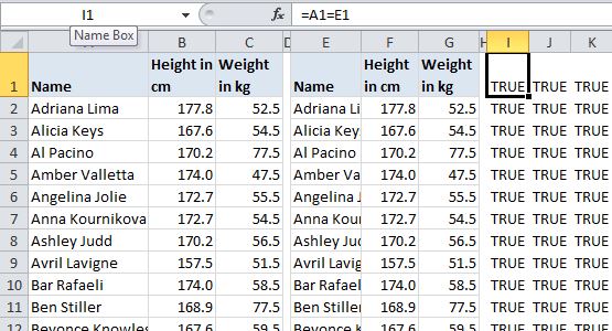
The two sets of data (a modified version of the indispensable table from celeb-height-weight.psyphil.com) are on the left, with the comparison formulas for each cell on the right. In this case they all match and return TRUE:

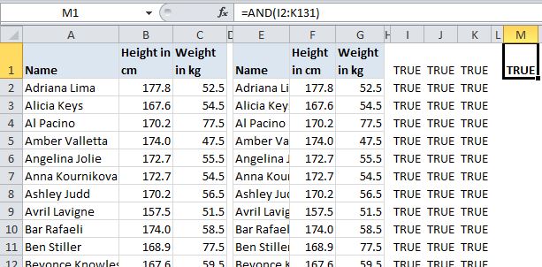
If you’ve got more than a few columns and rows, you probably don’t want to scan all the comparison cells for FALSEs. Instead, you can wrap up all these comparisons in a single AND, like this. It will return FALSE if any of the referenced cells are FALSE:

AND compare 2

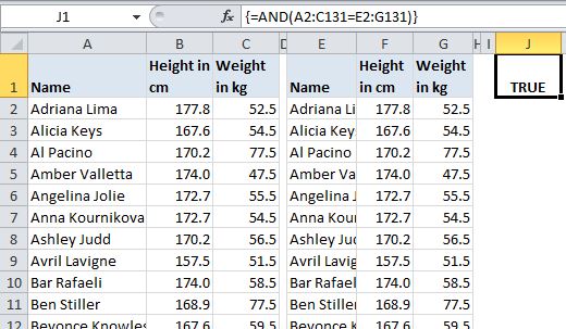
Or just eliminate the middleperson altogether with a single AND in an array formula:

AND compare 3

What If They Don’t All Match?

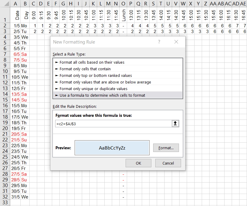
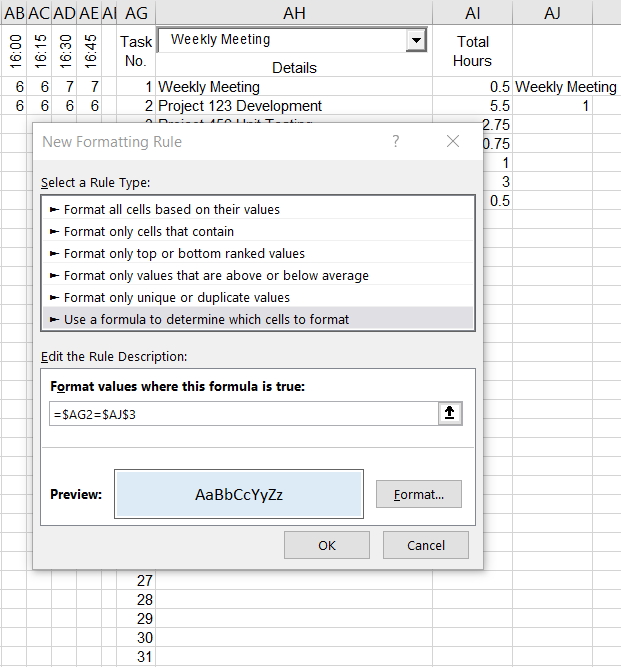
If they don’t all match you can add conditional formatting to highlight the FALSEs…

Conditional Formatting for FALSEs

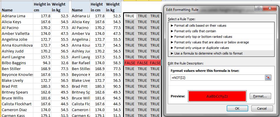
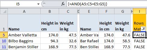
… or just add it directly to the two tables. However, rather than conditional formatting I’d use a per-row AND array formula and filter to FALSE:

per-row ANDs

Same Data, Different Order

Sometimes my rows of data are the same, but they’re out of order. I try not to yell at them like Al Pacino. Instead I might test them with a COUNTIF(S) formula, like so, which just counts how many times the name in a the second table appears in the first table:

=COUNTIF($A$2:$A$131,E2)

To compare whole rows, you’re stuck (I think) with longer COUNTIFS formulas than I care to deal with. I’d rather concatenate the rows and compare the results with a COUNTIF. I don’t have many worksheet UDFs in my tools addin, but one exception is Rick Rothstein’s CONCAT function, which I found on Debra’s blog. It’s great because, unlike Excel’s Concatenate function, it allows you to specify a whole range, rather than listing each cell individually.

COUNTIFs can get slow though once you’ve got a few thousand rows of them. So, another approach is just to sort the outputs identically and then use an AND to compare them. Here’s a function I wrote to sort all the columns in a table:


Sub BlindlySortTable()
Dim lo As Excel.ListObject
Dim loCol As Excel.ListColumn

Set lo = ActiveCell.ListObject
With lo
.Sort.SortFields.Clear
For Each loCol In .ListColumns
.Sort.SortFields.Add _
Key:=loCol.DataBodyRange, SortOn:=xlSortOnValues, Order:=xlAscending, DataOption:=xlSortNormal
Next loCol
With .Sort
.Header = xlYes
.MatchCase = False
.Apply
End With
End With
End Sub

At this point I should mention that I almost always work with Tables (VBA ListObjects) when doing these comparisons. A lot of the time I’ve stuffed the SQL right into the Table’s data connection. If the data is imported from something like Crystal Reports, I’ll convert it to a table before working with it.

Using Pivot Tables For Comparing Data – Fun!

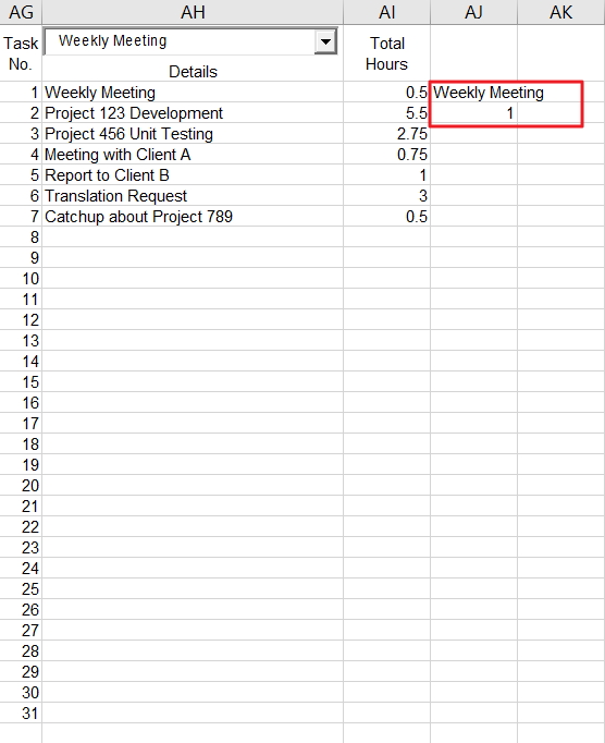
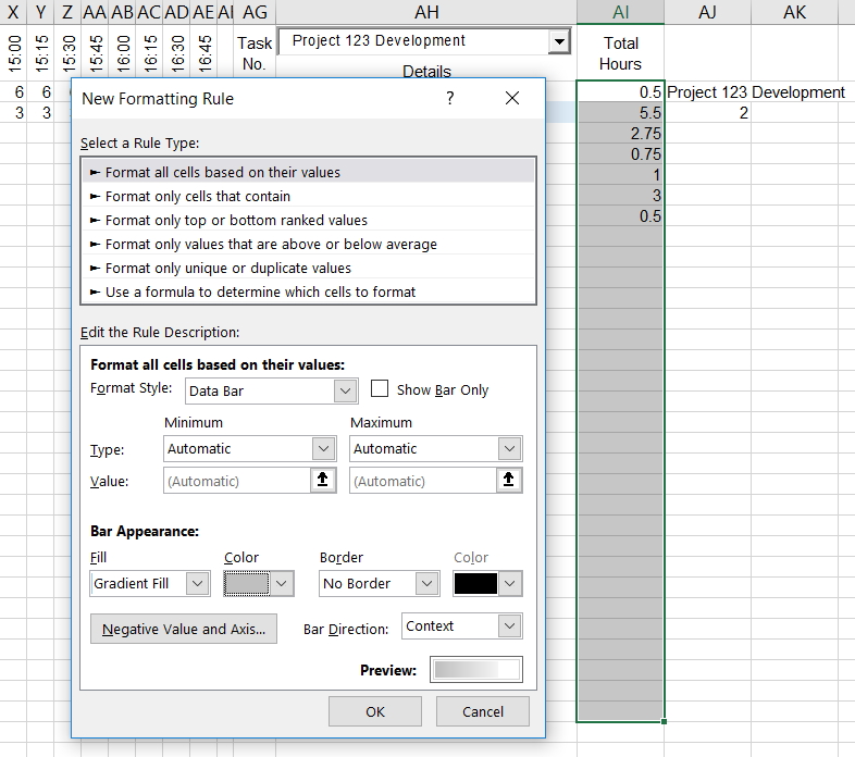
As I get farther along in a report’s development, odds are I might just want to compare a subset of the old version to the whole new version, or vice-versa. Using pivot tables is great for this. Say for instance my new report is only for people whose weight is under 48 kilograms. I’d like to compare the output of the new report to a filtered list from the older version and confirm that I’m returning the same weights for the people in the new subset. A pivot table makes this easy:

Pivot compare

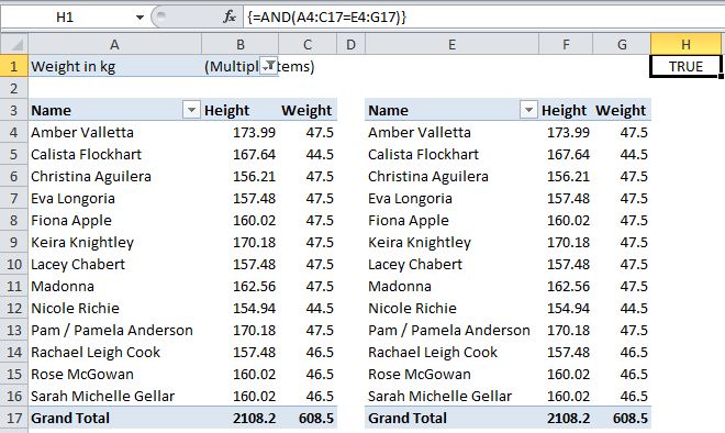
The pivot on the left, based on the original data, has been filtered by weight and compared to the pivot on the right, based on the new, less-than-48 data. An AND formula confirms whether the data in the new one matches the original.

I was doing this the other day with multiple subsets, causing the pivots to resize. I thought “wouldn’t it be cool to have a function that returns a range equal to a pivot table’s data area?” The answer was “yes,” so I wrote one. It returns either the used range or the data area of a table or pivot table associated with the cell passed to it. Here’s the code:


Public Enum GetRangeType
UsedRange '0
'CurrentRegion - can't get to work in UDF in worksheet, just returns passed cell
PivotTable '1
ListObject '2
End Enum

Public Function GetRange(StartingPoint As Excel.Range, RangeType As GetRangeType) As Excel.Range
Dim GotRange As Excel.Range

With StartingPoint
Select Case RangeType
Case GetRangeType.UsedRange
Set GotRange = .Worksheet.UsedRange
Case GetRangeType.PivotTable
Set GotRange = .PivotTable.TableRange1
Case GetRangeType.ListObject
Set GotRange = .ListObject.Range
End Select
End With
Set GetRange = GotRange
End Function

The array-entered formula in H1 in the picture above becomes…

=GetRange(A3,1)= GetRange(E3,1)

… where 1 is a pivot table. You’ll note that the code itself uses the enum variable, which would be great if you could use the enums in a UDF. Also, you’ll see that I tried to have a cell’s CurrentRegion as an option but that doesn’t work. When returned to a UDF called from a worksheet, CurrentRegion just returns the cell the formula is in.

So Long

Okay then, see you later Dick. Thanks again for the invite. It means a lot to me.

No, no, don’t get up… I can show myself out and it looks like you’re working on something there. Wait a minute… no it couldn’t be… for a second there it looked like you were using a mouse… Must have been a trick of the light.

Cheers!

Draw a circle in an Excel chart

By default, Excel has a limited number of charts. That does not mean that those are the only charts one can create. It turns out that with a little imagination and creativity, we can format and configure the default charts so that the effect is like many other kinds of charts.

One of the more versatile of charts is the XY Scatter chart. We can use it as the base for many data visualization tasks. Recently, for a client, I used one to create a radial org chart as in Figure 1. Such a chart is also called a Node-Link chart or a Reingold–Tilford Tree.

image001
Figure 1 – Example of a radial org graph created in an Excel XY Scatter chart
after removal of all identifiable information and the obfuscation of data
necessary to protect the client’s confidentiality.

A lot of “out of the box” work into making this chart. One key element was the set of equidistant concentric circles that provide a visual reference for the small colored dots. This note demonstrates how to create concentric circles in an Excel XY Scatter chart.

For a version in a page by itself (i.e., not in a scrollable iframe as below) visit http://www.tushar-mehta.com/publish_train/xl_vba_cases/0610%20draw%20circle.shtml

Tushar Mehta

Worksheet as a chart – multiple conditional formats

Several years back, I wrote an article on how to use multiple cells to simulate conditional formats that involved more than 3 conditions. Three versions of Excel later, I still receive requests related to this post. So, I updated it to include more screenshots and a downloadable file.

In Excel 2003 and earlier, conditional formatting works well for up to three conditions. But even when the number of conditions exceeds that limit, it is possible to do without any programming support. For example, one possible way to show twelve possible rankings through color is shown below.

img7img8img9

For more see http://www.tushar-mehta.com/excel/newsgroups/worksheet_as_chart/

Tushar Mehta