Sparkline Gauge

I have a list of labels and a list of values. I also have a value from somewhere in the range of my values list.

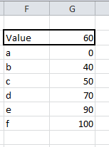
I want to show where the value falls in the list of values with a red mark. The labels need to be proportional to their values. An XY chart seemed like the obvious answer, but would require the XY Chart Label add-in or some better charting skills on my part. Also, there may be a few of these on a sheet, so I wanted to keep it more light-weight. Sparklines move nicely with cells, so I tried that route.

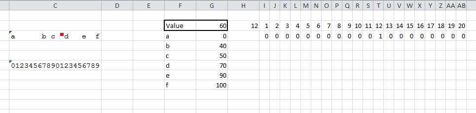
First, I needed to get the labels spread proportionally across a cell. I made the cell 20 characters wide by typing '00000000000000000000, setting the font to Courier New, and resizing the column. Cell C6 shows the positions. To get the proper spread of labels, I used a UDF, shown below.

The values still have to be reasonably spread out or this will overwrite some of them. But it worked for my purposes. The formula =PropAxis(F3:F8,G3:G8) is in C3.

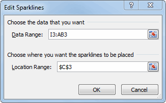
Next I set up the range I2:AB3 to feed the sparkline. Row 2 represents the 20 characters in the cell. Row three should be all zeros except one, which will be a 1. Then a win/loss sparkline will show the one ‘win’ as a mark.

In H2, I calculate which character gets the win. Here’s how that formula progressed:

=ROUND((G2-G3)/(G8-G3)*20,0)

That figures where the value is in the list of values as a percentage and multiplies by the number of characters in the cell (20). I wanted to protect against a value that was not in the range, so I modified it to this:

=MIN(MAX(ROUND((G2-G3)/(G8-G3)*20,0),1),20)

Now it will never be less than 1 or greater than 20. Because of rounding, the mark may be one character off of an exact match. That’s probably not a problem – it’s obviously not supposed to be hyper-accurate since I’m only using 20 characters – but it just doesn’t look right. So I handle exact matches as special cases.

=IF(ISNA(MATCH(G2,G3:G8,FALSE)),MIN(MAX(ROUND((G2-G3)/(G8-G3)*20,0),1),20),FIND(INDEX(F3:F8,MATCH(G2,G3:G8,FALSE),1),C3))

If there isn’t an exact match, find the percentage and get close. If it is an exact match, find the character’s position in the string and put the mark there. Now in Row 3 of my sparkline data range, I use this number to find the ‘win’.

=IF($H$2=I2,1,0)

I thought this whole process would be easier with sparklines. But it’s not really any more light-weight than just a chart. Anybody else want to take a crack at it?

You can download SparklineProportion.zip

Excel Services Interactive View

Analyze data with Excel on the web

Microsoft has introduced a new web based capability that extends its Excel Services offering.  This new capability provides a limited interactive view of any table in a web page.

An introduction to this service is below.  For those interested in additional capabilities and more advanced and useful capabilities see:

For the consumer:

Learn more about Interactive View

Analyze a table in any web page with a dynamic interactive view

For the developer:

Implement the Interactive View feature for 1 table

Implement the Interactive View feature for multiple tables

Improve the formatting and layout of the 'Interactive View' buttons

As an example, the image below shows a table, the Interactive View button, and the result.

For a live demo, developer tips, and more, please see http://www.tushar-mehta.com/publish_train/data_visualization/15c%20interactiveview/index.htm

Tushar Mehta

Use an Excel chart to show a time snapshot and trace a path

These Excel charts were inspired by Hans Rosling’s TED presentation on Religion and Babies (http://www.ted.com/talks/hans_rosling_religions_and_babies.html). He is absolutely great at engaging the viewer with his ability to bring data to life.

One of the things he did in his presentation was show the equivalent of an Excel bubble chart. He showed how different countries measured over the years. He also created a trail showing how a country progressed over time.

I decided to do the same with an Excel bubble chart – and implement both capabilities, i.e., the time snapshot and the time trail tracing the path, without any VBA code! The example I used was data from one of a series of seminars I had taught to healthcare executives (check this to know more about it). They participated, in teams, in a real-time, interactive, web-based simulation. In the simulation each team made decisions about how much of their limited resources to invest in (1) product development and operations and (2) marketing and sales. Their profitability depended both on their own decision and also their competitors. The simulation typically lasted 10 to 12 periods. The scroll bar in each chart controls the period shown or the latest period, as appropriate. The checkboxes control which teams have their performance history traced in the chart.

While I implemented the solution in Excel 2010, it should work in Excel 2007 and Excel 2003, though, in all fairness, I haven’t verified the older versions.

For a version in a page by itself (i.e., not in a scrollable iframe as below) visit http://www.tushar-mehta.com/publish_train/data_visualization/9e%20Bubble%20Chart%20by%20Period.shtml

Tushar Mehta

Align Primary and Secondary axes

There are instances when there are data series plotted on both the primary and secondary axes. For example, suppose we want to plot the two series A and B in Figure 1, with the elements in column B as the x-axis values. The A series will be a column cart on the primary axis and the B series will be a line chart on the secondary axis.

For a version in a page by itself (i.e., not in a scrollable iframe as below) visit http://www.tushar-mehta.com/publish_train/data_visualization/06%20Visual%20Effects.shtml

Tushar Mehta

Fitting curves to your data using least squares

Introduction

If you’re an engineer (like I used to be in a previous life), you have probably done your bit of experimenting. Usually, you then need a way to fit your measurement results with a curve. If you’re a proper engineer, you also have some idea what type of equation should theoretically fit your data.

Perhaps you did some measurements with results like this:

Data with fitted equation

I’ve created an Excel file with which you can fit curves to your data, check out the article on my website:

Fitting curves to your data using Least Squares

Enjoy!

Regards,

Jan Karel Pieterse

http://www.jkp-ads.com/

TM Custom Radar Chart add-in

A Radar Chart, also known as a Spider Chart, visually compares several entities (products, organizations, investment opportunities, or even people) on multiple dimensions. For example, a manager of a diagnostic imaging (radiology) center might want to compare her facility with the competition on dimensions related to patients such as Time To Appointment, Report Turnaround Time, No Show Rate, and Wait Time.

Or, one might want to compare 6 products A, B, C, D, E, and F on 6 different attributes: Aesthetic Appeal, Compatibility, Strength, Market Size, Durability, and Reliability. The Custom Radar Chart lets one easily compare all the products along each of the dimensions on interest. This is the example used in the documentation. With the axes normalized, the resulting chart would be

For more on this shareware product, please visit www.tushar-mehta.com/excel/software/custom_radar/index.htm

Tushar Mehta

Creating an Excel Mashup

Following up on my previous posts sharing my initial Excel mashups (http://www.dailydoseofexcel.com/archives/2012/01/29/excel-mashup-2/ and http://www.dailydoseofexcel.com/archives/2012/01/25/excel-mashup-1/), this post shares the details of how I created the second mashup. It assumes a basic familiarity with C-style syntax, asynchronous processing, and callback functions.

For a version in a page by itself (i.e., not in a scrollable iframe as below) visit http://www.tushar-mehta.com/publish_train/data_visualization/15a%20Excel%20Mashup.shtml

Tushar Mehta

Excel Mashup #2

Following up on the previous post (http://www.dailydoseofexcel.com/archives/2012/01/25/excel-mashup-1/) I extended the capability to create a Polar plot using a 2nd worksheet in the same workbook. The consumer provides graph parameters, including the graph type, using HTML form controls. The graph is in an Excel workbook.

Graph any Excel formula in a XY (Cartesian) chart or a Polar plot