By default, Excel has a limited number of charts. That does not mean that those are the only charts one can create. It turns out that with a little imagination and creativity, we can format and configure the default charts so that the effect is like many other kinds of charts.
One of the more versatile of charts is the XY Scatter chart. We can use it as the base for many data visualization tasks. Recently, for a client, I used one to create a radial org chart as in Figure 1. Such a chart is also called a Node-Link chart or a Reingold–Tilford Tree.
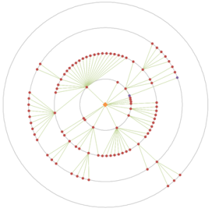
Figure 1 – Example of a radial org graph created in an Excel XY Scatter chart
after removal of all identifiable information and the obfuscation of data
necessary to protect the client’s confidentiality.
A lot of “out of the box” work into making this chart. One key element was the set of equidistant concentric circles that provide a visual reference for the small colored dots. This note demonstrates how to create concentric circles in an Excel XY Scatter chart.
For a version in a page by itself (i.e., not in a scrollable iframe as below) visit http://www.tushar-mehta.com/publish_train/xl_vba_cases/0610%20draw%20circle.shtml
Very impressive! I’m wondering how far of a jump it would be to create one like this:
http://thelastpixel.net/2011/07/31/radial-org-charts/
This would allow the user to easily insert names or positions.
Very impressive indeed.
So effectively, you implemented the Reingold–Tilford algorithm in VBA then ?
Wow !
Jason: Thanks for the compliment.
Compared to a node-link chart, *conceptually*, a Sunburst should be a lot easier to do in Excel. It’s essentially a customization of a doughnut chart.
That said, I am not sure I would use a Sunburst for large data sets. It would quickly become unreadable. The solution on which I based this post worked with large data sets (my client employs more than 100,000 people). The chart I created was “interactive” in the sense that hovering over a node brought up a pop-up, the contents of which the client could customize.
A crude sunburst in a doughnut:
MSimms: Thanks.
I haven’t researched the Reingold–Tilford algorithm but if it is a way to map a hierarchical structure then, yes, that’s what I did.
The original algorithm I created worked very well with the sample data from the client. The implementation in VBA ran with what I thought was acceptable speed (“a blink of an eye”). Then, it turned out that they had shared substantially less than 1% of the real data. Analyzing the complete data set took over 12 hours! So, I rewrote the analysis from the ground up and reduced the processing time down to 3 *minutes*. Of course, analysis of a subsidiary or a division took even less time.
Well done! I have always felt that Excel was rather poorly equiped on the charting side. (Witness the ad for Excel charting utilities that popped up on this webpage!)
A similar technique might be useful to add any chart annotation: I often want to add annotations to point out when events happened, but hand drawn annotations stay fixed relatively to the chart, and don’t move with the data, and so when additional data are added the annotations are then at the wrong time. An example might be annotating when you moved house on a chart of electricity usage.
Mind you, I can’t help feel that there must be an easier way – at least, there ought to be after all these years!
Tushar:
I agree on that the sunburst would not work well for large datasets. I was thinking of a simple org chart that may represent a part of an orgization, such as a department or local office (<50 employees).
Can you describe the steps you took to create the sunburst chart in your example?
Hey,
I’m trying to plot the circle, however it doesn’t allow for a formula in the Series Y Values. It doesn’t say anything is wrong when I do add =Sheet1!_C1Ys, it simply doesn’t allow me to press anything else until I change it.
It gives me a standard value of ={1}
Wondering if you experienced similar problems.
Jason M:
To get to the sunburst chart, first of all create the three data series you need. Create the chart with just the center circle (3,2,1). Then add the next two series with a straightforward copy (from sheet) and paste into the chart (series2 = 1,1,1,1,1,1 ; series 3 = 2,1,1,2,2,4). Then edit the series and set the doughnut hole size to 10%.
I’m assuming that Tushar has a neat formula in the hidden column D, or uses names in an innovative way that I can’t currently figure out. Just spotted the hidden rows too (12,13,15,16,18,19) so that is probably the answer if VBA isn’t.
Anyway once the chart is plotted then the unwanted segments can be set to white and the border increased on all the other wedges (and set to white).
Edwin K.
I got this problem too. The problem is a mismatch between the C1Y and other series named ranges – one of them may be assigned to the workbook level while the other is at the sheet level. I don’t know why it’s a problem, but you’ll need to re-create the mismatched series name at the same level as the others.
Tushar,
Firstly, I am not sure if this is right topic to post the query below. Please forgive me.
I have a requirement to show data similar to the following in excel. Think of this data as showing number of users of some application from a given geo location. The challenge I have is to show this data in a concentric circular chart. Center of the inner most circle is the center of location. In the example data below, there are 5000 users within 1000ft of the location, then 7500 users within 2000ft and so on. Need to draw a circle for each row of the data below. The spacing between the circles can be constant.
Distance, Number of Users
1000ft, 5000
2000ft, 7500
3000ft, 8000
Can you suggest some solution to accomplish this requirement.
Dear
Can yo please make a big circle inexcel sheet divided to 24 equal parts i.e 15 degrees apart and send it to me.
Rgds.
Vijay: That’s an interesting idea and a fairly straightforward extension of what I posted. I’ll create a post on that kind of a chart. I’m thinking that would be an interesting way to represent the various asteroid belts in and around the solar system.
Pankaj: Since you are calling me dear, should I call you sweetie? Not sure what my wife will think about it. {grin} Actually, I *know* exactly what she will have to say about it. {vbg}
I am not sure why you would expect someone to mail you a complete solution w/o any effort on your part. But, if you want an easy way to do what you want, put 24 1s in a column and create a pie chart from that data.
Jason: I’ll create a separate post on how to create the sunburst chart.
Edwin, GMF: Yes, most likely the name is scoped or spelled differently. Also possible is that the formula associated with the name has an error in it. One way to check is to select the appropriate number of cells in a column and array enter the name. Excel should show the values for that array formula, one value per cell.
Dear All,
We have a very easy method to create perfect square gridlines in Excel – this trick makes easy to create perfect circles too, without manually adjusting the plot area.
Just add a series (one point only = {0}) and set the chart type to pie chart.
Please see the details here:
https://sites.google.com/site/e90e50fx/home/perfect-square-plot-area-perfect-square-gridlines
Cheers,
Kris
Hi Tushar,
Thanks for the great post. I was implementing something very similar, but one small difference is that I have few dots(representing distance from the center of the circle) which take data from another sheet & could lie anywhere on the concentric circles/between them.Any thoughts on how to go about this ?
Regards
Everything is great, except I have one question. Is this only available for windows? Isn’t there a platform independent version of this? thanks
Hi this chart is great. I’ve been able to great the concentric circles but cannot figure out how to add the straight lines coming from the origin XY(0,0) out to the edgeof the circle.
Really great. Thanks for this. Managed to make it work.
I have the circles, and additional rings, so feel some accomplishment.
One more question. How do you add the data points onto the rings? I can’t work it out.
Thanks in advance. Years later your thread is still helping people. Thanks.