Draw a circle in an Excel chart

By default, Excel has a limited number of charts. That does not mean that those are the only charts one can create. It turns out that with a little imagination and creativity, we can format and configure the default charts so that the effect is like many other kinds of charts.

One of the more versatile of charts is the XY Scatter chart. We can use it as the base for many data visualization tasks. Recently, for a client, I used one to create a radial org chart as in Figure 1. Such a chart is also called a Node-Link chart or a Reingold–Tilford Tree.

image001
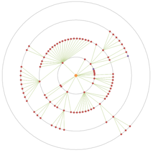
Figure 1 – Example of a radial org graph created in an Excel XY Scatter chart
after removal of all identifiable information and the obfuscation of data
necessary to protect the client’s confidentiality.

A lot of “out of the box” work into making this chart. One key element was the set of equidistant concentric circles that provide a visual reference for the small colored dots. This note demonstrates how to create concentric circles in an Excel XY Scatter chart.

For a version in a page by itself (i.e., not in a scrollable iframe as below) visit http://www.tushar-mehta.com/publish_train/xl_vba_cases/0610%20draw%20circle.shtml

Tushar Mehta

Worksheet as a chart – multiple conditional formats

Several years back, I wrote an article on how to use multiple cells to simulate conditional formats that involved more than 3 conditions. Three versions of Excel later, I still receive requests related to this post. So, I updated it to include more screenshots and a downloadable file.

In Excel 2003 and earlier, conditional formatting works well for up to three conditions. But even when the number of conditions exceeds that limit, it is possible to do without any programming support. For example, one possible way to show twelve possible rankings through color is shown below.

img7img8img9

For more see http://www.tushar-mehta.com/excel/newsgroups/worksheet_as_chart/

Tushar Mehta

Use an Excel chart to show a time snapshot and trace a path

These Excel charts were inspired by Hans Rosling’s TED presentation on Religion and Babies (http://www.ted.com/talks/hans_rosling_religions_and_babies.html). He is absolutely great at engaging the viewer with his ability to bring data to life.

One of the things he did in his presentation was show the equivalent of an Excel bubble chart. He showed how different countries measured over the years. He also created a trail showing how a country progressed over time.

I decided to do the same with an Excel bubble chart – and implement both capabilities, i.e., the time snapshot and the time trail tracing the path, without any VBA code! The example I used was data from one of a series of seminars I had taught to healthcare executives (check this to know more about it). They participated, in teams, in a real-time, interactive, web-based simulation. In the simulation each team made decisions about how much of their limited resources to invest in (1) product development and operations and (2) marketing and sales. Their profitability depended both on their own decision and also their competitors. The simulation typically lasted 10 to 12 periods. The scroll bar in each chart controls the period shown or the latest period, as appropriate. The checkboxes control which teams have their performance history traced in the chart.

While I implemented the solution in Excel 2010, it should work in Excel 2007 and Excel 2003, though, in all fairness, I haven’t verified the older versions.

For a version in a page by itself (i.e., not in a scrollable iframe as below) visit http://www.tushar-mehta.com/publish_train/data_visualization/9e%20Bubble%20Chart%20by%20Period.shtml

Tushar Mehta

Align Primary and Secondary axes

There are instances when there are data series plotted on both the primary and secondary axes. For example, suppose we want to plot the two series A and B in Figure 1, with the elements in column B as the x-axis values. The A series will be a column cart on the primary axis and the B series will be a line chart on the secondary axis.

For a version in a page by itself (i.e., not in a scrollable iframe as below) visit http://www.tushar-mehta.com/publish_train/data_visualization/06%20Visual%20Effects.shtml

Tushar Mehta

TM Custom Radar Chart add-in

A Radar Chart, also known as a Spider Chart, visually compares several entities (products, organizations, investment opportunities, or even people) on multiple dimensions. For example, a manager of a diagnostic imaging (radiology) center might want to compare her facility with the competition on dimensions related to patients such as Time To Appointment, Report Turnaround Time, No Show Rate, and Wait Time.

Or, one might want to compare 6 products A, B, C, D, E, and F on 6 different attributes: Aesthetic Appeal, Compatibility, Strength, Market Size, Durability, and Reliability. The Custom Radar Chart lets one easily compare all the products along each of the dimensions on interest. This is the example used in the documentation. With the axes normalized, the resulting chart would be

For more on this shareware product, please visit www.tushar-mehta.com/excel/software/custom_radar/index.htm

Tushar Mehta