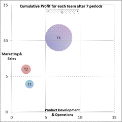
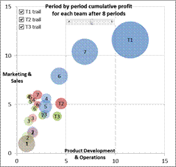
These Excel charts were inspired by Hans Rosling’s TED presentation on Religion and Babies (http://www.ted.com/talks/hans_rosling_religions_and_babies.html). He is absolutely great at engaging the viewer with his ability to bring data to life.
One of the things he did in his presentation was show the equivalent of an Excel bubble chart. He showed how different countries measured over the years. He also created a trail showing how a country progressed over time.
I decided to do the same with an Excel bubble chart – and implement both capabilities, i.e., the time snapshot and the time trail tracing the path, without any VBA code! The example I used was data from one of a series of seminars I had taught to healthcare executives (check this to know more about it). They participated, in teams, in a real-time, interactive, web-based simulation. In the simulation each team made decisions about how much of their limited resources to invest in (1) product development and operations and (2) marketing and sales. Their profitability depended both on their own decision and also their competitors. The simulation typically lasted 10 to 12 periods. The scroll bar in each chart controls the period shown or the latest period, as appropriate. The checkboxes control which teams have their performance history traced in the chart.


While I implemented the solution in Excel 2010, it should work in Excel 2007 and Excel 2003, though, in all fairness, I haven’t verified the older versions.
For a version in a page by itself (i.e., not in a scrollable iframe as below) visit http://www.tushar-mehta.com/publish_train/data_visualization/9e%20Bubble%20Chart%20by%20Period.shtml
Tip: I have something similar but connected the bubble-trail with arrows.
//Ola
ola, would you mind sharing your work?
Here is a simplified copy. I hope the link works:
https://skydrive.live.com/view.aspx?cid=CD4E55A373F3558D&resid=CD4E55A373F3558D%21147