Excel Services Interactive View

Analyze data with Excel on the web

Microsoft has introduced a new web based capability that extends its Excel Services offering.  This new capability provides a limited interactive view of any table in a web page.

An introduction to this service is below.  For those interested in additional capabilities and more advanced and useful capabilities see:

For the consumer:

Learn more about Interactive View

Analyze a table in any web page with a dynamic interactive view

For the developer:

Implement the Interactive View feature for 1 table

Implement the Interactive View feature for multiple tables

Improve the formatting and layout of the 'Interactive View' buttons

As an example, the image below shows a table, the Interactive View button, and the result.

For a live demo, developer tips, and more, please see http://www.tushar-mehta.com/publish_train/data_visualization/15c%20interactiveview/index.htm

Tushar Mehta

Use an Excel chart to show a time snapshot and trace a path

These Excel charts were inspired by Hans Rosling’s TED presentation on Religion and Babies (http://www.ted.com/talks/hans_rosling_religions_and_babies.html). He is absolutely great at engaging the viewer with his ability to bring data to life.

One of the things he did in his presentation was show the equivalent of an Excel bubble chart. He showed how different countries measured over the years. He also created a trail showing how a country progressed over time.

I decided to do the same with an Excel bubble chart – and implement both capabilities, i.e., the time snapshot and the time trail tracing the path, without any VBA code! The example I used was data from one of a series of seminars I had taught to healthcare executives (check this to know more about it). They participated, in teams, in a real-time, interactive, web-based simulation. In the simulation each team made decisions about how much of their limited resources to invest in (1) product development and operations and (2) marketing and sales. Their profitability depended both on their own decision and also their competitors. The simulation typically lasted 10 to 12 periods. The scroll bar in each chart controls the period shown or the latest period, as appropriate. The checkboxes control which teams have their performance history traced in the chart.

While I implemented the solution in Excel 2010, it should work in Excel 2007 and Excel 2003, though, in all fairness, I haven’t verified the older versions.

For a version in a page by itself (i.e., not in a scrollable iframe as below) visit http://www.tushar-mehta.com/publish_train/data_visualization/9e%20Bubble%20Chart%20by%20Period.shtml

Tushar Mehta

Copy Chart as a Picture

I needed to copy a chart to a picture, but I wanted it to be an enhanced metafile (EMF) which is kind of like a vector graphic picture format. EMF graphics scale well when the page resizes.

A user would select the chart, run the macro and a dialog would ask them where to save the picture to – pretty simple, but handy!
It uses the clipboard to do the conversion.

Declare Function OpenClipboard Lib "user32" (ByVal hwnd As Long) As Long
Declare Function CloseClipboard Lib "user32" () As Long
Declare Function GetClipboardData Lib "user32" (ByVal wFormat As Long) As Long
Declare Function EmptyClipboard Lib "user32" () As Long
Declare Function CopyEnhMetaFileA Lib "gdi32" (ByVal hENHSrc As Long, ByVal lpszFile As String) As Long
Declare Function DeleteEnhMetaFile Lib "gdi32" (ByVal hemf As Long) As Long

Const CF_ENHMETAFILE As Long = 14
Const cInitialFilename = "Picture1.emf"
Const cFileFilter = "Enhanced Windows Metafile (*.emf), *.emf"

Public Sub SaveAsEMF()
Dim var As Variant, lng As Long

var = Application.GetSaveAsFilename(cInitialFilename, cFileFilter)
If VarType(var) <> vbBoolean Then
On Error Resume Next
Selection.Copy

OpenClipboard 0
lng = GetClipboardData(CF_ENHMETAFILE)
lng = CopyEnhMetaFileA(lng, var)
EmptyClipboard
CloseClipboard
DeleteEnhMetaFile lng
On Error GoTo 0
End If
End Sub

Charts and Things

A list of people who will enjoy chartsnthings, “A blog of data sketches from the New York Times Graphics Department. Maintained by @KevinQ.”

  • People who say “data visualization” instead of “chart”
  • People who can find fault in any chart that they didn’t make
  • People who get lost in the minutia of charting psychology
  • Me
  • Maybe you

Align Primary and Secondary axes

There are instances when there are data series plotted on both the primary and secondary axes. For example, suppose we want to plot the two series A and B in Figure 1, with the elements in column B as the x-axis values. The A series will be a column cart on the primary axis and the B series will be a line chart on the secondary axis.

For a version in a page by itself (i.e., not in a scrollable iframe as below) visit http://www.tushar-mehta.com/publish_train/data_visualization/06%20Visual%20Effects.shtml

Tushar Mehta

TM Custom Radar Chart add-in

A Radar Chart, also known as a Spider Chart, visually compares several entities (products, organizations, investment opportunities, or even people) on multiple dimensions. For example, a manager of a diagnostic imaging (radiology) center might want to compare her facility with the competition on dimensions related to patients such as Time To Appointment, Report Turnaround Time, No Show Rate, and Wait Time.

Or, one might want to compare 6 products A, B, C, D, E, and F on 6 different attributes: Aesthetic Appeal, Compatibility, Strength, Market Size, Durability, and Reliability. The Custom Radar Chart lets one easily compare all the products along each of the dimensions on interest. This is the example used in the documentation. With the axes normalized, the resulting chart would be

For more on this shareware product, please visit www.tushar-mehta.com/excel/software/custom_radar/index.htm

Tushar Mehta

Income Statement Waterfall Chart

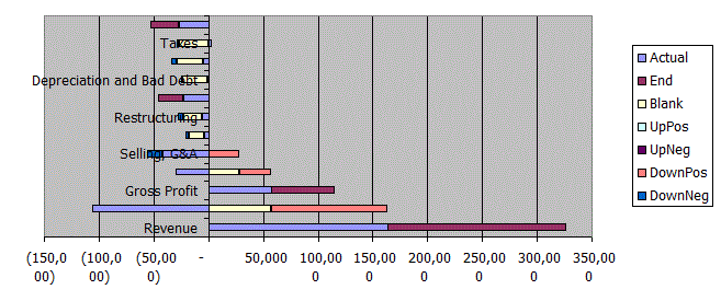
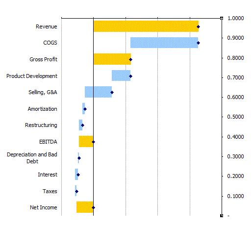
I want to make a chart that looks like this:

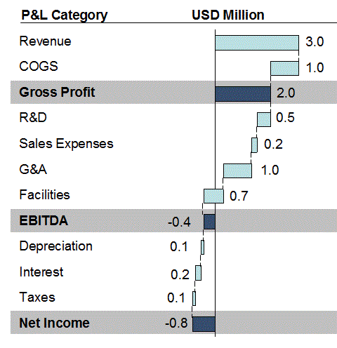
This example comes from Powerpoint. There’s another chart right next to it showing percent of revenue. I had to edit the chart in Powerpoint to obfuscate the data. That was a lesson in itself. I right clicked on the chart and chose Edit from the Chart Object menu. I had to manually change all of the numbers. I have no idea if you can use formulas in that PPT grid, but I didn’t see how. Then when I got back to the slide, none of the labels were right – they’re all hand typed numbers. And those lines that seemingly connect the bars? They’re hand placed individual shapes. That was a process. And not one I’d like to repeat. Oh, one more thing. Where facilities crosses the vertical axis, the axis is hidden by three shapes; One blue rectangle to fill over the axis and two small black lines to serve as horizontal borders. Brutal.

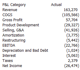
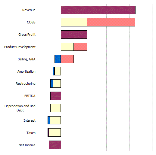
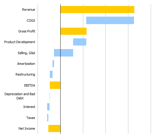
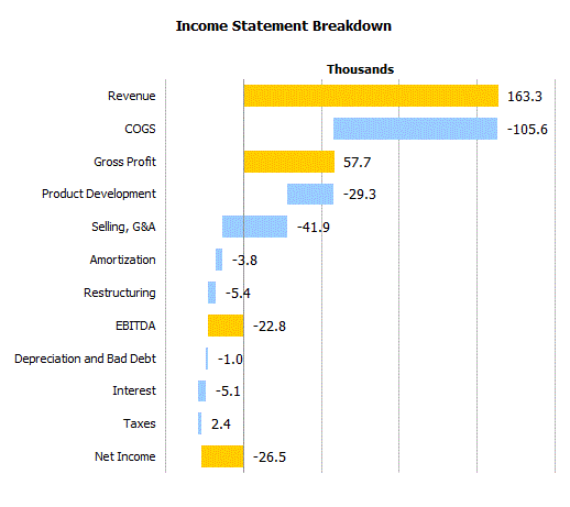
I started with this data

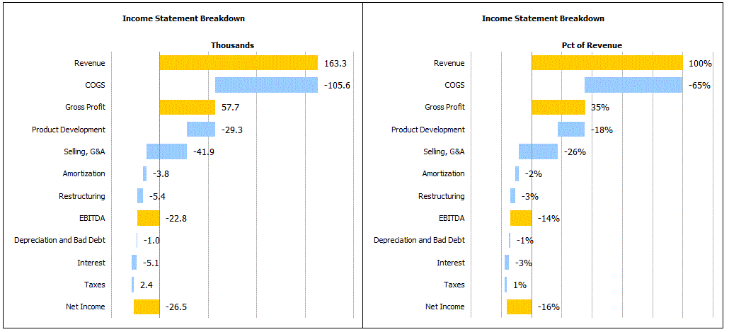
and end up with these charts

Here’s how I got there. First, I read Peltier’s post on the subject. Then I read Tushar’s page on the subject. Both are for columns, not bars, but very valuable information. I think we all know that I didn’t really read those “first”. Rather, I tried to do it myself, got stuck, then went and read them. But you get the idea.

The key to making a proper chart is laying out the data properly, so let’s start there.

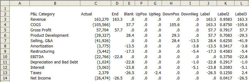
Column D: I manually identify which numbers are my end numbers. In D3, the formula is =C3 and it’s similar all the way down. Where this is no number, the cell is blank.

Column E: =IF(ISBLANK(D3),MAX(0,MIN(SUBTOTAL(9,C2:C$3),SUBTOTAL(9,C$3:C3)))+MIN(0,MAX(SUBTOTAL(9,C2:C$3),SUBTOTAL(9,C$3:C3))),0)

If it’s an end (D3 isn’t blank), the result is zero. Otherwise it computes where the visible data series should start. Column C uses the SUBTOTAL function to calculate the end points, so this cell uses them to properly ignore the end points. Other than the conditional and the use of SUBTOTAL, this came straight from Jon’s example (as did most of the formulas).

Column F: =IF(ISBLANK(D3),MAX(0,MIN(SUBTOTAL(9,C$3:C3),C3)),)
Column G: =IF(ISBLANK(D3),-MAX(0,C3-F3),0)
Column H: =IF(ISBLANK(D3),MAX(0,I3-C3),0)
Column I: =IF(ISBLANK(D3),MIN(0,MAX(SUBTOTAL(9,C$3:C3),C3)),0)

These four formulas split the data into rising and falling, positive and negative. It reminds me of astronomy class and waxing gibbous and waning crescent. I’ll hold off on columns J:L until later. If I create a stacked bar chart from just those columns, I get

And we’re done. Just kidding. That’s hideous. I’m sure there are better ways to start, but for me, I select the data and press Alt+I+H to create a chart. In this case, it means I have to delete the Actual data series. In addition to that, I do my normal chart formatting stuff.

  • Border and Area of Plot Area set to None
  • Legend removed
  • Major gridlines color set to 25% grey

And some charting stuff that is particular to this chart

  • Reverse order of Y axis
  • Remove Y axis tick marks
  • Set Y axis labels to Low
  • Set Gap Width to 50
  • Hide X axis

You can see that the work is pretty much done. It’s all about the data layout. Next, color the Blank data series as invisible, the End data series mustard and everything else Carolina Blue. There are four series that get the Carolina treatment and they may not all be showing. I don’t have any “Up Pos” datapoints visible – they’re all zero. But you still have to color them or you’ll be in for a shock when your data changes. Also, remove the borders.

Now I need to get some data labels on there. For this I needed three columns corresponding to the x coordinate, the y coordinate, and the label. You may have noticed that I used an ugly yellow color for the End data series. That’s because I wasn’t using a very good formula for placement of the labels and some of the labels were overlapping with the bars. When the bars were dark blue, it was no good. I fixed the formulas, but I must have grown fond of the yellow. So that’s the story behind that.

X Coordinate: =IF(COUNTIF(D3:I3,">=0")=COUNT(D3:I3),SUM(D3:I3),IF(COUNTIF(D3:I3,"<=0")=COUNT(D3:I3),E3,MAX(D3:I3)))
Y Coordinate: =(ROWS($B$3:$B$14)-ROW()+ROW($B$3:$B$14)-0.5)/ROWS($B$3:$B$14)

The Label3 column (used for the actual text of the label) just repeats column C, but is formatted the way I want. The Y Coordinate formula came from PTS Dot Plot. It simply returns a point on the Y axis that lines up with the bars. For the X Coordinates, I wanted the label to be just to right of the bar. If everything in that row (D3:I3, for example) is positive, add them up. If everything is negative, put it where the Blank data series stops. If there's a combination of positive and negative numbers, only consider the positive.

To create the labels, I right clicked on the chart and chose Source Data. Then on the Series tab, I added a new series called Label with column K as its Values.

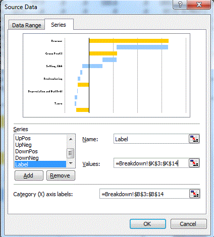
I changed that new data series into an XY chart and edited the Source Data again. I set the X Values to column J and left the Y Values at column K. Next I formatted the secondary Y axis to have a Minimum of zero and a Maximum of 1.

Finally, I used Rob Bovey's XY Chart Labeler Utility to put 'Right' labels from Column L on those points.

The finishing touches included hiding the secondary axes, hiding the Label data series bullets, making the primary Y axis 40% grey, adding a chart title, and adding a primary y axis title.

Then I did it all again for the percentage chart. The bar that crosses the Y axis doesn't cover up the axis, but I can live with that. Also, there are no lines connecting the bars, but I don't see the need for them. I could make another series to replicate it, but does it add anything? I don't think so.

You can download PLChart.xls

Excel Mashup #2

Following up on the previous post (http://www.dailydoseofexcel.com/archives/2012/01/25/excel-mashup-1/) I extended the capability to create a Polar plot using a 2nd worksheet in the same workbook. The consumer provides graph parameters, including the graph type, using HTML form controls. The graph is in an Excel workbook.

Graph any Excel formula in a XY (Cartesian) chart or a Polar plot