With the recent Excel beta, which now has become a released product, I’ve been thinking about how Microsoft can enhance the charting experience. In Excel 2007, there were precious few features added to charts. The new chart formatting is certainly nice, but the new user interface is awkward. The only real enhancement to charts in Excel 2007 is that the minimum and maximum of a logarithmic axis scale are no longer tied to powers of ten. However, we’ve given up a few things, some perhaps just to bugs which crept in during the complete restructuring of the charting module. The Size with Window setting for chart sheets was deprecated purposefully, and I’m hoping they bring it back. In Excel 2007, among the things I consider bugs is the inability of an XY series to be plotted on a line chart’s category axis, which means you need to use a secondary axis for the XY series, and that means the secondary axis is no longer available for another series that provides an additional effect.
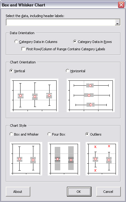
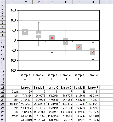
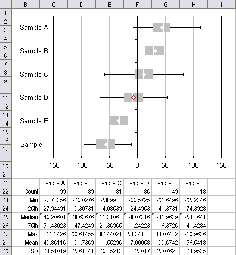
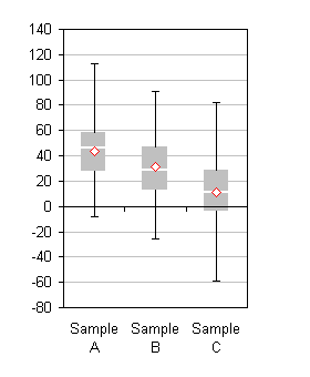
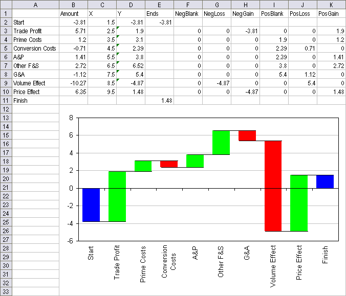
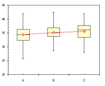
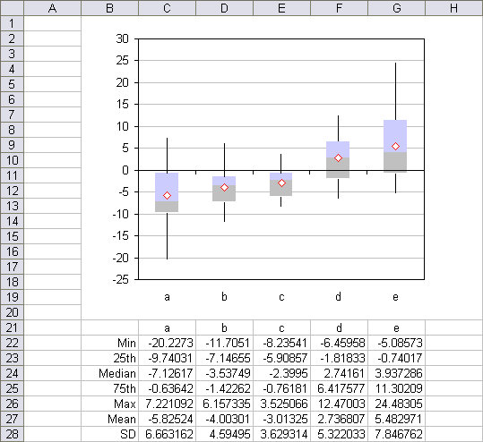
Part of my thinking has been about new chart types that should be built into Excel. I’ve decided that Microsoft should not spend much effort to recreate the chart types that clever people can build already with combinations of existing Excel chart types. One type of chart that Excel does not do is a 3D XYZ type of chart. To fake this requires some real heroics, and I think Microsoft should develop a 3D XYZ chart type, with points only and also with a surface. To fake a histogram, waterfall chart, box and whisker chart, and other similar charts, on the other hand, requires only careful assembly of individual series, and I think Microsoft’s efforts can be more wisely spent in other ways, rather than trying to make everyone happy with the difficult design decisions. Add examples, templates, and tutorials to the MS Knowledge Base, and include links to pages on the web sites of charting heroes.
My feeling is that Microsoft should add features to charts that enable more of the fancy combinations we can come up with. I have a fuzzy list of items in my mind, which change in importance depending on what I’m doing this week. I’ll describe some of them, and ask for additional suggestions.
1. Give us real text boxes for chart and axis titles and data labels, which can be resized and which have VBA properties like height and width.
2. Enhance a series, so it has more associated ranges. Allow us to more directly interact in VBA with the ranges describing the X and Y values of a series, without painful and error-prone parsing of addresses. Formalize the association of a series to its custom error bar values, so we can deal with error bar ranges in VBA. Add a range to a series that contains data labels for the series.
3. Allow more chart types to be combined. I’d like to be able to combine area charts with bubble charts, so the bubbles have a nice patterned background to lie on. Let me add an XY series to a contour chart. Don’t ask me why I want this, just enable it and a hundred users will have a hundred whys.
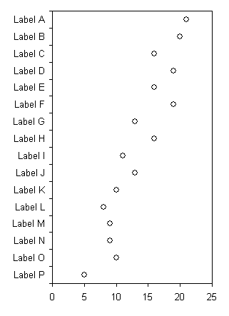
4. Combine Line and XY series into a single type. If the X values are labels, then treat the series as today’s line series. If the Y values are categories, then treat the series as a dot plot (a rotated line chart). If X and Y are both labels, well, we’ve heard people asking how to plot, say, classroom along X and letter grades along Y.
5. Construct an Axis object model, so we can apply any arbitrary funtion (or even range) to describe the axis and define its scale and ticks. Then such things as probability axes, reciprocal axes, even broken axes will be much easier to construct.
6. Let any numerical and text aspects of a chart be linked to a worksheet cell or range. For text, we can do this with titles and data labels, but not with axis tick labels. We should be able to link axis scales to the worksheet and use our favorite algorithms to provide autmatic scaling that suits our needs.
I could go on and on, but I’ve said enough to prime the pump.
I know that this is pretty much out of the box thinking, but if features like these are added, they provide flexibility that users like you and I can use to make a much wider array of great charts than a handful of added chart types could provide. What kind of features would you like to see? What would allow you to make better charts? What would make Excel 2010 a kick-ass charting product?