Another installment from Insomniac Software Inc.
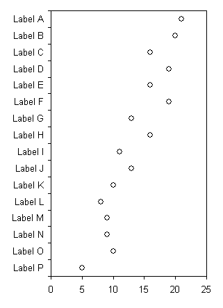
I’ve added a page on my web site about Dot Plots. These are like a line chart turned on its side, with labels up the left hand axis, and dots positioned horizontally according to the plotted value. Or they’re like bar charts with a hidden bar and a dot at the end of the bar.
On my web page, I link to studies of the relative effectiveness of dot plots vs. bar charts, and I give tutorials on how to produce worksheet function (in-cell) and conventional chart versions of dot plots.
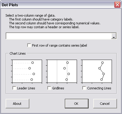
I also have built a utility to aid in construction of dot plots without having to remember all those stupid steps. The utility lets you select the data and choose from a few options, then spit out a nice dot plot. The Dot Plot utility is designed to work in Excel versions 2000, 2002, and 2003; it has not been tested in any Macintosh version or in Excel 97 or 2007, it may or may not work on these versions. The Dot Plot utility is a beta version, available at no cost in exchange for useful feedback. Ultimately it will be incorporated into a commercial Advanced Charting utility. The user interface looks like this:
and the output typically looks like this:

The Dot Plot utility is available at Dot Plots, which also has instructions for its installation and use.
I welcome any comments and suggestions, and will probably implement most reasonable feature requests.
Jon
This will be a great set of utilities when you get the whole lot together
Hui…
Howdy, Jon. I know you said these are not geared to Macs, but I donwloaded the Dot Plots xla and tried it anyway. While there was an error message about “border” (I can provide full message tonight), it still produced the Dot Plot as expected, with one major variation. The labels ended showed on the right side of the graph rather than the left. Otherwise the utility seemed to work fine.
Mac OS 10.3.9
Excel 2004
Jon,
I love the Dot Plots, I can already think of some great applications for the chart. I have 3 questions.
1. Will we be able to combine the Dot Plot with other charts or even another Dot Plot chart? Say, I wanted to show the average of your 16 values as a straight line, or one dot on the chart.
2. I noticed your Box and Whisker chart had color, will we be able to change the color of the Dots? I have visions of multi-colored dots raining down the screen, of course that could be for other reasons.
3. We will be able to change the shape of the dots? Say I want squares, or dollar signs or something else unique to the data I am presenting.
Just some random questions. Otherwise, I like the Utility and keep up the good work, charts are good, more people need to use them.
Thanks.
Bobb
Ok,
So it would help if I actually clicked on the link and looked at your website before I left my comments. Ignore my questions as I think all of them were answered.
Thanks.
Bobb
Jon,
coming back from a week off (in the mountains) just to see topic no.1 of my “playlist” is done.
“Shame” on you and thanks!!
Can’t we make this a habit?
unrädschistert
Hey Bobb –
RTFM, eh? But I’ll post some answers so anyone else can read them too.
These utilities all create regular Excel charts, nothing magical except for formatting and some extra hidden series to help with the smoke and mirrors. Double click on a visible series and you can change its patterns just like any other series (marker shape and size if it’s an XY or Line series, colors for any series). If you want an indicator line, add it like you would to any other chart. You could add additional XY series to make a multiple dot chart, but that sounds like something I could just as easily build into the utility. Maybe in next week’s release.
[…] Daily Dose of Excel » Blog Archive » New Charting Utility – Dot Plots […]
Update:
The Dot Plot Utility has been updated to allow multiple series of dots. It also has its own web page, so you don’t need to scroll all the way to the bottom of the Dot Plots page:
http://peltiertech.com/Excel/Charts/DotPlotter.html
Technically these aren’t proper dot-plots, in the statistical analysis sense. I’ve only found Analyse-it http://www.analyse-it.com/ draw proper dot plots.
“Dot Plot” — What’s in a name?
Analyze-It could streamline their web site. It took me ten minutes before I found an example of what they call a dot plot, and I’m still not sure what they mean. More commonly, a dot plot seems to be a histogram that uses stacks of dots instead of columns to signify the number of items in each bin. A less common dot plot seems to be an XY plot where similarities between populations are plotted with a dot: identical populations have a line of dots along the line Y=X. Some sources call an XY chart by other names, including a scatter chart and a dot plot.
What I’m calling a dot plot was first named “dot plot” by William Cleveland back in the ’90s or even ’80s. A readily available electronic paper by Cleveland, not the first on dot plots, was published in 1998 (http://www.valuemetrics.com.au/pdf/GoodGraphsforBetterBusiness.pdf). This dot plot is like a horizontal bar chart, without bars but with markers (dots) where the ends of the bars would be.
Hi John,
Yes, there’s a lot of confusion over the word “dot plots”. I found your site (and a few others) while looking for dot plots in Excel and thought I’d mention the differences.
I would refer to your ‘dot plot’ as an Excel line plot, except lines aren’t joining the points and the points are highlighted with a symbol/marker. Your plots are vertical whereas Excel normally does them horizontal.
A statistical box plot shows a dot for each value in the data. From the dot plot you can see the distribution of the values. Where values cluster, which values might be outliers, how they are spread between the minimum and maximum values. SPSS, JMP, and Minitab (e.g. http://home.ched.coventry.ac.uk/Volume/vol0/dotplot.htm) draw box-plots like this, and it’s an accepted plot (over 100 years old) in the field of statistics. They’re sometimes technically called one-dimensional scatter plots. Scatter plots (what Excel calls XY Charts) are only used for bivariate data, which I don’t believe we’re talking about here.
The Analyse-it site shows a dot plot at http://www.analyse-it.com/products/standard/compare.aspx (the ‘View example box-whisker box- and dot- plots’ link). The picture they’ve got shows a box-plot with the dots for each value shown behind. Analyse-it uses the jitter technique to avoid overlaps, like JMP does, rather than stacking them which gets unweidly if there is a large amount of data to show.
Will –
I found both of those plots. The one on the AnalyzeIt site took a long time to find. You’d think they’d have a gallery page with example charts. I would think that the dots would clutter up a chart like this when the population exceeded a rather small size. Below that size, it might not be relevant to build the box and whisker elements. Tukey’s version with dots only appearing for outliers (which had better be infrequent) is clear, and doesn’t overwhelm the reader with points that define the distribution.
Neville Hunt’s dot plot led me to the comparison to a histogram.
The Analyse-it site isn’t the easiest to navigate, I agree. Thankfully their software is a lot better. I’m using the free trial at the moment and it’s one of the best extensions for Excel I’ve seen.
When there are many values dot plots come into their own, as the density of points shows you where values cluster, where outliers lie (as you say, Tukey’s outlier plots are useful for this too). With many vlaues dot plots can become large, even useless, if you stack points, histogram-style. That’s when jittering becomes more useful.