I’ve just finished the beta version of another charting utility. This one turns a simple table of data into a Waterfall Chart, based on techniques described on two pages of my web site, Waterfall Charts and Utility and Waterfall Charts that Cross the X Axis.
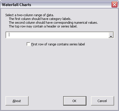
The utility is available as a zipped download file, which installs the utility as an add-in, and also provides a sample data file in the user’s My Documents folder. On installation, a new menu (PTS Charts) appears with the menu item Waterfall Charter. The Waterfall Charter dialog is shown below:
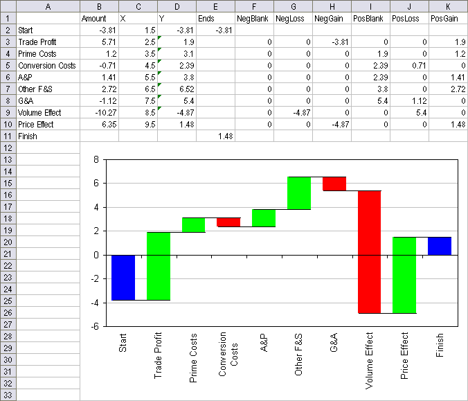
The utility’s output is shown below. The first two columns comprise the original data range; the utility adds the additional columns and the embedded chart.
The Waterfall Charter Utility is available from this web page, which also has more detailed instructions (although it’s nearly self-explanatory) and contact information.
I welcome any comments and suggestions, and will probably implement most reasonable feature requests. The blank gray area on the dialog is holding space for some enhancements which I have in mind.
Looks really good Jon. Well done.
Thanks, Rob. I’m getting better at these little things.
I’ve made a little enhancement to the utility. The new version (see dialog below) allows sorting of the input data.
Hmm, the picture doesn’t appear in my post, so you’ll have to visit my web page:
http://peltiertech.com/Excel/Charts/Waterfall.html
Are you planning on releasing all of your chart wizards combined into a single add-in?
Rob –
I’m not sure what kind of business model I’ll pursue for my utilities, other than that I’ll try to receive revenue from them. While I would like to put out a charting package on the order of PUP or ASAP, I can’t imagine having the time to assemble such a large add-in. Some utilities that are in demand, or are an extensive piece of work, can be released as stand alone utilities. Others will do better bundled together. In addition to the chart making utilities, I have a number of chart formatting and processing routines which would not make much sense as stand alone utilities. So now I’m thinking that I’ll offer a few sets of utilities, and people can mix and match.
The box and whisker utility is an example of a stand alone add-in. The working version that I haven’t released yet includes the simple box and whisker style and an alternate style that uses two more boxes in place of the whiskers (which two users have suggested). It also has the more rigorous style where the whiskers are a multiple of the interquartile range and points beyond that range are identified and individually plotted as outliers. The simple version by itself will probably remain a free demo, to give people a taste for the professional utilities.
Jon
I for one am awaiting for you to release the combined charting functions that you have been teasing us with now for several months
Put me down as your first customer
Ian Huitson
Jon, I know it might sound stupid, but I love your charts and I just would like to know the best use for specific charts like waterfall etc.. how you read that kind of chart, whats the best use for those charts etc…
There are so many on your website that sometime trying to figure out which one would be the best can be difficult.
I know how to show what I want with most basic charts etc… same for stocks, but all specifics like this one look very good to me, though I dont know what I could show with it and how to explain and read it.
(I just noticed that you do it for the new ones with the wizards, so I will wait for more ;) )
Very good. And it even works in Excel 2007 — until somebody tries to apply a different style. :)
You might want to add a warning for Excel 2007 users. To change the colors, format each series separately. Otherwise, it’s destroyed.
[…] Daily Dose of Excel » Blog Archive » New Charting Utility – Waterfall Charts […]
Thanks for the comments.
Re 2007:
In general my utilities seems to work in 2007. The only special work I did late in the 2007 beta process was to test one of the utilities that someone told me was not working in 2007. It turned out that a particular two line piece of code worked in 2000-2003 but didn’t work in 2007. Reversing the order of the two lines was all it took for the code to run in 2000-2007. I wish I’d written down which two lines these were, for an upcoming web page on programming charts in 2007.
I have noticed other things in 2007. In the beta, one of my tricks of making a line chart to get a date axis, then adding other series as XY to use this axis with different sets of dates, didn’t work, because an XY series doesn’t recognize the date axis in 2007. I haven’t tested this yet in the RTM. In the RTM, a newer version of my box and whisker utility has a strange Y axis: the line appears thicker at the top of the chart than at the bottom. I don’t know if it’s an actual thickening of the line or some kind of gradient shading, but I plan to follow up.
Applying a style in 2007 causes problems because what look like a bar of one color can be comprised of multiple series (above/below zero requires two stacked columns, and there are invisible series which help the other columns float). The same problem occurs in 97-2003, because Excel only knows what series there are, not that some are designed to look like each other, or like nothing at all.
Re: Which chart to use…
Over time I’ve concentrated more on the mechanics of Excel charting, but that’s only half the story. It doesn’t matter if you can make the best pie charts, if pie charts are so bad anyway at conveying information. The most popular item on my web site, judging from email, is the speedometer chart, and this is one of the worst chart types for conveying meaningful information; I only did it as a demo of an unusual combination of chart types, and I’ve been trying to convince people not to use it. I really should remove the page, but it is a good example of unexpected combination chart types.
Long story short, I plan to introduce content on my web site to help guide users to choose appropriate chart types and techniques to show data more effectively, and to avoid chart types which are confusing, misleading, and too time-consuming to comprehend. This includes but is not limited to charts with gratuitous 3D effects as well as unnecessary coloring and shading formats. The old (pre-2007) default formats in Excel are certainly not pretty; on the other hand some of the special effects easily attainable in 2007 are not only very pretty, but also fit in the category of confusing, misleading, and too time-consuming to comprehend.
Hi all,
Glad to see that kind of chart. I worked on that kind of utility for explaining Business Plan variations and had to think the same charts.
The way I did it was quite the same as you did. But I didn’t try to automated it.
I’m downloading your Addin ASAP to test it, ‘cose it will certainly help me in a near future.
TIA ;)
I tried installing and I’m not sure if it’s Office 2007 RTM or Vista – but it errors out on install. I’d love to have this utility and I have a workaround in excel but doesn’t give me the flexibility to show a start number, like a sales quota or revenue target and inflows and outflows against that. Will keep checking..
WTC:
Could you enter your ‘start number’ where I have a starting value, cell B2 of my table?
I have done limited testing of my utilities in Excel 2007, and they seem to work. I’ve heard lately about probelsm when someone is using Vista. I do not yet run Vista, so I cannot address these issues.
If you are inclined, document the problems and send me a report (error messages, what you’re trying to do and how, what you expect to happen, and what actually happens instead). Doesn’t have to be too detailed or too polished, just more than “it doesn’t work”.
Thanks for the report.
Would like ability to change default colors.
For the ultimate version, I plan (among other enhancements) an interface to handle things like default formats. I should probably just take a week away from my usual activities and bang these utilities together.
Hi Jon,
I used PTS Waterfall Charts in Office 2003 without any hassles. I installed Office 2007 recently on my machine and installed Waterfall charts again. Installation completed without any errors but I was not able to see PTS Waterfall Chart tab like in Excel 2003.
Where should I find it?
Thanks in advance and keep up the good work.
The utility currently available only installs explicitly into Excel 2000, 2002, and 2003, whichever is/are available on the computer. In any case, the add-in is present in C:Program FilesPTS Charts, so you could install it into 2007 manually.
Excluding the utilities from Excel 2007 was intentional, because at the time I released them I had not done extensive testing in 2007. The existing utilities will install a 2003-style button in the Add-Ins tab, but beyond this, the VBA code suffers from minor incompatibilities between pre-2007 and 2007 versions. I’ve determined which items need to be changed, and I’ve learned how to build a decent custom ribbon tab. Before too long I will start to release 2000-2007-compatible versions of these utilities, and these will probably be the last “beta” versions. Within a few months I plan to roll out a commercial application which combines all of my current utilities, along with other tools that I’ve developed over the years.
absolutely fabulous- saved my hours of headache!!