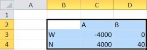
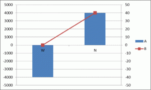
There are instances when there are data series plotted on both the primary and secondary axes. For example, suppose we want to plot the two series A and B in Figure 1, with the elements in column B as the x-axis values. The A series will be a column cart on the primary axis and the B series will be a line chart on the secondary axis.


For a version in a page by itself (i.e., not in a scrollable iframe as below) visit http://www.tushar-mehta.com/publish_train/data_visualization/06%20Visual%20Effects.shtml
Super helpful, thank you! This was driving me crazy. Aligning the ratios worked perfectly.
Thank you so much!!
I am working on a template where I am facing the similar issue and i could fix it using above method. But I need to send out the file as blank template and people will be using and each time we will not able to manually adjust. Is there any option where this step can be automated?
Thank you so much for this – it solved a problem I’ve been trying to fix all afternoon. Greatly appreciated!
Just set the min and max of the secondary axis to the same values but of course with opposite signs so scale is evenly spreads and zeroes align.
All these years later and this post is still helping people, I just used it to great effect. Thanks!