I use XY charts for schedules and I like to have a vertical line showing today’s date. I do this so frequently I have a named range for each of the X and Y values. To get the current date to show up as 2 similar X values the best I could come up with is:
=(ROW(INDIRECT(“1:2″))/ROW(INDIRECT(“1:2″)))*TODAY()
There must be a better way, but I can’t just put ={TODAY(),TODAY()} as a value and I’m curious why.
Until somebody smart like Charles Williams jumps in with a better explanation, the reason you can’t put individual functions into an array is that you can’t. I know, it sucks. I’d like to be able to do that too.
Edit: Colin Legg beat Charles to it:
When you use { } within a formula they are delimiters for an array constant. The formula parser won’t let you embed functions or references within an array constant because, by definition, the elements wouldn’t be constant anymore.
That said, you can get there indirectly:
=TODAY()*{1,1}
={41854,41854}
Sure Jeff, but I want to be able to put different functions in each array position.
Not a problem…with a bit of cleverness, you can do the equivalent of this:
={MIN(SomeRange),Max(SomeRange)}
…like this:
=MIN(SomeRange)*{1,0}+MAX(SomeRange)*{0,1}
…which says to Excel:
- Populate a 2-element array with the minimum of SomeRange, but multilpy the first element by 1 and the second element by 0, in order to clear the minimum from that second element.
- Populate a 2-element array with the maximum of SomeRange, but multilpy the first element by 0 and the second element by 1, in order to clear the maximum from that first element.
- Add them together, leaving just the minimum in the first, and the maximum in the second.
So how does this tie in with what GMF wants to do, i.e. put a vertical line in an XY chart to show the current date?
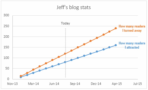
Well, because this is an XY chart, you only need two coordinates to draw that date line line: the point at the bottom, and the point at the top.
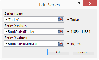
So to get the X values we want – today’s date, we define a name called Today:
=TODAY()*{1,1}
And for the Y values – the Min and Max values across both ‘Values’ series – we define a name called MinMax:
=MIN(SomeRange)*{1,0}+MAX(SomeRange)*{0,1}
And then we can add a new series called Today to our chart:
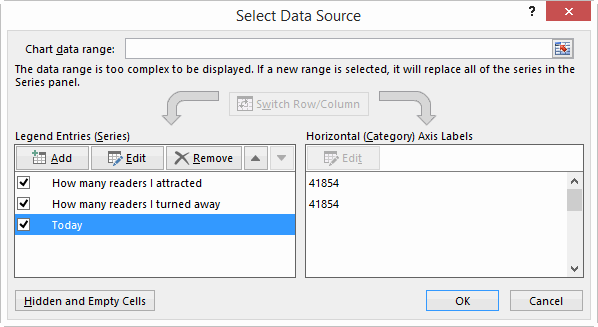
…with the X and Y coordinates of that series pointing at the appropriate name:
Of course, you don’t actually need a Named Range to do this… you can simply have some helper cells in the actual worksheet that calculate the Min and Max values of the entire block of data, and point your Today series at that:
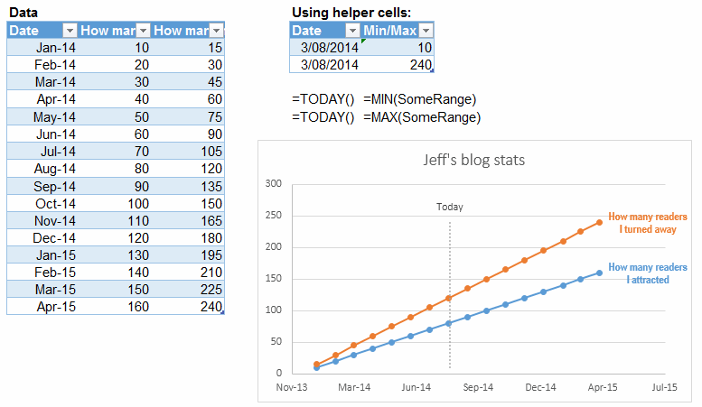
Here’s a sample file with both approaches: Todays Date on ScatterPlot
Maybe this stuff is all included in Dick and Mike’s book 101 Ready-To-Use Excel Formulas. I don’t know…I’m still waiting for my free advance copy in the post.
Well, that’s all folks. Hopefully this post moved those lines on the chart closer together rather than pushing them apart.
If you are happy to have the line touch the horizontal axis then you only need 1 data point at x=today and y=max_of_data and a 100% minus Y error bar.
Interesting approach. I’ve never played around with Error bars before, so had to Google to see how to get these in place in Excel 2013. Found it a bit more effort than the two-point approach and not as customizable, but good to know what can be done. Thanks, Andy.
“That said, you can get there indirectly.”
A pun, right? Get there indirectly by NOT using the INDIRECT function.
No, my puns are usually so bad that it is usually painfully evident they are puns. :-)
Wow. Don’t I feel foolish over my Rube Goldberg formula!
Yes, error bar handling in Excel, whether 2010 or 2013, is kludgy. But very useful in some circumstances.
Interesting, not because I want to use it for charts (why would anyone not use the “helper cells” method? :)), but because some playing with arrays produced:
A sequence of dates in a column, starting from today: {=TODAY()+ROW(A:A)-1}
A sequence of Mondays (if today is Monday): {=TODAY()+(ROW(A:A)-1)*7}
A sequence of numbers increasing by 0.1: {=G10+ROW(A:A)/10}
All entered as an array formula.
All of which I’m sure has been said before, but I tend not to use them.
Also I’m sure I’ll find a use for the error bar technique, which I’m going to go and play with now.
When you use { } within a formula they are delimiters for an array constant. The formula parser won’t let you embed functions or references within an array constant because, by definition, the elements wouldn’t be constant anymore.
Ahhhhhh. Best passive Googling I ever did! Thanks Colin.
Dick, I took your example and created a variant with a movable vertical and data labels that travel with the vertical plot.
I added the value labels to the helper table with the vlookup function and add a vertical scroll feature with a scrollbar and an index function linked to the scrollbar output. Now the data labels appear on the vertical plot and move with the vertical.
I’ve wanted to make something like this and you gave the perfect example to jump off and make it happen. Thanks!
Since I don’t have the ability to upload to your site I made the file available from here temporarily.
http://www.jeffkoenig.com/chart_with_vertical_marker_and_value_labels.xlsx
@Jeff: it’s somewhat ironic that you mistook this post for one of Dicks. Whoops, that could be taken the wrong way…what I mean’t to say is that this is one of my posts, not Dicks, with the irony being that you and I share the same name. :-)
(Some say that “Jeff Weir” is just a non-de-plume Dick uses to say stupid stuff. They’re half right.)
Hey, your graph’s really neat! I never would have thought about doing a lookup to get the values and then displaying them as dynamic labels. And the shape you use for those labels is a nice touch too. Can’t say I’ve ever mucked around with shapes as data labels before, but I’ll get myself more familiar with this little puppy going forward:
Permanent link to Jeff Koenig’s workbook
chart_with_vertical_marker_and_value_labels.zip
It would be nice if the labels could be more separated when the lines converge, but I don’t know how you’d do that without some crazy formulas.
Jeff,
I’m so sorry … please accept my sincere apologies for the misdirected credit.