Quick Access Toolbar Usage Survey

Chris Macro at TheSpreadsheetGuru surveyed some Excel users to see what’s on their QAT. Here’s my contribution:

I Don’t Use That Thing!

To my surprise there were a handful of Excel bloggers I reached out to who don’t use the Quick Access Toolbar at all! This includes the likes of Petros Chatzipantazis (Spreadsheet1.com & RibbonCommander.com), Andy Pope (AndyPope.info), Dick Kusleika (DailyDoseOfExcel.com), and Oscar Cronquist (GetDigitalHelp.com). Jon Peltier (PeltierTech.com) even went as far as to state that he “hate, hate, hates the QAT (it ain’t worth squat!).” I found this extremely intriguing and I hope these guys will share their philosophy on not making use of the QAT in the comments section below.

That’s good enough company for me. I don’t hate the QAT, I’m simply indifferent to it. I was at home when I responded to Chris’ request and when I got to work I noticed that I had added

and

, although I’m sure I’ve never used them. If I have used the speaking thing, I hunted for it on the Ribbon oblivious that I had added it to the QAT.

Incidentally (and uninterestingly) I use it extensively in Outlook. There’s no

so I have to have some way to get at those macros.

Where Are The Macros?

One of the biggest surprises for me was that there were not too many people running macros out of there QAT. I was especially surprised that some people who have dedicated blogs for VBA (cough, cough…Jordan Goldmeier….yeah I’m calling you out!) didn’t have one trace of VBA code hanging out in the QAT. I did get feedback from some stating that most of their macro code used on a regular basis was executed via assigned keyboard shortcuts and that does make sense. About 5 mouths ago I started to shy away from using shortcuts with my macros. Here was my reasoning:

Tell us how you use (or don’t use) the QAT in the comments here or at Chris’ site.
“Always” vs “Never”

I always select data from the top down, when I go to make a chart.
I never think to hit the Ctrl + Down Arrow first, so that I can select the range while leaving the active cell at the top.

I always end up with a chart waaay down at the bottom of that very long selection, where my active cell is.
I never want it all the way down there.

I always select the wayward chart, then move it gingerly up towards the Headings bar, in the vain hope that Excel will go into scroll mode, and let me release the chart where it belongs…at the top.
I never seem to hit that magic sweet spot, where Excel starts scrolling quicker than a crawl.

I always curse, then cut the chart, hit Ctrl + Up Arrow, then paste it up where it belongs.
I never remember this monkey business the next time I go to make a chart.

I always hope that MS will sort out basic usability stuff like this in the next release.
I never hold my breath.

“Yes please” vs “WTF?”

DDOE_Thank you vs. WTF_Formula Notation
Yes please.

DDOE_Thank you vs. WTF_Table Notation
WTF? That formula is the same as the last one, only it uses Table notation!

–Edit–

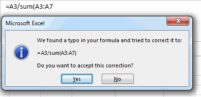
Out of interest, here’s how that 1st message looks in Excel 2010. (Apologies for the old-school look of these next two screenshots, vs the previous ones. I’m too tight to install Excel 2010 AND 2013 on all the machines in our house, so this screenshot comes from my wife’s PC, which runs XP, on account of that same monetary tightness.)

DDOE_Yes Please vs WTF_Old Correction

Let’s say I do decide to take the option offered in that 2nd bullet point – to close the message and correct the formula myself – and click NO. What do I get?

DDOE_Yes Please vs WTF_Old Yes

You told me that one click ago. Get out of my way, so I can do what I said I was going to do one click ago…i.e. fix the damn thing!

I spend heaps and heaps of my time on usability things when I build stuff in Excel. I can’t comprehend why these really crappy legacy usability issues are still perpetuated by the MS developers release after release. WTF.