CR rants:
One thing about Excel 2007 that really bugs me are the tab colors. Most of the choices look so washed out, rather than a nice solid color.
One does not have a choice when Excel makes the tab text white or black. Sometimes, Excel chooses a white font for the text when the tab color is light, making the text hard to read. For the most part, I would be happy if the text was always black.
I wish that Microsoft had chosen flat, solid colors for the tabs, rather than this “3-D” sort of look, which also interferes with reading the tab text. Also, the tabs are not tall enough.
I know they say you control the look of the tabs at the Windows level, but this affects the way that the rest of your system looks, and sometimes this look isn’t particularly attractive.
Has anyone else voiced these complaints?
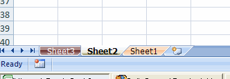
A sample of tab colors in 2007
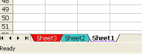
A sample of tab colors in 2003
I’ve never heard complaints about the tab colors. I tend to like the 2007 colors better than 2003, but I see the point about looking washed out. I’ve never noticed it before, but now it will bug me forever. The 2003 colors look, I don’t know, like they were done in MS Paint in 1986 by me. However, I rarely use tab colors. I’m an accountant, damn it. I like my data in tables and I like my spreadsheets in black and white.
What do you think of the Excel’s tab colors?
I never use tab colours.
When I first realised it was an option in 2003, I was excited, but quickly realised it was a pretty useless bit of fluff.
I’m not an accountant, and I build excel workbooks for other people to use, but I find tab colours make it harder to use an otherwise simple system of worksheet tabs.
The new tab colors have been a nuisance. I typically use them to separate sheet functions. Reporting sheets get one color. Data sheets another. Just for quick visual reference. As an accountant, I also use them for setting a review status. Red if the preparer is done with it. Blue when the reviewer is done.
I resent the whole “glassy” movement in UI design over the last 5 years or since Vista was released, whichever was sooner. And a light “marking up” of the tab colors can come in handy, but in the field I’ve definitely seen it overdone too.
We’ve got colored eyes for a reason, it enables us to distinguish changes in areas quickly
Colors in spreadsheets can destroy or enhance the experience.
Most High School kids destroy spreadsheets and reports with too many colors, fonts etc
But theres nothing better than a well setout and highlighted spreadsheet with concerning use of color.
Tabs colors are the same.
I’m not an accountant, I watch Color TV and use Color in my spreadsheets
I only really use tab colours as an aide-mémoire that a sheet should be hidden, so a sheet with lists etc. that the user does not need to interface with will have a red tab. That way it sticks out like a sore thumb in the finished workbook and my tired old brain will remember to ensure it is hidden.
Agree with you Dick – the 2003 colours are pretty ugly. The 2007 colours were a step in the right direction – but to my eye it still needs some polishing to make them really usable. When I’m in a tab-heavy document I often try to fiddle with colours to mark them more effectively but pretty much give up every time and revert to b&w – that’s the only one with the fade/hover implemented well.
Who is the Excel GUI guy?
I use those colored tabs often, but actually not for me. In my dept, its a code that states what kind of info they will find in it. Insofar, I would be glad to have more “loud” colors.
I’m the ranter that posed the question. I’m not an accountant, but even if I was one, colors would be important to me in spreadsheets, charts and tabs. Sorry, but the use of color is far from fluff. Colors direct your eyes to what’s important. Colors help to separate one group of related tabs from another. One can readily see relationships between tabs when using colors.
I’m not sure why, but for my PC at home, the tabs are extremely short and hard to see, while at work they’re not. What’s with that? I never had this problem with Excel 2003.
But I do find the tab text hard to read when using color. This is *not* an improvement. Why Microsoft decided to tie the look of the tabs to Windows settings is beyond me. I was perfectly happy with the way they looked before 2007.
It’s hard to get Microsoft’s attention with complaints, and I was hoping that they pay attention to forums like this one.
Thanks for the opportunity to voice my complaints.
Carroll
I don’t have a problem with the colors. Maybe it’s because I’m only sort-of an accountant. My tables are usually color coded and the the source data is placed on a tab of the same color. It enables me to find the source more quickly…
Tab colors are very useful for visually grouping worksheets that are aggregated in, say, a summary sheet. In my case the tabs are grouped by line of business. However, it is just a convenience. Good sheet names and placement do the same thing.
Brett
MS agrees with you in part if the 2010 beta means anything. Same colors but glassy is gone.
I have several macros that copy parts of one sheet to other sheets based on due dates. Sometimes some sheets receive no data. I automatically color the sheets; green for sheets with data and red for sheets with no data. I prefer the glassy colors to the pastel colors of days gone by but it would be nice if they had a bit more “pop”.
I think I may be missing the point of the rant. Why don’t you change the colors or the theme on Page Layout? I am pickier about font than colors but I do make the effort to change these from the Microsoft default.
Carroll: The size of your tabs is determined by the scrollbar size as set in your display settings, appearance tab, advanced button.
Here is the Law (at least according to me). I am an accountant (CPA in fact) and teach Excel to other accoutants. I guess that makes me an authority.
My opinion as to colors is skewed because I am somewhat color blind (about 7% of the population is color blind). In 25 years of being an accountant, I think I used colors on tabs less than five times.
Rule #1 Don’t use colors for at least two reasons: some people are color blind and not everyone has a color printer.
Rule #2 Don’t use colors alone to communicate important information. Labels and arrows can help ensure there is no misunderstanding.
Rule #3 If you must use colors, try to incorporate other distinguishing features. Something like, the orange vertical stripes represent year 1, the green checker board pattern year 2, and the yellow polkadots year 3.
As I have grown much older and my eye sight has gotten much worse, I find it harder to read the names on tabs. One of my (many) pet peeves with Microsoft is you can change the size of tabs but not so conveniently. It is a setting in the operating system (as Jan Karel Pieterse wrote here). This same setting changes the size of scrollbars. Since the setting is in the operationg system, that means every program you use (Outlook, QuickBooks, Internet Explorer, etc.) is impacted by this setting.
In Excel 2003, the only color I get is a colored underline under my black text.
Dick’s example shows a fully-colored tab with white text and a fully-colored tab with black text. I can’t figure out how to do those two types.
Duh.
Now I get it: when the colored tab is the active worksheet, the color is only in the underline.
Non-active sheets have fully-colored tabs.
General Ledger,
Maybe my free Excel add-in (Determine Colors) will be of some interest.
A picture of it…
http://i258.photobucket.com/albums/hh247/James_Cone/DetermineColorsPicture.jpg
Download from… http://excelusergroup.org/media/Default.aspx?PageIndex=2
I see almost no place for tab colors. As Brett states above, “Good sheet names and placement do the same thing.” I agree. I’ve found that tab colors are often a mark of messy organization. How will someone else know what your colors mean?
Place data in tables in as few worksheets as normalized data will allow, and put summaries on their own worksheets. Name tabs accordingly and using easily understood conventions. If you have many tabs (and you shouldn’t), use an Index sheet with hyperlinks.
Matthew
I use colors in tabs for one reason only… on a template. I have vba code that uses an event to validate the intent of the sheet (i.e. all blanks are filled in correctly), and when complete it makes the tab go green. Very handy to steer the users to missing data.
Hate, hate, hate the 2007 tab colors! They are washed out and distracting. I prefer solid colors without shading effects. The inability to format the font color or font size also make the tabs difficult to read.
Lee,
As JK Pieterse pointed out, changing the scrollbar width changes the tab height.
The tab font size automatically increases when the tab height increases. Try…
Right-click (desktop)
Properties (menu item)
Appearance (tab)
Advanced (button)
Item (dropdown)
Change “scrollbar” to a larger number.
I use 26 on my 1920 X 1200 monitor.
Note: Changing the “Icon” font size also changes the font size in Windows Explorer and Outlook Express.
‘
I just wish I knew how to increase the font size in the Project and Properties windows in the Visual Basic Editor.
It was never an issue until I got my new monitor.
I came here hoping for information on how to turn off this glassy effect on the tabs. I use colored tabs like some of the other posters do – to easily see what category different tabs fall under when I’m scrolling through a workbook.
I don’t mind the new colors, but the glass/highlight effect is very distracting. What’s worse, with most of the colors it’s hard to quickly see what tab is selected. And try selecting multiple tabs at a time – it’s next to impossible to see which tabs are grouped with the glass effect. I’d still like to use colored tabs but at this point I’m ready to turn them all black just for some contrast on selected tabs.
Has anyone seen a way to turn off this effect?
Like the last poster, I was hoping to find a way to turn off the glossy feature to the tabs.
I thoroughly use tab colors as I work with worksheets that contain a significant number of tabs (budget models primarily).
My biggest problem is that I am having problems distinguishing if I have highlighted the tab or not. I often highlight multiple tabs. Highlighted tabs look far too close to the standard glossy tab color.
I second (third) what CPA & JT are saying: How the heck do you turn off the glassy glossy 3D effect on the tabs? It is so hard to read and work with multiple highlighted sheets (tabs). Please please please someone figure out how to change this back to a simple flat solid color like in excel 2003.
White is the only tab color that eliminates the glossy effect. At least you can read the text more easily. Please someone post how to fix this!
I would like to add my voice to the tab color concern. This is one of the first things I noticed with 2007. I was initially thought that microsoft had added some tab color options but after realizing that my ability to read the tabs was heavily comprimised, I tried to find out how to change them. As we all know now, you can’t and that was a dissapointment. Readable tab colors are a useful tool for me and I wish that microsoft would correct this user interface error by either providing the option to choose solid or abandon altogether the washed out look.
How do we get this message to Microsoft and will they listen and take action?
It seems I can’t improve the readability of Excel 2007, so off to Open Office I go! I’ve only used 2007 a little bit (my government employer is still with 2003) and at home I thought it was something I’d get around to fixing one of these days. Like many others, I don’t have perfect colour vision, and I prefer black and white (or white on blue, or even green on black if I’m being really nostalgic for CPM86) if I get the choice – pretty interfaces are for kids (and software designers who don’t actually have to work with their products). I don’t suppose anybody will take any notice of this comment, but it makes me feel better!
I completely agree with most of the comments about Tab Colour being washed out. I had hoped for a fixed to Standard Solid Colours in Office 2003, but cannot find it in 2007. If Microsoft is listening, please change this or at least offer an AddIn to have solid colours. There has to be some genious who can write a simple code macro to change the colours. Sometimes Microsoft tries to be cleaver by introducing enhancements which on closer inspection are nothing more than cosmetic degradation. I use the colour tabs a lot. Eg Red incomplete, Orange part reconciled and Green completed. Blank on White as Master File. I also think the Ribbon is too big at the top and it should have allowed users to customise the bar, after all I, never use the the “watch window” in formulas tab what the point.
Excel 2007 and 2010 have a color scheme that is a *superset* of Excel 2003.
Right-click on a sheet tab then hover over ‘Tab Color >’ In the color choice pop up the theme colors are in the top section. Just below that section is the ‘Standard Colors’ section. Below that is the ‘Recent Colors’ section and below that are the ‘No Color’ and ‘More Colors’ buttons.
If the existing theme colors don’t work for you and then ‘standard colors’ don’t work for you and the ‘Recent Colors’ don’t work for you, make your own color with the ‘More Colors’ button.
One of the below is from Excel 2003 the other from Excel 2010.
I agree with JT. I often use Ctrl+left click on several tabs to make edits to several tabs at once. But this new coloring makes it difficult to tell which tabs are actually being edited. Not a helpful change to Excel 2007.
I thought it was just me but apparently lots of people don’t like the washed out look. Too bad there is not a workaround. :-(
I’m an accountant and I used tab colour extensively. e.g. I group all the tabs containing profit & loss statement for each entity in their original currencies in one colour, then the tabs with reporting currency in different color, and the consolidated one in another color.
I just find the standard white in Excel 2010 absolutely annoying (especially since I moved from desktop to laptop), I can’t , for the love of god, differentiate between the selected tab (used to be white vs grey in excel 2003, but now it’s white vs lighter white) and non selected tabs.
I’m with JT as well. I use multiple tab selections ALL THE TIME and now can’t tell what I have selected. Making your own color does not help this at all.
I detest the washed out colors, *including* those on this page. I need teh default tab colors to be ACTUAL BLACK on white. At least let me set that myself.