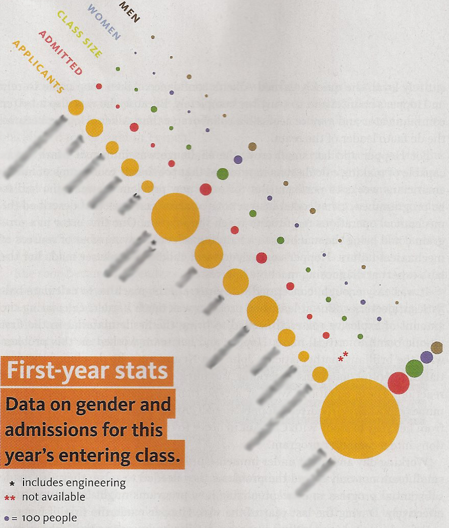
Because I have no clue. It’s from an university alumni magazine. The names I’ve smudged (or tried to anyways) are the various colleges. Could this graphic be done in Excel? Yes. Should it?

Tushar Mehta (www.tushar-mehta.com)
Because I have no clue. It’s from an university alumni magazine. The names I’ve smudged (or tried to anyways) are the various colleges. Could this graphic be done in Excel? Yes. Should it?

Tushar Mehta (www.tushar-mehta.com)
Posting code? Use <pre> tags for VBA and <code> tags for inline.
Its not easy!
The ‘legend’ is useless – how many is 100 students?? how does this compare to larger ‘blobs’? Area? Diameter?
On extended looking at the chart I have convinced myself that I can interpret it but looking away (at TV of Sacarecens v South Africa – rugby – ) and now I have lost the plot!
How not to use a chart!
Stephen
It’s a Bubble Chart – http://en.wikipedia.org/wiki/Bubble_chart
It’s used when lots of items vary by a large magnitude. I think the intention is to read the area of the circle as the size (rather than the diameter)
They’re often used to display three dimensions on a typical 2D XY plot. eg: X might be number of customers, Y might be profit and the “bubble” represents “cost per unit” or some such.
The above is not a great example.. it’s more chart fluff than anything…
“How not to use a chart!” awesome.
I once read an excellent book called “How to lie with charts” which was about all the things you could do wrong to make charts uninterpretable.. it ending up being a great aid for making clear charts. The above is a great example of what not to do.
Charts in these type of publications are done by graphic artists not data analysts. Exactly why would alumni care?
Aw, come on now! This is a good chart I think for the masses. We tend to dismiss it because it’s quite non-standard and not mathematically precise. But if you step back and take a look from a purely informational standpoint, I (and you) can see that it’s quite good. For example, we can see several ideas at a glance — the big blobs are more and the little ones are less, we can see where the majority of applicants applied versus where they were accepted, we can get a feel for the class size versus the number admitted, we see men versus women, and so on. Again, they’re not mathematically precise, but they do get across quite a few points with little analysis (which I think is the problem with the commenters here — there’s no analysis required)…..
This one is strange. At first glance, I assumed that Men, Women, Class Size and Admitted were all subsets of Applicants. Of course, that really makes no sense at all. The more I look at this, the more baffling it becomes. Edward Tufte would be horrified.
Respectfully, I would disagree with Floyd that this is fine for the masses. I would guess that the data is mathematically precise, in that the area of each blob corresponds to the actual magnitude of the measure. It fails because making comparisons between colleges is difficult due to using area as the graphic device. How many more applicants does the last college have compared to the first – 5, 10, 20 times? Certainly you can say “many more”, but you can create charts that allow for better comparisons while still maintaining quick readability.
Equally is there any difference between male/female ratio in the first two colleges? What about the actual number of females – 20, 80? I’ve tried to do a better job in Excel here:
http://blog.datadrivenconsulting.com/2009/11/nonsense-charts.html
It’s far from perfect – and maybe it just isn’t fluffy enough. Maybe I could make the bars ‘three-dimensional’..
After Applicants the rest of the blobs are too small to compare, so, as far as it is possible to tell, once you know the overall number of Applicants, then the number Admitted is in proportion to that, and you gain no new information by seeing that for every school. Oddly Class Size seems to be in the same proportion as well. Should class size be proportional to Applicants? I’d have thought that bigger schools would have more classes, rather than bigger classes.
Also Men and Women seem to be subsets of Class Size, which makes no sense to me.
I’m beginning to suspect this graphic hasn’t actually come from actual data at each point, but rather a source figure for Applicants and then the other figures calculated from that using a formula.
A very cute, and totally useless chart. The first row – Applicants – is somewhat useful, and provides a decent overview of the relative importance of each department (I assume these are departments / schools). But after that? Besides the question of whether the number of people corresponds to the surface or the radius of each point, it seems to me that the right metrics is not the number of women, or admitted, but the %, so that each department can be fairly compared… And why show Class Size, Women AND Men? I’d like to see what John Peltier, Chart Buster Extraordinaire, would do with that one!
Mathias is correct. They are schools at Yale – biggest bubble is the undergraduate college.
It should be a stacked-bar chart – two bars for each school, as the data points add up to each other:
* admitted | non-admitted (adds up to total applicants, on bar one – like Alex’s sample)
* male | female (adds up to class size, on bar two)
Alex’s sample is missing the distinction between admitted and enrolled, which this would capture. But I do like his mini-pie charts.
Mmmmm, pie.
My first instinct on seeing this is to ask: what are they trying to hide?
In this sense, their chart might be very informative indeed. Look at where it’s hardest to compare – the colleges with smaller numbers of students – and note that where the admissions are most competitive (or exclusive, and that might not mean the same thing) the gender ratio of applicants is difficult to figure out.
Next question: what have they omitted entirely? The gender ratio of the successful applicants. Oops. But then, who would think to ask an awkward question about what’s missing, after spending several minutes of their day attempting to work out what’s there?
To me the question is does the graphic accurately illustrate the reality and allow the user to understand what the underlying numbers represent. I agree that the best way to lie to people is to graph it in a way that demonstrates your personal bias. But to show a table of numbers is often meaningless as the end user is not able to assimilate the data into information.
I personally just completed a project where I used a graph that was similar to the one posted. It went to a limited audience of what I would describe as sophisticated users. The graph allowed the user to see in a material way the effects of changes that have gone on over the past 18 months. I also used predictive analysis to show what future periods might look like.
Is that graph conveying accurate information to me. I can’t say without having more context. If it is lying to me then is that the fault of the graph or of the creator. I would be inclined to say the creator as if they had not used a bubble chart they would have manipulated some other type of chart to their fiendish evil ways.
I agree with Floyd’s comments. And there is nothing wrong or devious about the bubble chart. It gives a good & quick overall visual comparison. The main point is that there are considerably more applicants than there is classroom capacity, across the board. Two of the colleges have a much higher % of applicants relative for there size, so they must be very popular, especially the one on the end. Another point, is that in most cases the admitted students are equally distributed between male & female. Most of the colleges are not over-flowing their capacity, or if so only by a small percentage.
As long as a chart uses the true data, it cannot be a lie. Granted, with scaling, a chart can make everything look fairly equal, when in fact the data results are considerably unequal. However, that does not make the chart a lie, it does not even make it necessarily devious. Ethically, it depends on the situation & the entire presentation that goes with the chart. Sometimes, the considerably unequal differences aren’t significant in the situation & don’t need to alarm the viewer unnecessarily.
Tushar Mehta,
To answer your questions. Yes, and why not?
I just duplicated the chart in Excel2003. It wasn’t all that easy, but it can be done. Keep in mind, college A data will always have a x-value = 1,(or whatever no. you want to start at) college B, x-value=2 & so on. Then all “Men” data will have y-value say 20 and “Women” y-value = 15, or whatever is necessary to get a nice layout. The worst part was adding the text labels, using drawing toolbox.