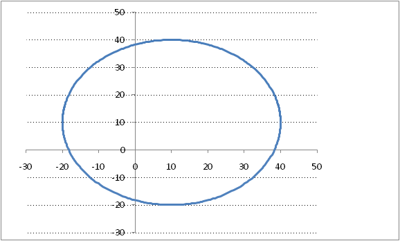
When Excel creates a chart it assigns, by default, certain physical dimensions to the chart. These physical dimensions (height and width) are independent of the logical content of the chart. So, in the case of a column chart the physical shape of the chart is the same irrespective of whether it contains 2 columns or 200. Similarly, for a XY Scatter chart, the size of the chart is independent of the range of the X or Y dimensions. For example, if we were to plot data that constitute a circle, the default chart would look like Figure 1.

Figure 1
This is clearly misleading since the physical width of the chart is greater than the height even though both the X and Y ranges are the same (each of them goes from -30 to +50) – and the minimum and maximum of the plotted values are also the same (-20 and +40 respectively).
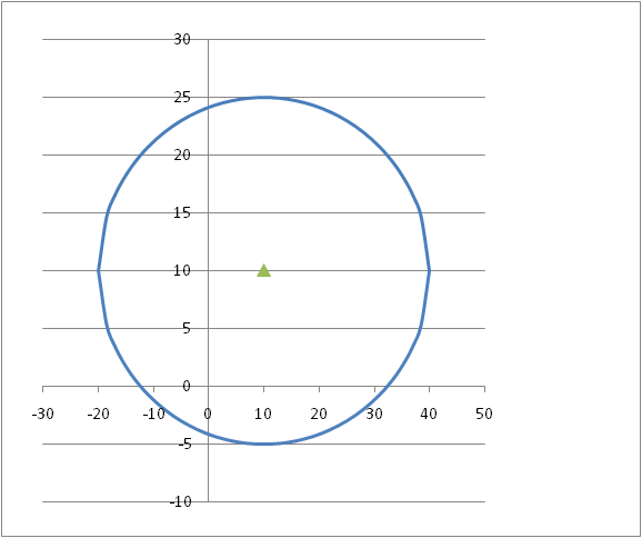
In reverse, we could have data that represent an ellipse but because of the physical shape of the chart look like a circle – see Figure 2.

Figure 2
In this case, though the physical dimensions of the chart match each other, the logical X range is 2.5 times larger than the logical Y range (-30to +50 and -10 to +30 respectively).
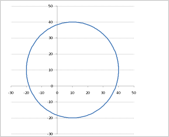
The code below adjusts the physical height of the active chart so that the ratio of the physical dimensions match the ratio of the logical ones. The corrected version of Figure 1 is Figure 3.

Figure 3
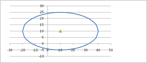
and the corrected version of Figure 2 is Figure 4.

Figure 4
There are two constants that control what the code in balanceAxis does. changeAxes causes the code to change the min. and max. values of both the X and Y axis based on the values of the series in the chart. useSeriesVals results in the code using the min. and max values of the series plotted in the chart for balance calculations rather than the min. and max. values of the 2 axes. Obviously, having changeAxes as true implies useSeriesVals.
To use the below, select a chart — it must be a chart where both X and Y axis are numeric scales — and run the balanceAxis subroutine (use ALT+F8 to open the Macro dialog box) . Given the wide range of possibilities with options across charts, the wide range of charts across all the different versions of Excel, the below works where it works.
Private Function MinVal(aChart As Chart, Optional CategoryVals As Boolean)
Dim I As Integer
If CategoryVals Then _
MinVal = Application.WorksheetFunction.Min( _
aChart.SeriesCollection(1).XValues) _
Else _
MinVal = Application.WorksheetFunction.Min( _
aChart.SeriesCollection(1).Values)
For I = 2 To aChart.SeriesCollection.Count
If CategoryVals Then _
MinVal = Application.WorksheetFunction.Min(MinVal, _
aChart.SeriesCollection(I).XValues) _
Else _
MinVal = Application.WorksheetFunction.Min(MinVal, _
aChart.SeriesCollection(I).Values)
Next I
End Function
Private Function MaxVal(aChart As Chart, Optional CategoryVals As Boolean)
Dim I As Integer
If CategoryVals Then _
MaxVal = Application.WorksheetFunction.Max( _
aChart.SeriesCollection(1).XValues) _
Else _
MaxVal = Application.WorksheetFunction.Max( _
aChart.SeriesCollection(1).Values)
For I = 2 To aChart.SeriesCollection.Count
If CategoryVals Then _
MaxVal = Application.WorksheetFunction.Max(MaxVal, _
aChart.SeriesCollection(I).XValues) _
Else _
MaxVal = Application.WorksheetFunction.Max(MaxVal, _
aChart.SeriesCollection(I).Values)
Next I
End Function
Private Sub getMinMaxVals(ByVal aChart As Chart, ByVal useSeriesVals As Boolean, _
ByRef XMin As Single, ByRef XMax As Single, _
ByRef YMin As Single, ByRef YMax As Single)
With aChart
If useSeriesVals Then
YMin = MinVal(aChart): YMax = MaxVal(aChart)
XMin = MinVal(aChart, True): XMax = MaxVal(aChart, True)
Else
With .Axes(xlValue)
YMin = .MinimumScale
YMax = .MaximumScale
End With
With .Axes(xlCategory)
XMin = .MinimumScale
XMax = .MaximumScale
End With
End If
End With
End Sub
Private Sub updateChartAxes(aChart As Chart, _
ByVal XMin As Single, ByVal XMax As Single, _
ByVal YMin As Single, ByVal YMax As Single)
With aChart
With .Axes(xlValue)
.MinimumScale = YMin
.MaximumScale = YMax
End With
With .Axes(xlCategory)
.MinimumScale = XMin
.MaximumScale = XMax
End With
End With
End Sub
Sub balanceAxis()
Const changeAxes As Boolean = False, _
useSeriesVals As Boolean = False
Dim aChart As Chart: Set aChart = ActiveChart
Dim XMin As Single, XMax As Single, _
YMin As Single, YMax As Single
Dim NewXMin As Single, NewXMax As Single, _
NewYMin As Single, NewYMax As Single
Const cMaxTries As Integer = 3
Dim Ratio As Single, OldRatio As Single, Tries As Integer
‘If the axes are on automatic scaling, changing the _
physical dimension may change the min/max axis values. _
If that happens and if the height-to-width ratio changes, _
the code will readjust the physical dimensions. However, _
to avoid a perpetual loop the number of attempts is _
limited to cMaxTries
Tries = 0
Do
Tries = Tries + 1
getMinMaxVals aChart, changeAxes Or useSeriesVals, _
XMin, XMax, YMin, YMax
With aChart
If changeAxes Then updateChartAxes aChart, XMin, XMax, YMin, YMax
Dim DesiredHeight As Single
OldRatio = (YMax – YMin) / (XMax – XMin)
DesiredHeight = .PlotArea.Width * OldRatio
.ChartArea.Height = DesiredHeight _
* .ChartArea.Height / .PlotArea.Height
‘The above retains the ratio of the heights of the _
chartarea and plotarea
.PlotArea.Height = DesiredHeight
getMinMaxVals aChart, changeAxes Or useSeriesVals, _
NewXMin, NewXMax, NewYMin, NewYMax
Ratio = (NewYMax – NewYMin) / (NewXMax – NewXMin)
Debug.Print “Try “ & Tries & “, Old Ratio=” & OldRatio _
& “, Plotarea=” & .PlotArea.Height / .PlotArea.Width _
& “, Chartarea=” & .ChartArea.Height / .ChartArea.Width _
& “, Ratio=” & Ratio
End With
Loop Until Tries >= cMaxTries Or Abs(OldRatio – Ratio) < 0.00000001
Debug.Print “”
End Sub
Thanx Tushar
I usually display grid lines, print the chart and then measure a similar distance on both axis and work out a scale factor and then drag the chart until it fits
Thanks for this.
Could you please clarify if such adjustment will be necessary for other types as well (like column or line charts). In other words, Will the dimensions of the chart affect perspective and comprehension of the data in these (line, column) types?
Thanks
Jay
Hui: That seems to be a lot of work. Hopefully, the balanceAxis code will make your life (a little?) easier. {grin}
Jay: Since the X axis in those charts is not numeric, there is no logical X-Y ratio. However, one can always use just one dimension to make the results look different. Take a simple case where you have 4 categories with values 10,002, 10,005, 10,010, and 10,012 respectively. Plot them in one column chart with zero as the minimum Y value and in another column chart with 10,000 as the min. Y value. If one were to visually compare the 4 categories using one chart or the other, what kind of conclusion is one likely to draw?