Euler Problem 109

Euler Problem 109 asks:

In the game of darts a player throws three darts at a target board which is split into twenty equal sized sections numbered one to twenty.

The score of a dart is determined by the number of the region that the dart lands in. A dart landing outside the red/green outer ring scores zero. The black and cream regions inside this ring represent single Darts. However, the red/green outer ring and middle ring score double and treble scores respectively.

At the centre of the board are two concentric circles called the bull region, or bulls-eye. The outer bull is worth 25 points and the inner bull is a double, worth 50 points.

There are many variations of rules but in the most popular game the players will begin with a score 301 or 501 and the first player to reduce their running total to zero is a winner. However, it is normal to play a “doubles out” system, which means that the player must land a double (including the double bulls-eye at the centre of the board) on their final dart to win; any other dart that would reduce their running total to one or lower means the score for that set of three darts is “bust”.

When a player is able to finish on their current score it is called a “checkout” and the highest checkout is 170: T20 T20 D25 (two treble 20s and double bull).

There are exactly eleven distinct ways to checkout on a score of 6:

D3
D1 D2
S2 D2
D2 D1
S4 D1
S1 S1 D2
S1 T1 D1
S1 S3 D1
D1 D1 D1
D1 S2 D1
S2 S2 D1

Note that D1 D2 is considered different to D2 D1 as they finish on different doubles. However, the combination S1 T1 D1 is considered the same as T1 S1 D1.

In addition we shall not include misses in considering combinations; for example, D3 is the same as 0 D3 and 0 0 D3.

Incredibly there are 42336 distinct ways of checking out in total.

How many distinct ways can a player checkout with a score less than 100?

If you’ve never “done darts,” this is the hard way to learn the rules. I did darts often in a Scot pub (I was “pretty good for a Yank”–damning with faint praise) so I had a good understanding of the game. A dart board has 20 spokes, worth from 1 to 20 points, an inner hub worth 50 points (the bull’s eye), an outer hub worth 25 points, a midway ring worth triple the spoke score, and an outer rim worth double the spoke score. Very good players countdown from 501, but the pub matches started down from 301. To win, your last dart had to land in the double ring and take you exactly to zero. Too high a value, or a reduction to one, and your turn was wasted.

A good picture of a dart board and the 3-dart “double-outs” is here.

The one tricky thing about this problem was the requirement that “S1 T1 D1 is considered the same as T1 S1 D1.” I couldn’t figure out how to handle that until I decided to not let it happen at all. This is why the middle loop of the 3-dart solutions starts at the same counter as the outer loop.

Here is the code that does the counting. It runs in a blink:

Sub Problem_109()
Dim DartScore(1 To 62) As Long, i As Long
   Dim Dart_1 As Long
   Dim Dart_2 As Long
   Dim Dart_Last As Long
   Dim Answer As Long, T As Single
   Dim SetScore As Long
 
   T = Timer
 
   For i = 1 To 20
      DartScore(i) = i   ‘ Singles
     DartScore(i + 21) = i * 2   ‘ Doubles
     DartScore(i + 42) = i * 3   ‘ Trebels
  Next i
   DartScore(21) = 25   ‘ Single Bull
  DartScore(42) = 50   ‘ Double Bull

   ‘One-dart set
  Answer = 21   ’21 ways to double out with one dart

   ‘Two-dart set
  For Dart_1 = 1 To 62   ‘ 1st Dart – All possible scores
     For Dart_Last = 22 To 42   ‘ 2nd Dart – doubles out
        SetScore = DartScore(Dart_1) + DartScore(Dart_Last)
         If SetScore < 100 Then
            Answer = Answer + 1   ‘ Doubled out
        Else
            Exit For
         End If
      Next Dart_Last
   Next Dart_1
 
   ‘Three-dart set
  For Dart_1 = 1 To 62   ‘ 1st Dart – All possible scores
     For Dart_2 = Dart_1 To 62   ‘ 2nd Dart – All possible scores
        For Dart_Last = 22 To 42   ‘ Last Dart – Doubles out
           SetScore = DartScore(Dart_1) + DartScore(Dart_2) + DartScore(Dart_Last)
            If SetScore < 100 Then
               Answer = Answer + 1   ‘ Doubled out
           Else
               Exit For
            End If
         Next Dart_Last
      Next Dart_2
   Next Dart_1
 
   Debug.Print Answer; ”  Time:”; Timer – T
 
End Sub

The reason you “go bust” on one is because you can’t double out from there. The usual angle bracket substitutions are in the above.

…mrt
Cumulative Percent

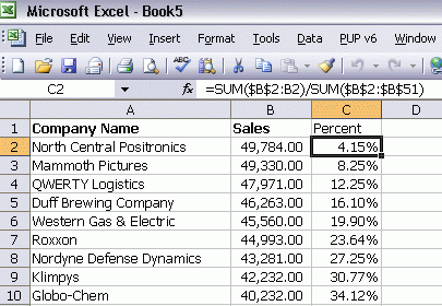
Recently I was asked how many customers made up 25% of my sales. I listed each customer and their sales for a specified period, then sorted descending on sales.

The formula in C2 is copied down for as far as the data goes. The secret is in the referencing.

=SUM($B$2:B2)/SUM($B$2:$B$51)

In the denominator, both B2 and B51 have dollar signs in both positions. They are absolute references and they will not change if the formula is copied to another cell. That’s also true of the first B2 in the numerator. The second B2, however, is relative and will change. By the time the formula is filled down to row 10, it looks like this:

=SUM($B$2:B10)/SUM($B$2:$B$51)

I can use the same formula for all of column C by making some references absolute and some relative.

NFL Slotting

Peter King at SI says:

The NFL has a slotting system that is ever-so-slightly malleable, where a player who gets drafted one spot lower than another player occasionally gets a smidgeon of a better deal. And sometimes a quarterback gets an above-market deal. But position players and non-quarterback skill players are slotted, and despite the efforts of agents to break the slotting system when picked lower than the agent or player thinks he should be picked, the league mostly holds firm.

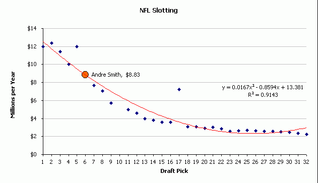
Andre Smith was an outstanding tackle at Alabama. The Cincinnati Bengals drafted him 6th in the draft last April. Smith and the Bengals can’t seem to agree on how much Smith should make, so I’ll help them out. It’s $8.83 million per year.

NFL Slotting Andre Smith Bengals

There are two unsigned first rounders left. I don’t care about Crabtree for a variety of reasons (#1: He’s from Texas Tech). The Bengals reportedly are offering Smith less than the #7 pick. They think they should pay what’s fair. Smith (and his agent Keels) thinks what’s fair is the long standing tradition of slotting first round picks.

I don’t know much about trend lines. Microsoft says that the best trend line is the one with an R-squared value closest to 1. So I showed the R-squared value (Format Trendline – Options) and tried all of the different kinds. Polynomial was the best one. I could get the R-squared closer to 1 if I increased the “Order”, but I stuck with the default because the line was prettier.

I wanted to show where Smith would end up on that line, but there doesn’t appear to be a way to do that automatically. First I went back into the Options to show the formula so I could compute Smith’s y value. Next, I created a new series that had #NA for every y value except for Smith, where I computed

=(A28^2*0.0167)-(0.8594*A28)+13.381

A28 being where his x value is. Then I made his data marker orange and black.

In conclusion, Cincinnati should offer and Smith should accept $8.83 million per year for 5 or 6 years and let’s get on with playing football.

Using VBScript to monitor Office events…or not

I spent an unexpectedly long time trying to figure out how to monitor Office events using VBScript and this post shares my experience, largely disappointing. The below scenarios were tested with Vista Ultimate and Office 2007 as well as with Windows 7 Ultimate and Office 2010 Beta.

This is about using VBScript through the Windows Script Host (WSH) — not VB6, not VBA, not VB.Net, and not VBScript in a browser — to sink Office application events.

For the longest time I was under the impression that there was no way to write event procedures in WSH-based VBScript. It turns out that VBScript (either in a .VBS file or in a .WSF file) running through the WSH does have a few different ways of monitoring events raised by programs it can connect to. These are documented in Scripting Events

Essentially, there are two ways to connect procedures with events.

  • The first way to connect a procedure with an event is to inform the WSH as to the prefix used in the names of the event procedures. This in turn can be done in two ways.

    • The first is to use the WScript CreateObject (or GetObject) methods. While named the same as the VB CreateObject and GetObject functions, these two methods include an additional argument. This string argument tells the WSH the prefix of the event procedures names. An example of the GetObject method is

         set anObj=wscript.getobject(“”,“powerpoint.application”,“Obj_”)
    • The second technique to inform the WSH of the prefix of the event procedures names is to use the ConnectObject method. This is also documented in the Scripting Events reference above.
  • The second way to connect a procedure with an event is by declaring an object capable of raising events. The ID of the object becomes the prefix of the event procedure. The declaration in a WSF file looks something like

    <job>
    <object progid=“word.application” id=“myorder” events=“true”/>
    </job>

Since my primary intent was to monitor Excel events, I went about it using the first approach. I tested with…as you can imagine just about every variation and combination thereof I could think of…both the CreateObject and the GetObject methods and discovered neither worked. I tried the ConnectObject method and it resulted in a run time error — something about an error with CreateObject. Of course, I thought I was doing something wrong and I spent who knows how many hours testing, retesting, Googling, testing, and retesting.

Finally, I gave up and decided to use the object declaration approach. That too did not work! After more struggling with tests, retests, Google searches, tests, and retests, I figured I was doing things correctly and decided to test Word.

Well, Word worked with the Object declaration approach but not the CreateObject/GetObject/ConnectObject methods!

Just to round out the tests, I tested PowerPoint. It worked with the GetObject method but not the Object declaration!

So, bottom line. None of the documented methods for monitoring events in VBScript seems to work with Excel. One can monitor Word events only with the object declaration approach and one can monitor PowerPoint events only with the GetObject approach.

Maybe, I missed something — and if so someone please tell me what I did wrong — but as of now it has been several days of all sorts of frustration.

The two approaches that work:

Track PowerPoint events in a VBS file:

option explicit
dim anObj, aDoc, aDoc2
sub Obj_NewPresentation(byval WB)
    msgbox “In NewPresentation: “ & wb.name
    end sub

sub testEvent()

    set anObj=wscript.getobject(“”,“powerpoint.application”,“Obj_”)
    anObj.visible=true
    set aDoc = anObj.presentations.add()
    set aDoc2 = anObj.presentations.add
    dim I
    for I=1 to 5
        wscript.sleep 1000
        next
    aDoc.close
    aDoc2.close
    anObj.quit
    end sub
‘msgbox wscript.version
testEvent

It is also possible to respond to Word events with the following in a WSF file:

<job>
<object progid=“word.application” id=“myorder” events=“true”/>
<script language=“vbscript”>
sub myorder_NewDocument(byval WB)
   Wscript.echo “In NewDocument: “ & wb.name
end sub
myorder.visible=true
myorder.documents.add
wscript.sleep 5000
myorder.quit
</script>
</job>

The following four do not work. In each case, the application starts up, two new files open, and after the designated interval close and the application quits. However, the event procedures are not called.

Respond to an Excel event in a VBS file:

option explicit
dim xlObj, xlWB, xlWB2
sub Obj_NewWorkbook(byval WB)
    msgbox “In newWorkbook: “ ‘& wb.name
   end sub
sub Obj_Calculate()
    msgbox “In Calculate” ‘& wb.name
   end sub

sub testEvent()

    set xlObj=wscript.getobject(“”,“excel.application”,“Obj_”)
    xlobj.visible=true
    ‘call wscript.connectobject (xlObj,”Obj_”)
   set xlwb=xlobj.workbooks.add()
    set xlWB2 = xlobj.workbooks.add
    xlwb2.sheets(1).cells(1,1).value=1
    xlwb2.sheets(1).cells(1,2).formula=“=A1+1”
    dim I
    for I=1 to 5
        wscript.sleep 1000
        next
    xlwb.close false
    xlWB2.close false
    xlobj.quit
    end sub
‘msgbox wscript.version
testEvent

Respond to Word events in a VBS file also does not work.

dim xlObj, xlWB, xlWB2
sub xlObj_NewDocument(byval WB)
    wscript.echo “In newWorkbook: “ ‘& wb.name
   end sub

sub testEvent()
    ‘set xlObj=wscript.getobject(“”,”word.application”,”xlObj”)
   set xlObj=wscript.getobject(“”,“word.application”,“xlObj_”)
    xlobj.visible=true
    xlobj.documents.add
    xlobj.documents.add
    wscript.sleep 3000

    xlobj.quit
    set xlobj=nothing
    end sub
sub testEvent2()
    set xlObj=createobject(“word.application”)
    ‘wscript.connectobject xlObj,”xlObj”
   wscript.connectobject xlObj,“xlObj_”
    xlobj.visible=true
    xlobj.documents.add
    xlobj.documents.add
    wscript.sleep 3000

    xlobj.quit
    end sub
testEvent
testEvent2

Respond to Excel events in a WSF file does nothing:

<job>
<object progid=“excel.application” id=“myorder” events=“true”/>
<script language=“vbscript”>
sub myorder_NewWorkbook(byval WB)
    Wscript.echo “new order received myorder “ & wb.name
    end sub
myorder.visible=true
myorder.workbooks.add
wscript.sleep 3000
myorder.quit
</script>
</job>

and finally, responding to PowerPoint events in a WSF file also does not work.

<job>
<object progid=“powerpoint.application” id=“myorder” events=“true”/>
<script language=“vbscript”>
sub myorder_NewPresentation(byval WB)
   Wscript.echo “In NewDocument: “ & wb.name
end sub
myorder.visible=true
myorder.presentations.add
wscript.sleep 5000
myorder.quit
</script>
</job>

Formatting Taskpane

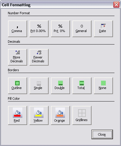
In order to perform my most common formatting operations, I’m going to try to use a userform with only those operations on it. These 16 buttons should cover about 95% of the cell formatting I do.

I set the Ctrl+1 shortcut, which normally shows the Format Cells dialog, to show my userform instead. Now that I type that, I should put a button on my userform to go that dialog. Oh well, version 2 I guess. I now have five or six Application.OnKey statements in my PMW. I think a table driven approach might be in order.

Before I show the userform, I make sure a range is selected as opposed to a shape or some such thing.

Sub ShowFormatting()
   
    If TypeName(Selection) = “Range” Then
        UFormatting.Show
    Else
        MsgBox “No cells selected”
    End If
   
End Sub

Most of the code behind the buttons is pretty simple. You could get all of it by recording a macro, in fact. The Gridlines button puts a 25% gray border around to simulate gridlines when a range has an interior fill.

Private Sub cmdGridlines_Click()
 
    With Selection
        Selection.BorderAround xlContinuous, xlThin, , RGB(192, 192, 192)
        With .Borders(xlInsideVertical)
            .LineStyle = xlContinuous
            .Weight = xlThin
            .Color = RGB(192, 192, 192)
        End With
        With .Borders(xlInsideHorizontal)
            .LineStyle = xlContinuous
            .Weight = xlThin
            .Color = RGB(192, 192, 192)
        End With
    End With
   
End Sub

The Total button puts a single border at the top and a double at the bottom.

Private Sub cmdTotal_Click()
   
    cmdDouble_Click
    With Selection.Borders(xlEdgeTop)
        .LineStyle = xlContinuous
        .Weight = xlThin
    End With
   
End Sub

When the userform shows, I attempt to move it to the right of the screen. I figure it will be out of the way most often there.

Private Sub UserForm_Activate()
   
    Me.Top = Application.Top + 125
    Me.Left = Application.Left + Application.Width – Me.Width
   
End Sub

All I really want is the selected cells to be visible, but it’s too much of a pain, particularly with dual monitors. I’ve wanted something like this for a while. Usually when it takes me a long time to make something it’s because it’s too hard (not the case here) or not as useful as I first thought. We’ll see. I doubt this will ever be useful as a general purpose add-in for two reasons. First, the buttons that I want aren’t necessarily the buttons that you want. Sure there’s some overlap, but if you can’t have it just the way you want, the way that covers 95% of your formatting needs, then it’s no good. Or it gets more buttons to cover everyone, which is exactly what the Format Cells dialog already is. Second, there’s no benefit here in 2007 or beyond because a custom tab on the ribbon has all the keyboard support you could want. But if it makes my remaining 2003 days more comfortable, then it’s a winner for me.

Golf Charts — Another Take

Inspired by Dick’s interest in charts, I took a look at how I would have presented the data.

Some overall thoughts. I used Office 2010 beta for the charts shown below. There was not much, if any, difference between what I would have got with Excel 2007. I also stayed with the default Office theme. And, for what it is worth, I almost never use a non-theme color any more. By staying within a theme, I can change the look of the entire workbook by simply changing the theme.

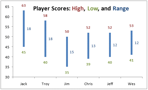
In creating charts, I tend to use colors within the text on the chart to document the visual elements. So, in the chart for week 9, the high and low scores and the corresponding text are the same color (red and green).

And, of course, it always helps if you understand, at least to some extent, what is being shown. While I don’t have Dick’s depth of knowledge of golf, I do know that lower scores are better than higher scores. So, I tend to use colors associated with good results (green, for example) for lower scores and colors associated with poor results (red, for example) for high scores.

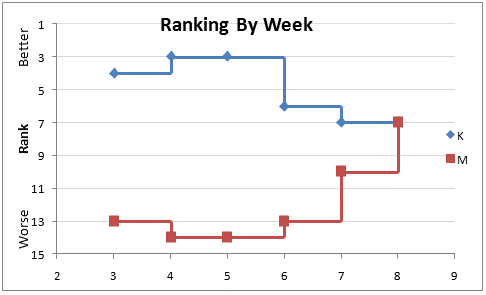
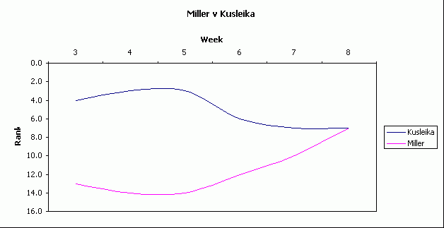
Week 8: As already noted, a smooth curve is misleading in this case. There are many instances where a smooth line is appropriate but this is not one of them. Further, even a straight line connecting the ranks between two successive weeks is not appropriate. After all, the change in ranking is an abrupt event that happens once a week. Just because someone was ranked #4 one week and #3 the next does not mean s/he was #3.5 halfway through the week. So, if one were to add lines connecting consecutive points they should create a “step chart.” Also, the key metric here is the status once a week. So, showing the markers is important. temp-ddoe-1

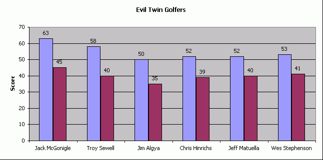
Week 9: To show the best and worst rounds for a golfer, I would use use a vertical separation to show the the scores and highlight the range. Of course, instead of a vertical separation one could also use a horizontal separation, but I picked the former. A good chart native to Excel for this kind of visualization is the Stock ‘High-Low-Close’ chart and I made the line thicker. Of course, it is not all that difficult to create one from scratch.
temp-ddoe-6

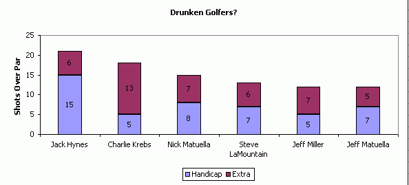
Week 10: A stacked column chart worked for this particular set of data since all the actual performances were worse than the handicaps. But, what if someone did better than their handicap? How does one show a negative column starting from the top of the lower column? Suppose Jack Hynes shot not a 21 but a 9. Then, we would want the blue column to go to 15 and the red column to start at 15 and drop to 9. But, there is no good way to show that. Instead, I prefer showing the handicap with a single point — which is after all what it is — and then draw a line up or down to show the actual result. And, I have used error bars for this kind of work for a long time. I modified Dick’s data to pretend that Jack did shoot 6 below his handicap. The chart below is a XY Scatter chart with two series, both of which represent the handicap. The first series has positive error bars formatted red. The 2nd series has negative error bars formatted green.
temp-ddoe-3

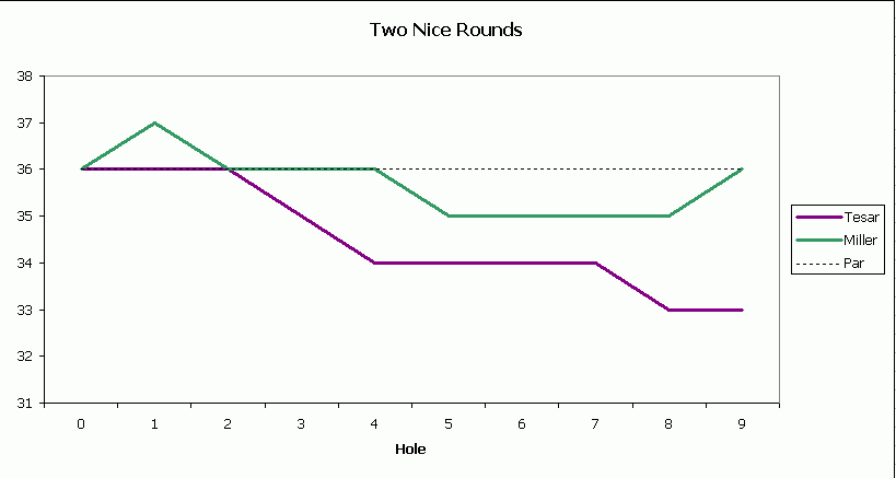
Week 11: As with Week 8, the important metric changes only at specific points along the x axis (Hole in this case). Using connecting lines without markers is somewhat misleading. After all, Miller did not have a half-bogey while walking to the first tee. In this case I decided to forgo even step connector lines and use just markers. I also thought it did not really help to show the performance relative to the par for the entire round. After all, a golfer doesn’t start the day with a hole zero score of par for the round (36 in this case). So, I chose to show the cumulative performance relative to par, represented by zero. The y-axis title documents the significance of above-zero and below-zero scores. If we wanted, we could add the cumulative player score as a data label. Finally, the default square marker looks much larger than the default diamond marker. So, I reduced the size of the former by two units.
temp-ddoe-51

Week 12: I have no idea what the 2 charts represent and lacking a golf context for them I left this week’s chart alone.

Week 13: Dick expressed some frustration at the ‘Upset Saturday’ chart and I can sympathize. As Jon noted, using dark colors and losing the gridlines would have helped. But, here’s a more important point. In most cases showing a lot of data results in nothing but confusion. But, there are exceptions. One such instance is when I show one of the metrics for a management simulation exercise I conduct on a regular basis. One of the results of this simulation is the resulting market price of a product in multiple markets (6 – 10) over several periods (8 – 12). The resulting chart looks very confusing and when the audience first sees it it invariably invokes an audible response. However, when I explain what the chart represents it makes sense to the participants. What it does represent is this: The prices in the markets start off all over the place. They also fluctuate each period. However, the cumulative effect of 10 periods of decision making and learning is that they are slowly converging to the theoretical optimum of about 50, even though this is not known to the participants! Some markets learn very smoothly (see the bright blue line with the star marker) others take a stumble and then pick up smoothly (the pink squares) while others fluctuate a bit but are eventually closing in on the optimum (the orange circles).
temp-ddoe-7

Week 14: Here again, I would use a chart with vertical lines to show the separation between the high and the low. To include a measure of the average, I chose the median rather than the mean.
temp-ddoe-81

Week 15: I would use steps to indicate the change in ranking rather than straight line connectors for the reason already mentioned above.
temp-ddoe-9

In the final chart, I have no idea what Dick wanted to show. But, here’s how I would create a bar chart on different scales such that it is easy to align. Start with a stacked bar chart. The first series is the actual value of the average scores. Then, we add a dummy series so that the total of the average plus the dummy series is a constant. I tried different numbers for aesthetic appeal before finally settling on 10. Then, I scaled the total scores down so that they don’t overwhelm the average scores. After some trial and error, I picked 9 as the largest possible score. So, all the scores are scaled by actual-score / max-score * 9. I plotted this as the 3rd stacked series. Finally, it is not possible to put data labels for a bar chart on the ‘outside end.’ So, I added a dummy series all with a value of 1 as the fourth stacked series.

The two dummy series were formatted to be ‘invisible.’ I also added the average values as the data labels for the 2nd series (formatted to the ‘inside base’ and the total scores as the data labels for the 4th series. I also formatted the horizontal (value) axis so that the vertical (category) axis crosses at a value of 9.temp-ddoe-a

Download the Excel 2010 XLSX workbook

Golf Charts

After week 8 of my golf league, I decided to have a chart-of-the-week. Now, for the first time ever, you can view all the charts o’ the week in one place with author commentary.

Week 8

After scoring week 8, I noted that I was plummeting down the leaderboard while Miller seemed to be scoring well each week. I thought I would chart it out to see what it looked like. It was such a hit, that I decided to make a chart every week; sometimes two. I used smoothed lines, but in retrospect I shouldn’t have. I think smoothed lines gives a sense of imprecision. That’s OK if there is some imprecision in the data, but this data is rock-solid.

Week 9

This week Jack shot a 45, which is a pretty good round for him. I thought I’d see what his highest round of the season was and that lead to showing the top five golfers with the largest difference between best and worst rounds. I must have been particularly lazy that week because I always change the plot area background to white. I couldn’t come up with a good way to show the dates of the rounds, so I just left them off.

Week 10

Charlie is a sub and was working off of last season’s handicap. For those of you unfamiliar with golf, your handicap is an indication of how many strokes over par you should shoot. Charlie shot 18 over par, but his handicap (based on his past performance) indicated he should shoot 5 over. I tried sorting this based on the maroon section, but it didn’t look as good. You might note that I can’t seem to change those default data series colors. But when you see examples where I do change them, you might not think it’s such a bad thing.

Week 11

Tesar had an amazing round, but I didn’t want to leave Miller out of the prop-fest. While I gave proper respect to the people who performed so well that week, this chart is really stupid. Does it really convey anything that posting a score card wouldn’t? Maybe it does, or maybe I had trouble coming up with a good chart that week. You try coming up with one every week. I wasn’t enamored with the “Par” data series because it gets obfuscated by the other series through most of the graph.

Week 12

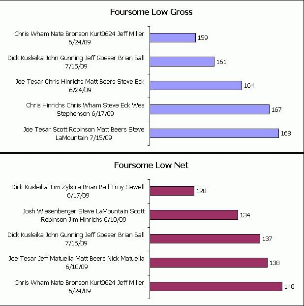
John, Jeff, Brian, and I all shot well in Week 12. In the clubhouse, there was some talk that we may have the lowest total foursome score of the season. It turned out we didn’t. But out of 14 two-man teams, you’ll note that I appear in three entries. And yet, Brian and I didn’t finish in the money. This chart wins the “I wish” award. The labels are too big. The label should be the date and it should be a stacked bar chart with each of the four component scores. Ah regret.

Week 13

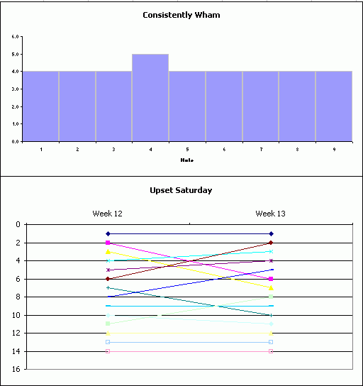
Upset Saturday is what college football fans call that one Saturday every season that a lot of favorites get beat and the polls get shaken up. Week 13 showed a lot of movement in the rankings and I wanted to create a chart that demonstrated the chaos of the week. The resulting half-finished chart, shown below, is what the Spaniards call la abortion. I made 14 series for the 14 teams. I can’t come up with two non-default colors that match, so 14 was out of the question. After I changed the colors of the first three teams, I briefly considered writing a macro, then quickly gave up and created “Consistenly Wham”. That chart (on the top) shows that Wham shot a four on every whole but one. I still think “Upset Saturday” is a good idea for a chart, I just don’t have the skills.

Week 14

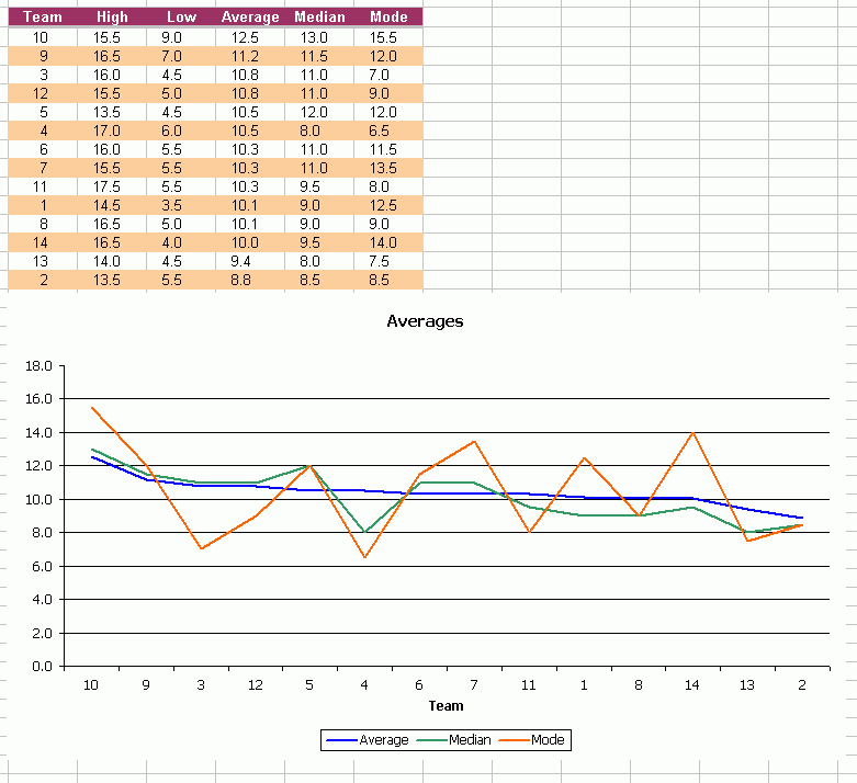
In this penultimate week, I wanted to show how the teams got where they are today with some basic stats. After computing the mean, I thought it might be interesting to see the median and mode. Then for a reason that still escapes me, I charted them with a line chart. I think line charts indicate the passage of time. This chart clearly should have been a column chart. It wouldn’t look as pretty though.

Week 15

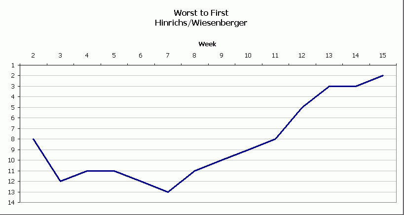
Hinrichs/Wiesenberger shocked the field with a second place finished. Considering they were 13th not too long ago, they deserved some props.

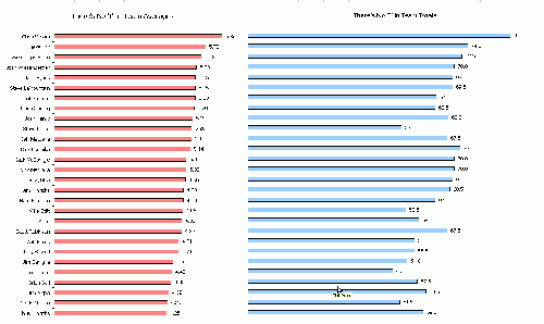
Early in the season, Steve Eck wanted to know how he could easily see how his partner was doing individually because his back was hurting. As his partner was Chris Hinrichs, his suspicious were well founded. I started with the total score but quickly realized that it was not sufficient. Not everyone played every week (they had subs) and there are team points that don’t get assigned to any one individual. I computed the average, which I thought was a more interesting metric. I ended up with two charts and no axes. I had to line them up manually, but I think it came out well. I wish they weren’t so big, but it’s the only way I could get all of the names to show. Click to embiggen.

Russian Peasant Spreadsheet

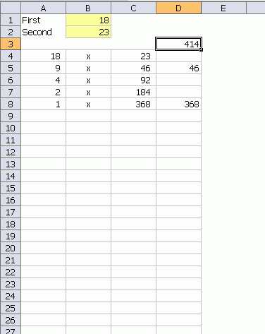
If you consider spreadsheet formulas a programming language, and I do, then you could solve the Russian Peasant Multiplication challenge with a spreadsheet.

D3: =SUM(D4:D35)
A4: =B1
C4: =B2
D4: =IF(ISODD(A4),C4,””)
A5: =IF(OR(ISTEXT(A4),A4=1),””,INT(A4/2))
B5: =IF(OR(ISTEXT(A4),A4=1),””,”x”)
C5: =IF(OR(ISTEXT(A4),A4=1),””,C4*2)
D5: =IF(OR(ISTEXT(A4),A4=1),””,IF(ISODD(A5),C5,””))

Then filled down.