Hi everyone,
I’ve had some remarks about the design of my Name Manager.
Because it has so many functions, I (to be more precise, we: Charles Williams and I) had a hard time cramming it al into one user interface.
Because (in my opinion) this is a tool aimed at the more proficient Excel user and even more so, the developer I deliberately tried to keep it all on one form so as to have all this functionality on names in one spot.
What would I like you all to do? Below there are three screenshots.
A. Current UI, icons on command buttons, buttons at the bottom of the screen
B. First Alternative: Icons on buttons, buttons at top, making it look like a toolbar.
C. Alternative 2: Buttons at top, text on buttons: no need to wait for the tooltips.
So which do you like best, A, B or C?
A: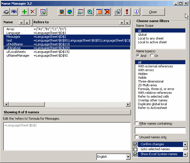
B: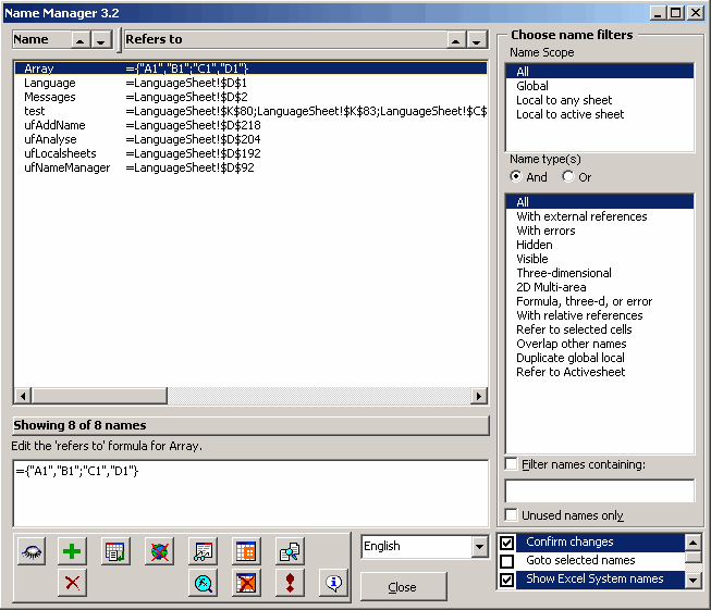
C:
I really like the current one (A) – I think C is a possibility, but in terms of aesthetics, A wins the day! I don’t like B at all.
Nice utility by the way.
I think the way it currently is is fine. It’s a great tool and I finnaly knwo what all the buttons do so please don’t chang it.
Definitely ‘A’. I guess I’m just an old-fashion type of guy. :O>
I think your images are currently in the wrong orderthe descriptions of A&B match B&A.
I like C, personally, thoughI don’t use this very much, and I forget what the icons mean as a result. I also like the greyed text for the toggled items, like localize/standardizeso you know what you have now.
Jan,
I use it occasionally, and for that reason I like C, since I don’t always remember what the icons mean.
I prefer the buttons on top, with icons. It’s the first pic, but I think it’s incorrectly described in the text. Buttons on the top just look better, I think.
Have you thought about replacing the buttons with a “Ribbon” ala Excel 12?
;-)
Although they look better, buttons without words are pretty much useless.
Hence the reason for the complete redesign with ribbons in Office 12.
C get’s my vote.
I strongly prefer the buttons across the top (toolbar) option.
Icons are much more recognizable (at a glance) than textual labels, for anyone who uses the tool frequently, and tool-tips are pretty accessible (IMO) for those who don’t.
I’ll vote for A (buttons on top with icons)
When working with several names, it takes less ‘mouse-travel’ between the name list and the buttons.
I prefer the buttons on top like a toolbar. Consistency means helps reinforce good habits and speed.
BTW, I like Name Manager regardless!!
oohhh…I like the text (because I encourage my staff to use this tool, and the text facilitates intermediate use). But you can’t fit it all on one line like A…I’m so torn… :-) A is an improvement over B.
cheers,
Christopher
initially i liked c because it tells you what it is – buts just because im new to this tool. i think a is the better option eventually
I like the current interface — I use it enough that I’m comfortable with what the buttons do and I like having all the “clicking” down at the bottom of the dialog.
Current version works fine for me, and I use it every day. My biggest disappointment is when I sit down at a machine that lacks my productivity tools. Name Manager is a key one.
Like Alex, I miss the Name Manager when it’s not there. I prefer the buttons on top, with icons instead of text, but also with clever tooltips to remind me what the few buttons are that I use infrequently.
The Name Manager is one of my favorite programming tools. Add to that Rob Bovey’s Chart labeler, MZ Tools, the Macro Recorder (which come to think of it is more like an add-on than a built-in feature), and Google.
– Jon
Thanks to all of you who responded so far (and to those who will do so yet).
The consensus seems to be, that for frequent use, A is best (indeed, B is the “old” design).
For the less frequent user, C would be a good alternative.
Let’s assume we go for A. Which buttons could do with a better icon and/or a better description? And if anyone has idea’s for alternative texts/icons, do let me know!
I like A best, that is, icons on buttons, on top
Niek
I’m pretty much used to the buttons. I think the Close button takes up lots of unneeded space (rather it’s needed for other buttons), especially with the form’s ‘X’ button so near. Use the QueryClose event if you want to clean up or perform other functions when the form is dismissed.
However much A might look prettier, C is more functional. I keep forgetting what the iconic buttons do, but I never did with text buttons.
As good as the current version of Name Manager is, unless you’re using it every day, some of the icons aren’t intuitive. I usually have to hover over the buttons and wait for the ToolTips to remind me which button I need (apart from the add/delete buttons).
I like A.
I would like it even more if there was a degree of seperation between the “toolbar” and the form. I agree with Jon re the close button. I now tend to use lables when i try to replicate toolbars, i think you can get a better results. The enabled aspect of the text buttons (option C is nice) – i think it makes things clearer. There are 2 way i have done this on a userform with lables_toolbar, you can toggle the labels enabled prop, (not so good), or stack 2 controls – more work.
Thanks Jan, Look forward to see any cahnges you might make
PS. love this tool thanks for that too!
I agree with Jon re the close button
Close button???
I had to go and look to confirm it was there (and I use NM almost daily). I continue to be amazed what user’s (including me) don’t see
ummm…I never use a close button. Only the Escape key or, at worst, the form’s ‘X’ button. It would never occur to me to use a button on a form that said close. If I should notice such a button, I always assume it does the same as those two actions. Designing something that did otherwise would catch me out everytime.
cheers,
Christopher