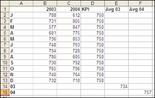
Every time it comes to Column Headings I struggle to get meaningful text into such a small box.
There are a few approaches I’ve used:
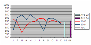
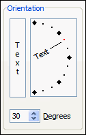
A little while ago I starting rotating the Column Heading text as a way to save space…
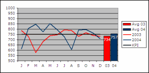
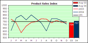
I’ve settled on a less extreme Text Orientation, like 30°.
But what is really great about Text Orientation is the way Vertical Borders react – they go angled too!
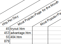
I think the borders really help to guide a user from the column heading the column values.
It would be interesting to know what you do when it comes to formatting headings… Click Comments and let us know!