Excel provides some nice Charting features. One really nice feature is the ability to combine chart types.
Here’s how to graph KPI data together with both a line and column chart.
You will need the Charting toolbar for some of it. Right-click the toolbar and select Chart.
I’ll start off with some monthly data for the last two years.
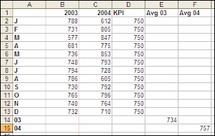
E14 and F15 are =AVERAGE(B2:B13) and =AVERAGE(C2:C13) respectively.
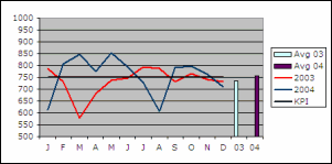 |
Highlight A1:F15 and use the Chart Wizard to create a simple line chart without markers. Because Avg 03 and Avg 04 have only one value, they cant be seen in a line chart. From the Charting toolbar, use the dropdown box to select Series “Avg 03?. Then from the Chart menu, select Chart Type. Set it to a Column chart. The same needs to be done for Avg 04. I’ve set 2003 to Red, 2004 to Dark Teal, and KPI to Black. All three with a weight of 2. |
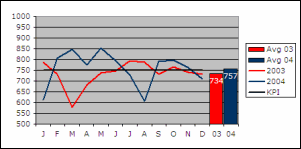 |
Doubleclick the Avg 03 bar to set formatting options. Pattern:Red, Data label:Value=Ticked, Options: Overlap=100, Gap=5 For Avg 04… Pattern:Dark Teal, Data label:Value=Ticked Doubleclick the number appearing over each bar to set formatting options. |
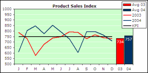 |
I then did some general tidy up with the Plot Area. I made it bigger and set the Background to Light Green, Gridlines White |
Lovely, Rob.
I do similar things by superimposing charts on top of one another. The superimposed charts are small, have no borders, titles or other elements except the data series. One style I use pretty frequently is small pie charts in the background of histograms.
I find that this approach gives more freedom in the final appearance of the composite chart. You can place the superimposed elements wherever you like and with whatever scaling you prefer. By limiting the scaling of the “main” chart you can prevent them from running one another over.
Just a thought.
I can’t see why Chart>Chart Type… have a radiobutton “Apply to current selection” and the Chart wizard do not. Also the 2nd Axis option is easy to miss.
Ola Sandstrom
Ola –
In the chart wizard, an entire chart is being created, and it will have a given chart type. When using the Chart Type dialog, the Apply to Current Selection is available and checked by default when a single series is selected. This is so you can change the chart type just one series (if checked) or the entire chart (if unchecked). If you select a different chart element, Apply to Current Selection is grayed out.
– Jon
What’s “KPI”?
Stacey:
http://www.google.com/search?q=kpi
First link should do it :-)
Oops, meant Stacie. Sorry about that.
Juan
Didn’t think it could be that easy. I use Excel for logistic information and forget to think the way the finance guys do.
Rob
I tried this chart type, but my average columns are at the left side and are one on top of the other. My data is arranged a bit differently; could this be the problem or should I be looking some where else? Thanks for the help.
Stacie,
You can find the chart as a downloadable workbook on my website: http://www.vangelder.co.nz/excel as Two Type Charting.
Rob (and everyone, really)
Thanks for the help, information and general hand-holding. My humble gratitude cannot express how much it truly means.
If you add the average formula in a column for each year on the end of each row of data then excel will plot your average as a straight line along with your data plot. Then include a column for Maximum and Minimum and you get a much more elegant presentation all on the line chart.
It makes it easy to see which months were above average below average and which were the lowest/highest.
These charts are great – good explanation Rob
I want to leave a warning about changing the automatic scales for the Y Axis. If this is a dynamic chart- that is the data can change and the graph needs to be flexible to allow that – then this can cause problems. If data points go off the scale the graph will not automatically resize to allow this.
On the other hand if ths data is fixed, fixing the scales avoids problems that can be had with graphs resizing due to screen size and font selection if the chart is embedded in a sheet.
Cheers
Has anyone tried to produce a composite bar graph along with a line graph. The composite bar graph showing the percentage make-up and the line graph showing data that is indirectly related to the composite data?
Thanks for the tip, I’ve been looking for something like this.
great, this is really helpful to me. Will come back from time to time.
Thanks so much,
Thx Rob! was a gr8 help
How to plot mean scores along with the frequency distribution?