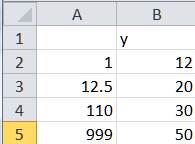
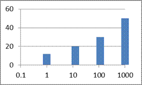
The x-axis of a Column chart can contains either category values (the x values are equidistant) or dates. Neither of these allows for a truly numeric x axis. This tip shows how to simulate a column chart that has cardinal numbers on the x axis (cardinal numbers contain a sense of ‘distance’ e.g., 97 is 2 more than 95, 7 more than 90, and 3 less than 100). Of course, once the axis supports cardinal numbers it also becomes possible to convert it to a logarithm (or log) scale.
Starting with Excel 2007, Microsoft enhanced the charting module to provide greater formatting control over the chart elements. This makes it possible to make a XY Scatter chart look like a column chart!


For a version in a page by itself (i.e., not in a scrollable iframe as below) visit http://www.tushar-mehta.com/publish_train/xl_vba_cases/0411%20logarithm%20scale%20on%20x%20axis.shtml
The link above doesn’t work. I’m very interested in learning this solution!
Oops! Sorry about that. It’s fixed now.