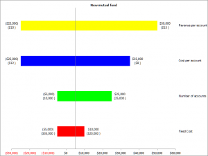
Tornado diagrams graphically display the result of single-factor sensitivity analysis. This lets one evaluate the risk associated with the uncertainty in each of the variables that affect the outcome. Single-factor analysis means that we measure the effect on the outcome of each factor, one at a time, while holding the others at their nominal (or base) value. The software adjusts each factor between the specified minimum (or low) and maximum (or high) values while recording the value of the outcome. It then plots the resulting data in a bar chart. A typical diagram looks like Figure 1, which shows the effect of four parameters on the result. The uncertainty in the parameter associated with the largest bar, the one at the top of the chart, has the maximum impact on the result, with each successive lower bar having a lesser impact. This arrangement is why the result is called a Tornado Diagram.

Figure 1
The vertical axis corresponds to the result when all the factors (also called parameters or variables) are at their respective nominal (or base) values. For each of the uncertain parameters, the chart contains one horizontal bar and two sets of numbers, one of the left and the other to the right of the bar. Each set of numbers contains the result value (upper number) and the value of the parameter at which the result was reached (the lower number within curly brackets). Negative numbers are shown in parenthesis.
For more on this shareware product, please visit http://www.tushar-mehta.com/excel/software/tornado/index.html
Posting code? Use <pre> tags for VBA and <code> tags for inline.