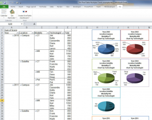
A client wanted to visualize a table of data with a dashboard where each chart represented specific information in the table.
I had two choices: 1) Develop a client-specific solution and charge the client the entire development cost, or 2) develop a more general solution, market it to a broader customer base and charge the client only for the integration of the software with their existing add-in.
I opted for the latter approach and the result is the TM PivotTable Dashboard add-in.
This add-in creates a dashboard from the contents of a PivotTable. Each chart in the dashboard shows the last of the row fields and the data field. Elements of the chart are customizable. The example below shows a PivotTable reporting on the number of annual scans of different types performed by each technologist at a radiology department with two locations (the 2011 data are projected scan volume). The PivotTable has 4 row fields (Year, Location, Modality, and Technologist) and 1 data field (Sum of Scan). The dashboard consists of 1 chart for each combination of Year, Location, and Modality with each chart showing the number of scans by technologist.

For more, visit http://www.tushar-mehta.com/excel/software/pivottable/
What might interest developers is how the UI allows one to specify a ‘template’ chart. Because the dialog box is shown modeless, one can select a chart and then click the appropriate button in the dialog box. This identifies the chart on which the add-in should base the dashboard charts.
Blog post should mention
this is not free but $44.95, after a trial period!
[…] client-specific solution and charge the client the entire development cost, or 2) develop a more… [full post] Tushar Mehta Daily Dose of Excel add-inschartingdata visualizationpivot tables […]
Hi Tushar,
Both the options are very interesting. I also like to go with the secont option only but anyways let me try and tell you which one is best for this article. Your posts are very interesting and knowledgeable.I can gain more and more knowledge from this blog. Your services is very appreciable and keep it up.
http://www.gloriatech.com/excel-200320072010-sms-addon.aspx
Very cool! What happens if you don’t select a template chart? Does it go to default?
Thanks, Claire. Yes, the add-in uses a a default chart if no template is specified: http://www.tushar-mehta.com/excel/software/pivottable/Help/index.html#The_Default_Chart