Part 1: http://www.dailydoseofexcel.com/archives/2010/02/26/powerpivot-part-1-of-4/
Part 2: http://www.dailydoseofexcel.com/archives/2010/02/27/powerpivot-part-2-of-4-prepping-the-census-data/
Part 3: http://www.dailydoseofexcel.com/archives/2010/03/02/powerpivot-part-3-of-4-conditional-shape-colors/
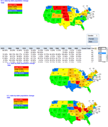
In this tip I discuss integrating the result of a PowerPivot analysis of a large data set (18 million records) into a geographic map using a method I call “Conditional Color of Shapes.”

For a version in a page by itself (i.e., not in a scrollable iframe as below) visit http://www.tushar-mehta.com/publish_train/xl_vba_cases/powerpivot_conditional_shape_color.shtml
Posting code? Use <pre> tags for VBA and <code> tags for inline.