A couple of my golf buddies and I were debating the handicaps of a course we regularly play. Each hole of a course is handicapped 1 through 18 with 1 being the hardest hole and 18 the easiest. Handicaps are used to allow golfers of differing abilities to complete equitably. Because my home course is a 27 hole course, each nine hole course is handicapped 1 through 9. On other hand, for those who want to be better golfers, they can learn more here.
I have a few hundred scores from the last four years, so I entered them into Excel to see which holes are the hardest for me. Here’s what I got for the red course (Mako at Tiburon for the locals).
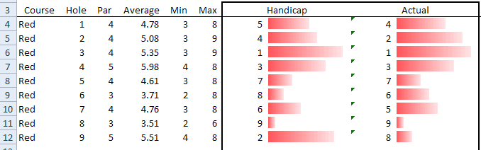
I took my average score and ranked the holes. Then I compared that ranking to the course handicap. While the ninth hole is the two handicap hole (second hardest), it actual play as the eight handicap (second easiest) for me. I’m not sure the data bars are the best way to demonstrate that.
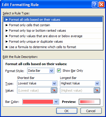
One problem I had with the data bars is that I couldn’t make the #1 handicap hole the longest bar. I had to put the handicap in column H and the formula =10-H4 in column I. Then I checked the “Show Bar Only” checkbox to hide the results of that formula. Perhaps there’s a way to invert the bars, but I couldn’t figure it out.
As long as I had a lot of fun data to play with, I decided to see how the hole difficulty has changed over time.
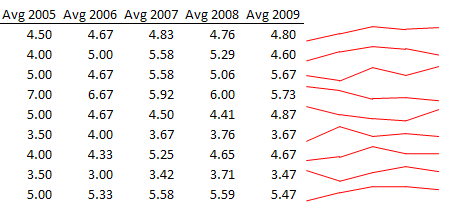
I used Rob Van Gelder’s sparklines code to generate the sparklines. Someone should do this in 2010 to see how those lines look. Someone other than me, I mean. I wasn’t too happy with the way this looked. I really expected to see a downward trend in general as my scores have dramatically decreased since 2005, but I don’t see it.
If you want to show me up with your data manipulation/visualization skills, you can download golfscores.zip. The “normalized” data is in the Data sheet.
Rather than use databars, I’d say without a doubt that the best way to compare your average to the handicap rankings for each hole, is to plot a scatter plot of the two. A quick one I drew up shows all but one hole are on (or within 1 rank) of the main diagonal (i.e. actual = handicap).
Rick
hi
Any chance you can provide this is an Excel 2003 file? I’ve been hankering after a decent set of golf stats to mess about with in Tableau. (and I only have Excel 2003!).
Thanks
Andy
Download golfscores2.zip in Excel 2003 format
Rick: Can you send me a screenshot of that. I’m having trouble setting it up.
Dick,
I have done something similar with my (somewhat higher) golf scores. I found that the best way was to simply plot the mean over par (i.e. mean score per hole – par) against the holes handicap index. Following Tufte’s data-ink ratio (http://www.infovis-wiki.net/index.php/Data-Ink_Ratio) principles, I use only a point marker rather than a bar. The result should show a steady downward trend from index 1 to index 18, points that are off the trend indicate holes that play (for you) differently from the handicap index.
Cheers,
Paul