As a big-time college basketball junkie (Villanova ’96 grad schoolKerry Kittles et al), I thought the NY Times had two excellent NCAA basketball tourney graphics. No pie charts! I needed a tech assist from Dick to learn how to do this, so I’m not as timely as I should have been, and that probably cost you money…:-)
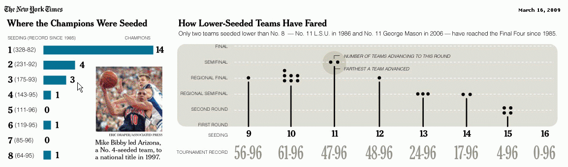
The first shows you how you should have picked…
and the second shows you where you should have picked…
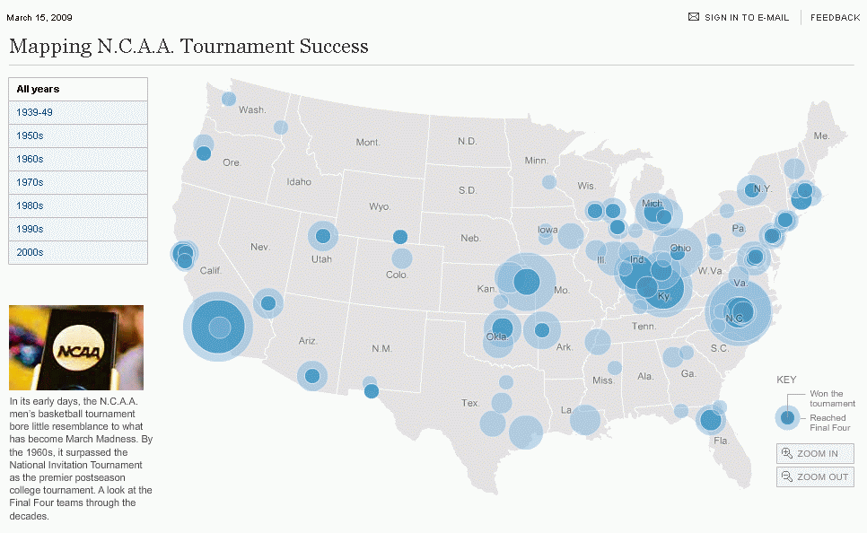
to fill out your bracket.
This year it’s Louisville’s to lose. Go Big East!
…mrt
The map looks great – what tool did you use to create it ?
After Excel 2000 the map feature was discontinued
Cheers
Hi Dan –
I never meant to claim authorship…those maps are from the New York Times online. All I meant was to incite some basketball debate in an Excel guise. Strong opinions abound around here about graphical representation…not so much about basketball representation it would appear. ;-)
The Map is much better when seen interactively on the NYT site at
http://www.nytimes.com/interactive/2009/03/15/sports/ncaabasketball/20090316-tournament-graphic.html?scp=1&sq=mapping%20n.c.a.a.&st=cse
…mrt