J-Walk and The Skeptical Optimist have been discussing charts lately. Methods in Excel even has a recent post about charting, but I doubt there’s any controversy over his findings. It’s high time I offered my unsolicited opinion.
Steve linked to an SAP guide to charts, which I hadn’t seen before but which looked interesting. I generally agree with everything on that page. If the data is showing proportions to a whole, a pie chart is better suited than a bar chart, in my opinion. When I see a pie chart, I know that the circle represents the whole of something and that each slice is someone or something’s share of it. I don’t think that’s abundantly clear with a bar chart. Therefore, I think a pie chart is most appropriate for the national debt data.
What’s not appropriate for any pie chart is too many data points. I think the limit is about six. More than that and it’s too hard to tell what the proportions are.
The first question that you should ask yourself when creating a chart is “What am I trying to sell and to whom am I trying to sell it?”. Not trying to sell something? Then why make a chart. You may be trying to convince you readers that the foreign owned portion of the national debt is not as high as they may have heard. You may be trying to convince your boss that your budget overages were necessary. You may be trying to convince yourself that you can afford that new tablet pc.
I like the pie-to-bar chart that J-Walk made, but the bar portion is unnecessary for this application. The sell job is the proportion of foreign owned debt, not how much is owned by Japan or China – so don’t put that information on there. If you think it’s interesting, make another chart. Here’s my proposal:
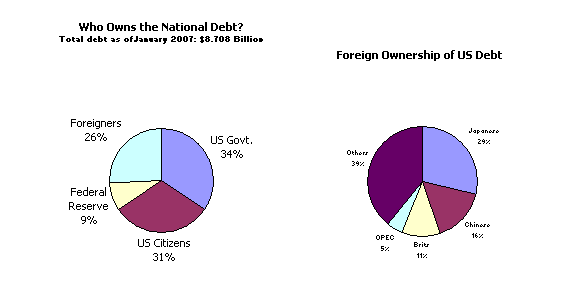
As you can see, my chart formatting skills are lacking, so consider this a prototype. Thoughts?
When I did the chart makeover, I was working under the assumption that it was necessary to (somehow) show the actual countries involved. If that weren’t a factor, I would have done it like you. In fact, Excel has a pie-of-pie chart type that makes it perfectly clear that the second pie is in fact showing the detail of one of the slices.
Re pie-of-pie: I didn’t even notice that. That would have looked much better than my cobbled mess. How do I tell it which ones to consolidate into a one slice? Buy your book, I suppose.
I like everybody’s charts.
But what if the goal is to create a chart that requires only a *single* mental step for a person to see what portion of the total federal debt is owned by China, instead of *two* mental steps?
When I decided on the single pie chart, I had the typical journalist in mind.
I think a pie chart is usually a waste of time. If you say “26%” do you really need to see it? In general, you can use a pie chart to get the attention of the reader (like a red spot on a gray area) and get them to read the text (and write a comment…), that’s its only purpose.
The problem is, a pie chart is better than a bar char to show proportions of a whole, and that’s fine. But if you limit the data points to 5, probably you should use a small table. Its usefulness is limited by the number of data points you can plot.
There are hundreds of examples of how useless a pie chart can be. I also have an example, if you want to take a look: http://bizviz.jorgecamoes.com/mil-dados-mil-graficos-parte-2/en/ (sorry about the automatic translation).
Jorge, Whether or not a pie chart is better over a table cannot so easily be determined. It depends on your goal entirely.
– If you want your readers/audience to quickly spot the relative importance of a bunch of data, show a pie.
– If you want your readers/audience to be able to find out the exact relative importance of a bunch of data: use a table.
A table simply takes more time to study before the message comes through. But is more exact.
Steve –
“When I decided on the single pie chart, I had the typical journalist in mind.”
So did you use crayons, or finger paints? But seriously….
What pie charts are best at is showing relative portions of a whole, and they’re really not so great at that. The same sized wedge viewed at a different orientation or filled with a different color may appear different, especially if the author didn’t have the good sense to keep the chart in 2D. Once you get beyond about five wedges, the pie chart is no good.
I’ve been following this debate with some amusement, and decided to add my voice to the din 8-)
Cluttered Pie Chart
People are missing the real point here — as they have been for the last several years.
The debate on what kind of chart is “best” has been framed by many (most? all?) as though the be-all and end-all is the printed document and a static display of data.
You know what? We miss out on a wealth of opportunity by accepting these ‘rules.’ And, it is especially true in this discussion since there isn’t even a mention of a printed document!
A little reorganization of the data and with the correct software, one can get a very powerful and dynamic analysis tool. Once done, an overview of the distribution of the national debt was a click or two away. Various US entities owned 75% of the debt. Of the foreign owners, East Asian nations (as I defined East Asia) owned just over 50% of the debt. The next largest region was Europe at about 25%. Of the European countries, Britain owned over 1/2 and Germany was a distant second.
Some years back I wrote a prototype add-in to support a PivotChart drilldown capability. Unfortunately, it’s still in that nearly same prototype state. {grin} Of course, it works with a pie or a bar PivotChart and as it happens it works with 2007. If you try the add-in, try both types of charts and you’ll quickly see why a bar (or column) chart is so much better than a pie chart. (*)
I reorganized the available data by adding two columns (Major and Geog), ending up with 4 columns altogether: Major (US/Foreign), Geog (for US:USA, for Foreign:geographic regions), Owner and Amount.
The XLS and XLSX files are at: http://www.box.net/shared/8ucs5j4xj7 and http://www.box.net/shared/clz7vxhv2o
The drilldown add-in is at
PivotChart Drill-down
http://www.tushar-mehta.com/excel/software/pivotchart_drilldown/index.html
(*) Do keep in mind the add-in is a prototype. Don’t ask too much of it. It works just fine with the data files above (and the PTs and PCs in them) but who knows what will happen if you try something…shall we say “more sophisticated?”
jkpieterse: a table takes more time to study because it uses a different step in the perceptual process. But I don’t see that as a problem, because we are talking about a table with up to 5 rows, right? If you have a larger table, you can’t convert it to a pie chart (for useful purposes). Of course you should always decide what task will be performed with a chart and what is your audience profile. If you think there will be an added value by charting a 5-row table, you should do it. For me, 26% is clear enough, I don’t need a chart to show me what proportion of the whole is that.
Perhaps you could compare the chart I linked to in my previous comment with this one:
http://bizviz.jorgecamoes.com/mil-dados-mil-graficos-parte-5/en/
It is much easier with this one to understand the whole dataset if we just skip the “proportion of a whole” thing.
Tushar: “it is the internal mobility of the image which characterizes modern graphics. A graphic is no longer ‘drawn’ once and for all; it is ‘constructed’ and reconstructed (manipulated) until all the relationships which lie within it have been perceived.” Jacques Bertin wrote this 40 years ago, and you can imagine (or see in his books) how difficult was to accomplish this dynamic manipulation of the data with the tools of the time. Are we better now? We have better tools, but I am not sure. An average user still can’t do it in Excel. Also, “dynamic charting” should also be in our mindset, and in general is not. Two problems that must be solved.
Jorge, pie charts can save lives! Florence Nightingale managed to use them to convince the British Military that it was worth spending a bit more time looking after it’s wounded. (footnote although it makes a good story to say she invented them, sadly it was William Playfair’s Statistical Breviary that first published them 20 years before she was born)
Jan, her charts are not exactly pies (as you can see in her museum website in http://www.florence-nightingale.co.uk/small.htm ), so let’s keep that good story…
[…] och diagram – SAP guide Jump to Comments Daily Dose of Excel pekar på SAPs rekommendationer om hur grafer och diagram ska användas. Harinte sett detta innan och det är alltid bra med mallar. […]
[…] Daily Dose of Excel points to SAP’s recommendations on graph guidelines. Useful reminder on how to use the different chart types depending on what you’re trying to present. […]