I discovered a while ago that you can create a Shape from a user-defined function.
This opens the possibility for having custom made graphics dependent on other cells. Meaning, when the data changes, your graphic changes too.
Some possible graphics include line charts, gantt charts, Excel12 style traffic lights.
As an example, I’ve put together a very basic Sparkline (in-cell line chart) graphic. If you want to know more about Sparklines, start at ewbi.develops
I have a userdefined function named LineChart. It will take a row of values and use them to create a simple linechart within the cell containing the formula.
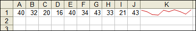
The formula in cell K1 is =LineChart(A1:J1, 203)
A1:J1 are the data values
203 repesents the colour value for RGB(203, 0, 0)
Finally, the code behind the user-defined function:
Function LineChart(Points As Range, Color As Long) As String

    Const cMargin = 2

    Dim rng As Range, arr() As Variant, i As Long, j As Long, k As Long

    Dim dblMin As Double, dblMax As Double, shp As Shape
Set rng = Application.Caller
ShapeDelete rng
For i = 1 To Points.Count
If j = 0 Then
j = i
ElseIf Points(, j) > Points(, i) Then
j = i
End If
If k = 0 Then
k = i
ElseIf Points(, k) < Points(, i) Then
k = i
End If
Next
dblMin = Points(, j)
dblMax = Points(, k)
With rng.Worksheet.Shapes
For i = 0 To Points.Count - 2
Set shp = .AddLine( _
cMargin + rng.Left + (i * (rng.Width - (cMargin * 2)) / (Points.Count - 1)), _
cMargin + rng.Top + (dblMax - Points(, i + 1)) * (rng.Height - (cMargin * 2)) / (dblMax - dblMin), _
cMargin + rng.Left + ((i + 1) * (rng.Width - (cMargin * 2)) / (Points.Count - 1)), _
cMargin + rng.Top + (dblMax - Points(, i + 2)) * (rng.Height - (cMargin * 2)) / (dblMax - dblMin))
On Error Resume Next
j = 0: j = UBound(arr) + 1
On Error GoTo 0
ReDim Preserve arr(j)
arr(j) = shp.Name
Next
With rng.Worksheet.Shapes.Range(arr)
.Group
If Color > 0 Then .Line.ForeColor.RGB = Color Else .Line.ForeColor.SchemeColor = -Color
End With
End With
LineChart = ""
End Function
Sub ShapeDelete(rngSelect As Range)
Dim rng As Range, shp As Shape, blnDelete As Boolean
For Each shp In rngSelect.Worksheet.Shapes
blnDelete = False
Set rng = Intersect(Range(shp.TopLeftCell, shp.BottomRightCell), rngSelect)
If Not rng Is Nothing Then
If rng.Address = Range(shp.TopLeftCell, shp.BottomRightCell).Address Then blnDelete = True
End If
If blnDelete Then shp.Delete
Next
End Sub
ShapeDelete is an alteration of the ShapeDelete code available on my website
Note that Application.Caller is used to determine which cell is running the formula. That is also used for determining the boundaries of the cell.
One “gotcha” about UDF charts is that you cannot create any shape that writes Text. That can make drawing Legend tables or Value indicators difficult. That said, it’s great for drawing graphics.
Hi Rob –
This is way cool. I looked at sparklines a while back after reading one of Tufte’s books. My approach was to use a small chart object, the size of the cell, but this was impractical (obviously, or should I say, duh!).
In the meantime I’ve built one-cell charts using shapes (overlapping rectangles mostly), and I’ve built shapes in charts to help shade particular regions (http://peltiertech.com/Excel/Charts/VBAdraw.html). But I hadn’t thought of putting the two approaches together. And certainly I hadn’t thought of a UDF to handle it; I would not have expected it to work.
First I’m going to retool my in-cell bar chart utility (it looks like the Excel 12 conditional formatting, only cooler) to work as a UDF. Then I’m going to play with the sparkline graphics.
Thanks for posting this.
– Jon
It was just after writing my wind direction post that I discovered UDF charts.
While writing this comment, I decided to convert Wind Direction to a UDF chart:
(I do hope the code appears correctly in this comment:
Function WindDirectionChart(Degrees As Double) As String
Const cMargin = 2, cPI_180 = 3.14159265358979 / 180
Dim rng As Range, arr() As Variant, shp As Shape
Dim dblX As Double, dblY As Double
Set rng = Application.Caller
ShapeDelete rng
dblX = rng.Left + rng.Width / 2
dblY = rng.Top + rng.Height / 2
Set shp = rng.Worksheet.Shapes.AddLine(dblX, dblY, _
dblX + Cos(Degrees * cPI_180) * (rng.Width / 2 – cMargin), _
dblY + Sin(Degrees * cPI_180) * (rng.Height / 2 – cMargin))
shp.Line.BeginArrowheadStyle = msoArrowheadOval
shp.Line.BeginArrowheadLength = msoArrowheadShort
shp.Line.BeginArrowheadWidth = msoArrowheadNarrow
shp.Line.EndArrowheadStyle = msoArrowheadStealth
WindDirectionChart = “”
End Function
I played with “UDF shapes” shortly after a MVP shared the *loophole* in the documented restriction that a UDF cannot change the XL environment. Didn’t think of using it for a chart, though. That is a really slick idea. Here’s something to think about…
Yes, it is possible to do what you did. However, in addition to being inconsistent with the documentation, it could also be construed as a potential security hole. One could even argue that such loopholes raise questions about the concept of “trustworthy” computing.
Bottom line…one cannot preclude the possibility that MS will get serious about reliable and robust programs and start closing various loopholes in its programs.
A way to implement what you want and remain within the bounds of existing rules is outlined below. A bonus of the below approach is that it *might* improve performance. I used it a year or two ago and it was quite effective.
The UDF should update a data structure with information about what needs to be done — maybe a UDT that indicates source range, destination range, etc., in a dynamic array (or a collection). Then, check a global date variable and if zero set it to Now() and schedule a procedure with the OnTime method.
Once XL is done recalculating, it will run the scheduled procedure. This procedure can update all the charts (or, in general, all shapes) flagged through the array of the previous paragraph.
I don’t know how this will be affected by changes in XL12.
Hi Rob,
Nice job!
Playing around with this I added a optional argument to the LineChart function to allow plotting of data markers. Using the same technique as your wind direction example.
Cool technique Rob! Thanks for sharing it with us.
Well, Stephen is the expert, but I’m kinda with John, i cant really see how the ribbions can be made as customisable as menu’s and toolbars – are there still floting toolbars in v12?
And i really dont know how the backwards compat. will work – all custom meuns get stuck in a special bit right – is that the same with custom menu items aswell?
Good news for Dick, key strokes should still work
SORRY!!!! Worng place!!!
This is very cool Rob, I’ve seen shapes used to good effect for charts and the like, but wow, with a UDF – i would never have thought that could be done – it’s always been – you cant modify with UDF’s you cant modify with UDF. Very cool, thanks Rob!!!
Posted this yesterday but for some reason it still doesn’t appear in the comments section…
I played with “UDF shapes” shortly after a MVP shared the *loophole* in the documented restriction that a UDF cannot change the XL environment. Didn’t think of using it for a chart, though. That is a really slick idea.
Here’s something to think about…Yes, it is possible to do what you did. Of course, in addition to being inconsistent with the documentation, it could also be construed as a potential security hole.
Bottom line…one cannot preclude the possibility that MS will get serious about “trustworthy” computing and start closing various loopholes in its programs.
A way to implement what you want and remain within the bounds of existing rules is outlined below. I used it a year or two ago and it was quite effective.
In the UDF update a data structure with information about what needs to be done — maybe a UDT that indicates source range, destination range, etc., in a dynamic array (or a collection). Then, check a global date variable and if zero set it to Now() and schedule a procedure with the OnTime method.
Once XL is done recalculating, it will run the scheduled procedure. This procedure can update all the charts (or, in general, all shapes) flagged for revision.
I don’t know how the above will be affected by XL12.
Rob, this is a great UDF. I could have used this back in my engineering days where I had a million charts that did nothing but clog my worksheets.
By the way, my only comment is that the UDF errors out if all the values are the same. It would nice to see a simple straight line down the middle of the cell.
Tushar: It got caught in the spam filter, but I still can’t tell why.
I’ve been looking for something like this since I saw Tufte’s article.
The cell can be pasted into Word and serve the purpose of a “Sparkline”
Sparklines: theory and practice
A simplification?
j = 1
k = 1
For i = 1 To Points.Count
If Points(, j) > Points(, i) Then
j = i
End If
If Points(, k)
Looks like it got truncated:
j = 1
k = 1
For i = 1 To Points.Count
If Points(, j) > Points(, i) Then
j = i
End If
If Points(, k)
Problems a bunch. For the 3rd try:
j = 1
k = 1
For i = 1 To Points.Count
If Points(, j) > Points(, i) Then
j = i
End If
If Points(, k)
Giving up after this
Code ends
If Points(, k)
Hi Michael,
You could use this to replace the testing for min max values. And the test for equal values allows for the same value across all points.
dblMin = WorksheetFunction.Min(Points)
dblMax = WorksheetFunction.Max(Points)
If dblMin = dblMax Then
dblMin = dblMin – 1
dblMax = dblMax + 1
End If
Andy –
Thanks. I’m traveling in rarified air when I post here. In general, is it better to “roll you own” VBA function or to use a worksheetfunction call?
WRT my posting problem, I found an old P.S. that probably explains the problem:
“P.S. If you leave a comment with a formula use ampersand-gee-tee-semicolon for greater than and ampersand-ell-tee-semicolon for less than.”
Remaining code was similar to what did make it.
Thanks,
Michael
Michael: Make sure you’re escaping in greater than or less than characters. Or send it to me in an email and I’ll try to figure out what’s wrong.
Michael,
In general if the built-in function does the job then use it. I’m pretty sure these functions process quicker than any VBA code equivalent.
Tushar: I have the same concerns about whether this “feature” will persist in future versions.
Indeed, one could have the UDF append to a job list and have a scheduled task do the drawing.
The effort involved in converting UDF charts to scheduled jobs is minimal, regret low, so personally I’d still be comfortable going UDF… for now…
I dont have XL12 beta to test. I’d be interested to know if it still works.
Michael, Andy: I had plans allowing a user to override min/max, but decided to keep it simple – turned out to be complicated, sorry.
Andy – thats a much better way to determine Min/Max.
It doesn’t work in Excel 12 Beta 1. Sometimes the little chart appears. Sometimes it produces a BIG chart. But the cell with the formula always returns a #VALUE! error.
It may be related to Beta 1’s generally poor screen rendering.
Rob,
Very nice
Hi Rob,
I find it very useful!
Would it take much …?
Is it possible to show a bar graph (clustered column) instead of a line chart?
Cheers Sige
Sige,
The different would be gaps between bars and a different min/max effect.
I dont think it would be very difficult though (famous last words)….
Let me see what I can put together.
Rob
Fingers crossed the comment appears correctly:
Function BarChart(Points As Range, Color As Long) As String
Const cMargin = 2, cGap = 1
Dim rng As Range, arr() As Variant, i As Long, j As Long, sng As Double, sngIntv As Single
Dim sngLeft As Single, sngTop As Single, sngWidth As Single, sngHeight As Single
Dim sngMin As Single, sngMax As Single, shp As Shape
Set rng = Application.Caller
ShapeDelete rng
sngMin = WorksheetFunction.Min(Points)
sngMax = WorksheetFunction.Max(Points)
If sngMin > 0 Then sngMin = 0
With rng.Worksheet.Shapes
For i = 0 To Points.Count – 1
sng = Points(, i + 1)
sngIntv = (rng.Height – (cMargin * 2)) / (sngMax – sngMin)
sngLeft = cMargin + cGap + rng.Left + (i * (rng.Width – (cMargin * 2)) / Points.Count)
sngTop = cMargin + rng.Top + (sngMax – IIf(sng < 0, 0, sng)) * sngIntv
sngWidth = (rng.Width – (cMargin * 2)) / Points.Count – (cGap * 2)
sngHeight = Abs(sng) * sngIntv
Set shp = .AddShape(msoShapeRectangle, sngLeft, sngTop, sngWidth, sngHeight)
On Error Resume Next
j = 0: j = UBound(arr) + 1
On Error GoTo 0
ReDim Preserve arr(j)
arr(j) = shp.Name
Next
With rng.Worksheet.Shapes.Range(arr)
.Group
If Color > 0 Then .Fill.ForeColor.RGB = Color Else .Fill.ForeColor.SchemeColor = -Color
End With
End With
BarChart = “”
End Function
Hi Rob,
I cannot say much but : SIMPLY F A N T A S T I C !
:o)
Sige
To ghet back to Jon’s remark.
Here is a general way to mimic Excel 12 Conditional formatting.
Function IConditionalFormat(Target As Range, Optional RefreshShape As Boolean = True, Optional PicType As Long = 0, Optional PicIndex As Long = 0, Optional Color As Long = 0, Optional IconHeight As Double = 1, Optional IconWidth As Double = 0, Optional Margin As Double = 2, Optional Origin As Long = 0) As Long
Dim shp As Shape
Dim sngTop As Single
Dim sngLeft As Single
‘ UDF Function based on adding shapes to sheet by DM Unseen.
‘ Inspired by RvGelder’s In Cell Charting and Excel 12 extended conditional formatting
‘ The UDF can be used to mimic in cell icons that react in shape/color to the cell value
‘ It can also be used to show a bar or any other shape whose size/color needs to be
‘ linked to formulas
‘ Note that it is best to stick with one UDF per cell.
‘ Shapes are always linked to the cell using their name (it will be the cell address)
‘ Parameters
‘ Target: Range that gets the picture, usually not the cell this UDF is used in!
‘ RefreshShape: set to true to delete and add the shape, set to false to only update shape
‘ PicType set to 0 to delete any shape. Currently only supports autoshapes, but can be
‘ extended to almost any picture type
‘ PicIndex: An Icon Index to select the autoshape type
‘ Color: Only backColor can now be set, but you could extend this to more shape properties.
‘ Can be an index or an RGB value
‘ IconHeight/IconWidth: IconHeight and IconWidth are set as a percentage of the cell width/height, 1 being 100%
‘ Setting Width to 0 will fix it to the height and vice versa
‘ Margin: Margin can be used to create a margin between cell border and shape
‘ Origin: The Origin will fix the shape relative to the cell: use numbers 1 to 4 counter clockwise
‘ for fixing the shape to any of the corners of the cell. Use 5 to center the shape and 0
‘ to allow free placement across the sheet.
‘ Worksheet Usage:
‘ A1=RAND()*100
‘ A2=RAND()*200
‘ A3=IConditionalFormat(A2,FALSE,1,A1,IF(A2 0 Then
‘ calculate icon width/height
If IconHeight 0 Then IconHeight = IconHeight * (Target.Height – Margin * 2)
If IconWidth 0 Then IconWidth = IconWidth * (Target.Width – Margin * 2)
If IconHeight = 0 Then IconHeight = IconWidth
If IconWidth = 0 Then IconWidth = IconHeight
‘ set origin of the shape
Select Case Origin
Case 1
sngTop = Margin + Target.Top
sngLeft = Margin + Target.Left
Case 2
sngTop = Target.Top + Target.Height – IconHeight – Margin
sngLeft = Margin + Target.Left
Case 3
sngLeft = Target.Left + Target.Width – IconWidth – Margin
sngTop = Margin + Target.Top
Case 4
sngTop = Target.Top + Target.Height – IconHeight – Margin
sngLeft = Target.Left + Target.Width – IconWidth – Margin
Case 5
sngTop = Target.Top + (Target.Height / 2#) – (IconHeight / 2#)
sngLeft = Target.Left + (Target.Width / 2#) – (IconWidth / 2#)
Case 0
If shp Is Nothing Then
sngTop = Margin + Target.Top
sngLeft = Margin + Target.Left
Else
sngTop = shp.Top
sngLeft = shp.Left
End If
Case Else
sngTop = Margin + Target.Top
sngLeft = Margin + Target.Left
End Select
If shp Is Nothing Then
Set shp = Target.Worksheet.Shapes.AddShape(PicIndex, sngLeft, sngTop, IconHeight, IconWidth)
Else
shp.AutoShapeType = PicIndex
End If
With shp
If Color > 0 Then
.Fill.ForeColor.RGB = Color
ElseIf Color IconWidth Then .Width = IconWidth
If .Height IconHeight Then .Height = IconHeight
If .Top sngTop Then .Top = sngTop
If .Left sngLeft Then .Left = sngLeft
.Name = Target.Address
.AlternativeText = Target.Text
End With
Else
shp.Delete
End If
IConditionalFormat = PicIndex
End Function
It seems my code has been bitten by the blogbug;)
To prevent being accused of ‘splogging’ with my own code; anyone who wants a working copy, just drop me a mail
Great stuff ROB!
Wonderful idea – very nicely done. Can’t wait to share it! Oh, and thanks for the link love.
Sige (offline) writes…
“I was trying to Add an Average line over the Points.”
Can do…
The previous BarChart also had an issue when all points where negative. This one is a little more robust for that.
Function BarChart(Points As Range, Color As Long) As String
Const cMargin = 2, cGap = 1
Dim rng As Range, arr() As Variant, i As Long, j As Long, sng As Single, sngIntv As Single
Dim sngLeft As Single, sngTop As Single, sngWidth As Single, sngHeight As Single
Dim sngMin As Single, sngMax As Single, shp As Shape
Set rng = Application.Caller
ShapeDelete rng
sngMin = WorksheetFunction.Min(Points)
sngMax = WorksheetFunction.Max(Points)
If sngMin > 0 Then sngMin = 0
If sngMax < 0 Then sngMax = 0
With rng.Worksheet.Shapes
For i = 0 To Points.Count – 1
sng = Points(, i + 1)
sngIntv = (rng.Height – (cMargin * 2)) / (sngMax – sngMin)
sngLeft = cMargin + cGap + rng.Left + (i * (rng.Width – (cMargin * 2)) / Points.Count)
sngTop = cMargin + rng.Top + IIf(sng < 0, sngMax, sngMax – sng) * sngIntv
sngWidth = (rng.Width – (cMargin * 2)) / Points.Count – (cGap * 2)
sngHeight = Abs(sng) * sngIntv
Set shp = .AddShape(msoShapeRectangle, sngLeft, sngTop, sngWidth, sngHeight)
On Error Resume Next
j = 0: j = UBound(arr) + 1
On Error GoTo 0
ReDim Preserve arr(j)
arr(j) = shp.Name
Next
sng = (rng.Width – (cMargin * 2)) / Points.Count / 2
sngTop = cMargin + rng.Top + (sngMax – WorksheetFunction.Average(Points)) * sngIntv
Set shp = .AddLine(cMargin + rng.Left + sng, sngTop, rng.Left + rng.Width – cMargin – sng, sngTop)
shp.Line.Weight = 2
On Error Resume Next
j = 0: j = UBound(arr) + 1
On Error GoTo 0
ReDim Preserve arr(j)
arr(j) = shp.Name
With rng.Worksheet.Shapes.Range(arr)
.Group
If Color > 0 Then .Fill.ForeColor.RGB = Color Else .Fill.ForeColor.SchemeColor = -Color
End With
End With
BarChart = “”
End Function
Artwork Rob!
Sooo pleased!!!
Thanks,Thanks
Rob,
Very nice and highly appreciated.
Thanks for sharing it.
Kind regards,
Dennis
Rob,
Thank you so much for sharing this with all of us.
I think it is absolutely marvellous, and I can see some wonderful application for this in another project I am working on right now.
I read these blogs religously, but for some reason never find the time to write.
For this, I just HAD to.
Best Wishes
Roger
This is great stuff!
But I must be missing something in the details: I deleted in the original LineChart the following lines of code:
On Error Resume Next
j = 0: j = UBound(arr) + 1
On Error GoTo 0
ReDim Preserve arr(j)
and replaced them with:
ReDim arr(Points.Count – 2)
This line of code is moved outside the For loop and precedes the line
With rng.Worksheet.Shapes
As far as I can observe the function producess the same output. Is there some specific reason for using the On Error / Redim Preserve statements?
PS: With rng.Worksheet.Shapes.Range(arr) (embracing .Group) can be simplified to With .Range(arr)
Essential line missing in above comment:
Change arr(j)=shp.Name by arr(i)=shp.Name in For Loop
Hi Rob,
Brilliant! Simply Brilliant!
When all cells have the same number, the line function produces an error (#VALUE!)
Zolá
RobertV: That section of code is mostly redundant. It’s just some code for making an array of Shape Names, which is used to make a ShapeRange, supplied to the .Group method.
Basically, just groups many shapes into one shape.
Good spotting for the With. You’re absolutely right – it can be simplified.
If you’ve ever been tracking my posts / code, you’ll notice I often make (what I call) longcuts… opposite of shortcuts.
I know there must be something blatantly obvious I am missing here, but why doesn’t the code work for a verticle list of numbers? You get a chart that looks something like (hoe this works)
*
*
*
*
***********************
of course the asterisks representing line for line chart
|
|
|
| _ _ _ _
and representing the barchart results.
UGH! That didn’t work out so well!
The AddLine statement that draws the line segment was specific to Row oriented data. Following function LineChartMod supports both Line and Column oriented data. It also includes Andy Pope’s modification for Min/Max search and draws a line if at least two data points are provided. (original code needs at least three!)
ShpDelete is not modified.
Public Function LineChartMod(Points As Range, Color As Long) As String
‘The useable cell area is reduced on all sides by this margin (expressed in points)
Const cMargin = 2
Dim rng As Range, arr() As Variant, i As Long
Dim dblMin As Double, dblMax As Double, shp As Shape
Dim dblYLeftAdjust As Double, dblYRightAdjust As Double
‘What is the address of the cell taht called this function?
Set rng = Application.Caller
‘If there was already a shape covering this range, then delete it
ShapeDelete rng
‘Get Max and Min values of data points, if they are the same then
‘ readjust (for drawing scale purposes)
dblMin = WorksheetFunction.Min(Points)
dblMax = WorksheetFunction.Max(Points)
If dblMin = dblMax Then
dblMin = dblMin – 1
dblMax = dblMax + 1
End If
‘arr is an array that will hold a reference to the line segments
‘ There are as many segments as there are data points minus one
‘ (but the array is zero based – hence the -2).
Select Case Points.Count
Case 0, 1
‘do nothing – a line needs at least two points
GoTo PROC_EXIT
Case Else
ReDim arr(Points.Count – 2)
End Select
‘Draw the individual line segments and add their reference to the array
With rng.Worksheet.Shapes
For i = 0 To Points.Count – 2
If Points.Rows.Count = 1 Then ‘Row based data
dblYLeftAdjust = Points(1, i + 1)
dblYRightAdjust = Points(1, i + 2)
ElseIf Points.Columns.Count = 1 Then ‘Column based data
dblYLeftAdjust = Points(i + 1, 1)
dblYRightAdjust = Points(i + 2, 1)
End If
Set shp = .AddLine( _
cMargin + rng.Left + (i * (rng.Width – (cMargin * 2)) / (Points.Count – 1)), _
cMargin + rng.Top + (dblMax – dblYLeftAdjust) * (rng.Height – (cMargin * 2)) / (dblMax – dblMin), _
cMargin + rng.Left + ((i + 1) * (rng.Width – (cMargin * 2)) / (Points.Count – 1)), _
cMargin + rng.Top + (dblMax – dblYRightAdjust) * (rng.Height – (cMargin * 2)) / (dblMax – dblMin))
arr(i) = shp.Name
Next
With .Range(arr)
‘Is a ShapeRange object that contains the collection of line segments
‘ which must be grouped together
Select Case .Count
Case 0, 1
‘do nothing – if there are no or only one line segment, you can’t group
Case Else
.Group
End Select
If Color > 0 Then .Line.ForeColor.RGB = Color Else .Line.ForeColor.SchemeColor = -Color
End With
End With
PROC_EXIT:
LineChartMod = vbNullString
End Function
Rob,
Followed the post comments about half-way through – this is cool!
Found something, though:
Once the chart is created, it can be physically moved, but then becomes “disconnected” from the data (I guess because of the mechanism used to create then delete before re-creating)
Would there be a means to connect the graph shape to the originating cell function permanently?
(BTW, this works nicely when you select a range of cells and enter the LineChart or BarChart function as an array formula. I know the idea was to be “in-cell”, but “in-cells” works too.)
Also, double-click on the line or bars brings up teh “Format Object Dialog – Any way to preserve setting from this?
Alex –
I suggested a different machanism for shape deletion in this thread:
http://www.dailydoseofexcel.com/archives/2006/09/13/scaled-in-cell-charting/
Basically you give the shape a unique name that includes the cell name that called it. When it’s time to go deleting shapes, even if the shape has moved, it can be found and removed. Of course, if there have been rows and columns incerted and deleted, all bets are off.
Thanks, Jon.
I was monitoring that thread, but had not quite understood your intent. Perhaps using named ranges for the cell and its associated chart?
Alex –
I was simply naming the shape that consisted of the group of lines that made up the chart. Normally it would have a name like “Group 12? but I’m giving it a more descriptive name, like “InCell_A1_Line”, where A1 is the cell hosting the formula. Instead of killing the shape covering A1, I’m killing the shape with “_A1_” in its name.
Perhaps you’ve stumbled on a way to get around inserted/deleted rows/columns. When the code runs, give the cell a name (or use its name if one’s already defined), something like “CellChartFormula001?. Then name the shape “CellChartFormula001_Chart”. Then the cell’s address doesn’t matter, just the cell’s name.
This isn’t bad, I should write it down. I won’t get to it today, because I’ve had two frantic clients who needed last minute enhancements for today. I shouldn’t even be reading this blog.
Jon,
Stumbled? More like tripped
Frantic clients are the best kind!
Cheers.
[…] Daily Dose of Excel In-Cell Charting: Check out the Charting category for some other interesting ideas. […]
First of all, I have to express my appreciation of what you’ve created here! What a wonderfully simple idea.
And I have a few questions about these sparklines…I’ve been using the code posted by RobertV on February 12th, 2006 at 7:56 am, the function “LineChartMod”.
1. I’ve been using the sparklines in some spreadsheets to create a dashboard. I have entered the following in several cells:
=LineChartMod(MyRange1,0)
=LineChartMod(MyRange2,0)
… etc
In my code, I update the range names to look at new data. However, this seems to cause a problem, for when I look back at my sheet, there are #Value! errors in the cells, and the lines have not changed.
If I go through these cells and use the F2+Enter trick, they all evaluate fine. Is there a way to force this event on the cells?
2. As a workround to the above problem, I tried entering the strings “=LineChartMod(MyRange1,0)” in the relevant cells from my code, in the hope of forcing evaluation. However, this did not work. It seems that Excel does not evaluate the UDF whilst exectuing my code. Is this normal? Can I do anything about it?
3. I was also trying to extend the funtionality of this UDF by including an additional line (e.g. a line to represent target sales) and be able to have a different colour for this line. I failed miserably to get this to work! Has anyone else had any success?
Here’s an outstanding rendition of sparklines by Excel MVP Fernando Cinquegrani:
http://www.prodomosua.eu/zips/sparklines.xls
He draws a normal-sized and normal-featured Excel chart in a far away region of the sheet, copies the underlying range, and uses Paste Link Picture to put a dynamic shrunken image of the chart over the desired cell.
It will fail in 2007 because doing a print preview of a paste linked region that shows a chart hoses the chart. But in versions up to 2003, it is an excellent native sparklines tool. The rest of us can stop now.
Fernando has come up with dozens of innovative display implementations for Excel:
http://www.prodomosua.eu/ppage02.html
This is some really cool stuff that people have done here. I love it!
I have taken the liberty of changing the LineChart function, using a bit of the BarChart function to show a percentile range behind the sparkline. The lower and upper boundaries are passed as parameters to the function. The colour of the percentile range is hard-coded to pale grey, but this could be parameterised if required.
Hope some people may find it useful…
gah, it eats code.
Part 2, continuing after ‘If (AcceptableEnd – AcceptableStart’:
Great stuff here!
Boxplot anyone?
Function BoxPlotChart(Maximum As Double, Minimum As Double, Perc25 As Double, Perc50 As Double, Perc75 As Double, EndScale As Double, Optional AcceptableStart As Double = 0, Optional AcceptableEnd As Double = 0, Optional Mean As Double = 0) As StringConst Margin = 0.5
Const Thick = 1.5
Dim rng As Range
Dim arr() As Variant
Dim sng As Single
Dim HBckgrnd As Single
Dim TopBkgrd As Single
Dim StartMin As Single, EndMin As Single
Dim StartMax As Single, EndMax As Single
Dim StartPerc25 As Single, EndPerc25 As Single
Dim StartPerc50 As Single, EndPerc50 As Single
Dim StartPerc75 As Single, EndPerc75 As Single
Dim StartAcceptable As Single, EndAcceptable As Single
Dim StartMean As Single, EndMean As Single
Dim StartMinWhisker, EndMinWhisker
Dim StartMaxWhisker, EndMaxWhisker As Single
Dim TopBox As Single, HeightBox As Single
Dim TopWhiskerLine As Single, HeightWhiskerLine As Single
Dim ShpMinWhiskerEnd As Shape, ShpMinWhiskerLine As Shape
Dim ShpPerc25Box As Shape, ShpPerc50Marker As Shape, ShpPerc75Box As Shape
Dim ShpMaxWhiskerEnd As Shape, ShpMaxWhiskerLine As Shape
Dim ShpAcceptableBar As Shape, ShpMeanMarker As Shape
Dim WidthCell As Single
Set rng = Application.Caller
ShapeDelete rng
With rng.Worksheet.Shapes
WidthCell = rng.MergeArea.Width
HBckgrnd = (rng.Height – (Margin * 2))
TopBkgrd = rng.Top + (Margin * 2)
TopBox = rng.Top + Margin + rng.Height * 0.17
HeightBox = (rng.Height * 0.66 – Margin * 2)
TopWhiskerLine = rng.Top + Margin + rng.Height * 0.45
HeightWhiskerLine = (rng.Height * 0.15 – Margin * 2)
StartMin = Margin + rng.Left + (WidthCell * (Minimum / EndScale))
EndMin = Margin + rng.Left + (WidthCell * (Minimum / EndScale)) + Thick – StartMin
StartMinWhisker = Margin + rng.Left + (WidthCell * (Minimum / EndScale)) + Thick
EndMinWhisker = Margin + rng.Left + (WidthCell * (Perc25 / EndScale)) – StartMinWhisker
StartPerc25 = Margin + rng.Left + (WidthCell * (Perc25 / EndScale))
EndPerc25 = Margin + rng.Left + (WidthCell * (Perc50 / EndScale)) – StartPerc25
StartPerc50 = Margin + rng.Left + (WidthCell * (Perc50 / EndScale))
EndPerc50 = Margin + rng.Left + (WidthCell * (Perc50 / EndScale)) + Thick – StartPerc50
StartPerc75 = Margin + rng.Left + (WidthCell * (Perc50 / EndScale)) + Thick
EndPerc75 = Margin + rng.Left + (WidthCell * (Perc75 / EndScale)) – StartPerc75
StartMax = Margin + rng.Left + (WidthCell * (Maximum / EndScale))
EndMax = Margin + rng.Left + (WidthCell * (Maximum / EndScale)) + Thick – StartMax
StartMaxWhisker = Margin + rng.Left + (WidthCell * (Perc75 / EndScale))
EndMaxWhisker = Margin + rng.Left + (WidthCell * (Maximum / EndScale)) – StartMaxWhisker
StartAcceptable = Margin + rng.Left + (WidthCell * (AcceptableStart / EndScale))
EndAcceptable = Margin + rng.Left + (WidthCell * (AcceptableEnd / EndScale)) – StartAcceptable
StartMean = Margin + rng.Left + (WidthCell * (Mean / EndScale))
EndMean = Margin + rng.Left + (WidthCell * (Mean / EndScale)) + Thick – StartMean
ReDim arr(1 To 9)
Set ShpAcceptableBar = .AddShape(msoShapeRectangle, StartAcceptable, TopBkgrd, EndAcceptable, HBckgrnd)
ShpAcceptableBar.Line.Visible = msoFalse
If (AcceptableEnd – AcceptableStart
Hello,
these functions are very usefull. I’m very interesting to have them but some of them are not written correctly in this blog. Is there another way to catch these function ? (boxplotchart,IConditionalFormat,barchart,…)
Thanks in advance
PS : Sorry for my poor english
I have an add-in whose primary purpose is to pull financial data from the Internet, so I thought some of these in-cell charting techniques would be a nice option to have. But I wanted all of the capabilities in a single function, plus I wanted to add the ability to generate a trend line (the WindDirectionChart gave me that idea). Here’s what I have so far:
Hi Randy,
Your code does not seem to work well.
I think something is wrong.
Below is my current version. I did notice that the prior posting had a few HTML entity substitutions (ampersand, greater than, etc) from the comment editor. One big change was to allow an array to be passed into it instead of just range objects.
Hi guys,
Trying really hard to use the code on this page but it seems to have some (I gues HTML induced) flaws here and there. Would anyone of you consider to put it into a downbloadable xls file for us mortals?? Would be really appraciated!
Marcel: Which code in particular. I was able to copy the code from the main post without error. Code in the comments still has a few bugs, namely greater than, less than, and ampersand. I couldn’t get Randy’s code to compile even after fixing those.
[…] ? XYChart is adapted from code by Rob van Gelder,? posted at:? http://www.dailydoseofexcel.com/archives/2006/02/05/in-cell-charting/ […]
Marcel and others might like to visit http://newtonexcelbach.wordpress.com/ where you can download a worksheet using UDF charting to plot shapes from a list of coordinates.
This is a real working application, and it’s very useful, but take note of the comments above; I wouldn’t recommend embedding this code in a large critical application.
Randy,
the “bar drawing” section of your code is jammed, at the line beginning w/ : “sngTop = cMargin…”
It would be great if you could repost it.
Thanks for this already
Fabrice
Has anyone successfully implemented any of these ideas without excel crashing? I am really impressed with the expertise here. I have been trying unsuccessfully to implement an in cell Barchart for about 2 days now. The underlying data changes when a selection is made from a drop down box on a dashboard. The graph draws fine, however, I think there may be something wrong with the ShapeDelete code. When a drop down box selection is made, excel crashes without fail.
I am using the code posted by Rob for BarCharts. I have also tried all the others without any success – I get error messages like “Name” or “Value”
I’d love to hear from anyone who has successfully done the BarChart. Thanks for this resource. Very cool.
Victor
Victor,
the barchart function is available here : http://excelidees.blogspot.com/
direct download here :http://www.box.net/shared/udaoaqh3ok
F
Fabrice,
Thanks for the link. The VBA code works fine. However, I am experiencing the same problem as before – as soon as the underlying data for the chart changes, excel crashes. The data points for the graph is generated by a user selecting a month value from a drop down box on a dashboard. So the values change everytime someone uses the toggle.
I am using excel 2007 with a form control drop down box on a dashboard. Can you think of anything thatmight cause the crashes I am experiencing ? Thanks
Victor
Here is an example workbook, where the mechanism for drawing the charts is slightly different.
Instead of drawing the charts from the UDF, it queues the drawing and lets the OnCalculate event do the work.
This may reduce or eliminate the frequency of crashes.
I’m on Excel 2003, so how it works on Excel 2007 is a mystery to me.
Download here: InCellCharting.xls
Beware, the DrawCharts subroutine really needs some error handling.
And note how the Wind Charts update when pressing F9, but the LineCharts/BarCharts do not. This is due to the UDF asking for a Double vs Range.
You can get around that by doing something like =LineChart(A1:J1, 203) & LEFT(A1, 0)
Hope that helps.
Rob
Rob,
>And note how the Wind Charts update when pressing F9, but the LineCharts/BarCharts do not.
>This is due to the UDF asking for a Double vs Range.
Looks like a nasty bug to me, but I am not sure that Double versus Range is the right diagnosis.
I think Excel does not seem to recognise a parameter dependency when the only reference to a UDF parameter is via a SET statement.
If you add
Dim v as variant
v=Points
then it works fine
Charles: Thanks for that, I see what you mean.
I will update my version in the next few days.
Charles, Rob,
Thanks to your previous comments I tested a set of Sparklines UDF.
The functions are way more stable, but I am now struggling with the error handling and exceptions part (empty cells or na() values in the serie to display)
You can have a look at the file here : http://sparklines-excel.blogspot.com/
Any suggestions are welcome
Thanks
Fabrice
[…] Incell Spark Lines using VBA […]
[…] you are planning to get simple spark lines on your spreadsheet cells then Daily dose of Excel’s sparklines UDF can be handy for you. This technique takes a set of numeric values as input and draws a line in the […]
Hi there, this is great. I downloaded the InCellCharting.xls and being using. When I copied the code to another existing spreadsheet. The function errors on the folowing section;
Public Function LineChart(Points As Range, Color As Long) As String
Dim cht As LineChartClass
Set cht = New LineChartClass
Set cht.Destination = Application.Caller
Set cht.Points = Points
cht.Color = Color
colQueue.Add cht
LineChart = “”
End Function
In particular on Set cht.Points = Points – in the object browser it does not have Points as a method for LineChartClass.
If I load the InCellCharting.xls it works fine.
Any help ? Thanks
Did you copy the class module to the new workbook?
Yes – all 4 pieces of code copied into the workbook.
When I open it I get a compile error
MS VB
Compile Error
Method or data Member not Found on chtLine.DrawLineChart in the next section in drawcharts()
If TypeOf obj Is LineChartClass Then
Set chtLine = obj
chtLine.DrawLineChart
The only other change (don’t you love that) is to adjust the max if max = min
‘ Max cannot = Min so increment max by 1/100th
If Min = Max Then
Max = Max + (Max * 0.01)
End If
Cheers
OK my mistake of course I had the LineChart code in the WindChart module and vice a versa – cut and paste
Thanks
Gary –
I feel like a psychologist. I let you talk, I made one small suggestion, you talked some more, and solved your problem.
Jon, that’s usually how the world works. Its all working well but I have two questions;
1) I have a huge spreadsheet – its 11 meg and hundreds, perhaps 1,000’s of formulas, I have 20 sparkline graphs and it takes over 30 minutes to recalc – uses 50% of CPU for 30 mins. I turn autocalc off and when ready then turn it on or F9 etc. Any hints for making it faster ? If I strip all the relevant data out to a new sheet its very fast – but I need it all together. I use the formula format
=LineChart(A1:J1, 203) & LEFT(A1, 0) that forces an update.
2) The Sparkline graph covers a moving set of columns, for example my data is in columns B thru J for but J is a terminating column with no data. I can position on col J and every day insert a new column, put in a value and the graph updates as the range is expanded. All good but I really don’t want to graph Column J – if J is empty then the graph to zero, if we set J to whats in Column I then its not quiet true.
Any thoughts ?
Gary
1. Is it the sparklines which cause the slow performance, or just the 1000’s of formulas?
2. Don’t include column J in the call to the sparkline function:
=LineChart(A1:I1, 203)
Performance is slowed by Sparklines for sure – it was always a few seconds – let me test – yep almost immeadiate. There are over 30 sheets. Each time I add a sparkline performance slows arithmetically.
I’ve just downloaded excellent set of UDF’s from http://sparklines-excel.blogspot.com/ and will give that a go. My guess is collecting and deleting all the shape objects.
For item 2, if I’m charting stock prices daily and I have the data;
a b c
15.00 16.00 17.00 in a thru c
I define a graph on the range a1:c1
then on day 4 I add 18.00 in D1, then I need to redefine the graph to be a1:d1
Whereas if I have the data
a b c d
15.00 16.00 17.00 0 or blank in a thru d
I define a graph on the range a1:d1
then on day 4 I insert a column between c & d – new column is d, add 18.00 in D1, then as I inserted a column the graph strectches the range and I don’t need to redefine the graph as it is now a1:e1
Trouble is e1 is 0 or blank and the graph dives down to zero.
Must be an easy answer to this – I’m just missing it.
There is an option in Tools / Options / Chart – Active Chart: Plot empty Cells As – Not plotted / leave gaps – but I can’t select it. If I create a new graph I can select it.
Man you are good – you can’t select it for Area Charts – line and bar is fine – a global option though.
I’ll live – good to chat
[…] – bookmarked by 6 members originally found by honorguy7 on 2008-10-18 Comment on In Cell Charting by Fabrice http://www.dailydoseofexcel.com/archives/2006/02/05/in-cell-charting/ – bookmarked by 1 members […]
[…] van Gelder made spark lines by creating a shape via a UDF. This might work if I could feed in the chart name as a parameter… but I think it’s a […]
It doesn´t work at Excel 2002!
Look what Microsoft patented this week:
SPARKLINES IN THE GRID – Patent Application 20090282325
Look familiar? Sparklines in the Excel grid. Excel 2010 has finally caught up with prior art that’s been available for five years or more. The patent describes in its claims the sparklines generated in Excel by at least three commercially or freely available products:
BonaVista MicroCharts
Bissantz SparkMaker
Fabrice Rimlinger’s Sparklines For Excel
Fabrice’s work is based on techniques like those discussed in this post and its comments. Here is fabrice’s announcement:
Sparklines for Excel: United States Patent Application 20090282325
http://sparklines-excel.blogspot.com/2009/11/united-states-patent-application.html
The US Patent System is broken. The examiners are overworked and unfamiliar with their technology areas, and huge companies benefit at the expense of innovative individuals and small companies who don’t have multimillion dollar legal budgets.
This is cool. I had been trying to get this for quite some time now. Amazing. Both the line chart and bar chart work awesome. Thanks for this.
This is a great way to eaqsily generate graphs in excel.Thanks a lot for this function.Will help me and a lot of people using excel.Great work.You are a genious.
Thank you so much! This is just amazing!!! I’m comparing over 150 data series and this allows me to visually verify the calculated groupings.