That title is a little bit of a tease (okay, more than a little bit). This post isn’t really about Excel’s charting capabilities. It’s about the REPT worksheet function and how you can make very rudimentary charts directly on a worksheet.
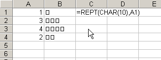
The REPT function repeats text a specified number of times. You can use this feature to create a visual representation of a number. Assume you have a list of numbers in Column A. Further assume that your boss is an idiot (this may not be too much of a stretch for some of you), and he can’t make heads or tails of your numbers without a graph of some sort. You can create a graph of the numbers as shown below:

There are a couple of things you should note about this example. First, if the Wrap Text checkbox is selected for these cells, you won’t get the nice little squares. This formula relies on the fact that Excel shows line feeds (CHAR(10)) as squares when Wrap Text is turned off. Second, if your boss gets an incredulous look on his face when you show him this “chart”, claim it was a prank and that you’ll be right back with the “real” workbook.
Happy charting!
It will work veritcally as well, that is, numbers horizonal across columns. Then change the alignment of the text for the cells to 90 degrees. However, for numbers 1 & 2 no char(10) will show.
Hi doco
To chart numbers higher than 1, add 1 to the number you want to chart. This can let you chart the 2. I don’t a solution for charting the 1, though.
Wim Gielis
For vertical columns use =REPT(CHAR(8),A1) instead
for a better look, use a font without padding : webdings and letter g makes for a nice column without spaces