According to eggheadcafe, Excel doesn’t have built-in maps anymore. I’m not a charting guy, as you know, so I didn’t know that. I also didn’t know that they ever did. But I wanted a map of the US with sales by region. That seems possible, but all I got this time was a map of Nebraska. Kind of a proof of concept before I’m ready to tackle the whole US. Here’s how I got it:
First I went to Finder to get a KML file. A KML file appears to be a special purpose XML file. You know XML? That data format that’s perfect for everything in every situation? When I got to Finder, I noted a CSV download. Perfect, I thought. Alas, the CSV does not provide the same information as the KML file, so I had to go the long way. I’m not sure what good that CSV file is. That is, I don’t really know what you could make out of that data.
I downloaded the KML file and started inspecting it. There is a coordinates tag that plots the outline of every state. Some states, like Nebraska, have one coordinates tag because we are a closed polygon of a state. States that touch water, however, have more than one coordinates tag because there’s always an island. Alaska has ten million coordinates tags (not really, but it’s a lot).
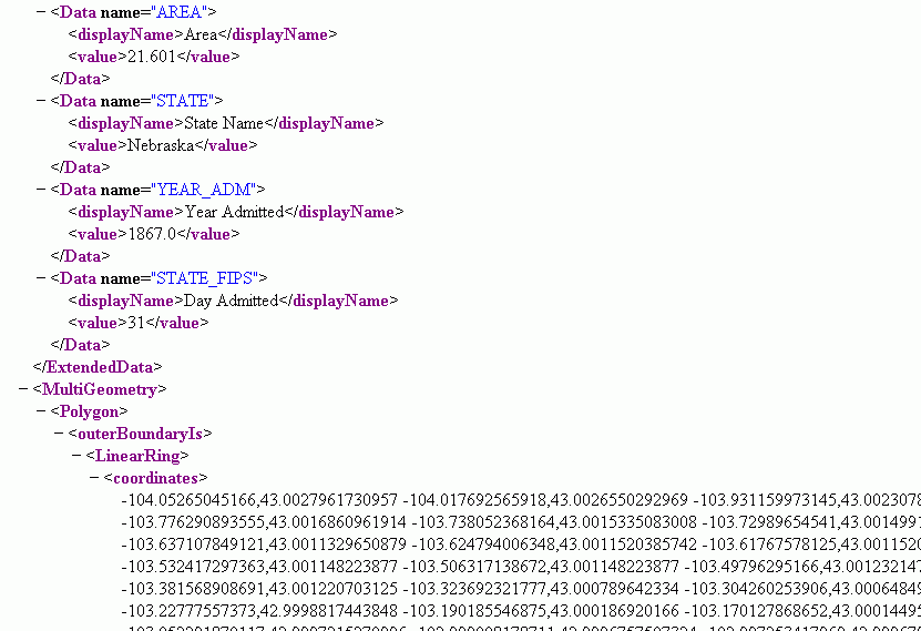
If I had Office 2003 Professional, I could probably get that XML file right into a spreadsheet. But I don’t. I have Small Business Edition – no XML facilities in here. Although I intended (and intend) to make a map of the US, I thought I’d start simply and just do one state – my state. I copied the coordinates tag with all of those coordinates and pasted into a text file. Then I used this macro to list them in a worksheet.
Dim sFname As String
Dim lFnum As Long
Dim sLine As String
Dim vaCoords As Variant
Dim vaIndiv As Variant
Dim i As Long
lFnum = 1
sFname = Environ$(“userprofile”) & “My DocumentsNE_Coordinates.txt”
Open sFname For Input As lFnum
Do While Not EOF(lFnum)
Line Input #lFnum, sLine
vaCoords = Split(sLine, ” “)
For i = LBound(vaCoords) To UBound(vaCoords)
vaIndiv = Split(vaCoords(i), “,”)
Sheet3.Cells(Sheet3.Rows.Count, 1).End(xlUp).Offset(1, 0).Resize(1, 2).Value = vaIndiv
Next i
Loop
Close lFnum
End Sub
I actually tried pasting the coordinates from the XML (opened in Firefox) directly into Excel and splitting them out with Text to Columns and some transposing, but I think I ran into a character limit – not everything pasted. So I went with the text file/VBA method.
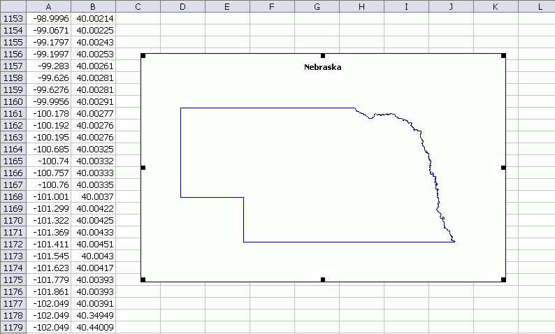
With the data in Excel, I created an XY Scatter Chart. I removed the axis, gridlines, makers, and connected the data points with lines.
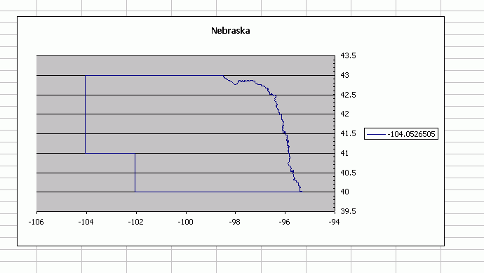
Not too bad. I’m not sure how to ensure the axes are on the same scale. This looks a little horizontally squashed. Here’s what it looks like before the clean up.
I need to read the XML file directly into VBA. There are some XML libraries (under VBE – Tools – Reference) that look promising, but I haven’t tried them yet. Then I should be able to draw the whole country without a lot of effort.
I have an example of an XY chart map in my “Excel Charts” book. It creates a map of California, and even includes major cities. I got the data here, which gives you lat/long coordinates in a text file:
http://www.maproom.psu.edu/dcw/
The example is not in the “Excel 2007 Charts” book, because using that amount of data in a chart consistently crashed Excel 2007.
Hi Dick
Jon Peltier discusses marking charts square here:
http://peltiertech.com/Excel/Charts/SquareGrid.html
…mrt
Takes me back! Lotus Magazine in the late 1980s showed how to use XY charts to draw circuit diagrams.
When I had to map sales by postcode for a whole state, I screen capped a map of the whole state from Google Earth, made a note of the co-ordinates of the map edges, and downloaded a list of geo-coordinates for the postcodes, so I could overlay the numbers in the right spots on the map.
That’s a lot easier than trying to draw all the separate bits.
I wonder how the Kama Sutra would display in a scatterplot? A revised version of this ancient text in .xls could open the eyes of a whole new generation.
I used the link that John Walkenback posted above to download the coordinates for my country (New Zealand) into excel 2007, then numbered the points in a recurring range from 1 to 100, then filtered the range on 1 to cut down the overhead to excel’s charting engine, and it works pretty good. The only issue is that the parts of coastline of New Zealand that are sculptered by fiords or the like don’t render so well, whereas the long, curved beaches do.
What would be really great is to have say a macro that adjusts the resolution of points for a particular part of coastline upwards if there’s a good deal of variation (as there would be for a fiord) and downwards if there’s not too much variation (for instance a long sweeping beach) in order to have the most efficient representation of the coastline (i.e. best overall representation for the least amount of dots).
I’ll see what I can come up with (although I’m only up to page 355 of John’s ‘Power programming with VBA’, so my code will be ruder than my previous comment)
While this is very interesting, what one can do with a chart that emulates a shape is somewhat limited. Why not create a shape directly?
Given shapes one can do a lot of ‘conditional’ highlighting with them. For an example see
Dashboard example conditional colors of shapes
http://www.tushar-mehta.com/excel/charts/0301-dashboard-conditional%20shape%20colors.htm
[I am working on a revised version of the page that will fix a few problems with information that is not completely visible on the page and also introduce a simpler way of connecting the shapes to the corresponding values.]
In the above, I copied the individual shapes from one or more websites. Given that one can get map data as you did, one could create a map with VBA using the data and multiple shapes. Then, one could implement the conditional color of shapes.
hi Tushar. I disagree that “what one can do with a chart that emulates a shape is somewhat limited”. It depends on what you are trying to do.
For sure, what you’re proposing is all that’s required for business applications that only require data displayed at the aggregated sales area level. But that’s the tip of the iceberg in terms of end use options.
A chart allows you to place specific events right where they occur, so that you can draw conclusions from that. For instance, a modern equivalent of Dr. John Snow (the guy who’s map is credited with discovering the source of of deaths from the 1854 London cholera outbreak) might want to use a user-friendly tool like Excel to track movement of swine flu . Or a resource management organisation might want a friendly interface that helps display very specific environmental indicators.
“what one can do with a chart that emulates a shape is somewhat limited.”
Given a XY Scatter chart with a series that looks like the state of Nebraska, can you fill in the state with a color? [While the theoretical answer would be yes implementing it would be completely impractical.]
Can you make that color conditional? [Did you visit the page I linked to see what one can do with shapes?]
Can you click on the state and zoom in to a closer view?
I do things with charts that leave most people scratching their heads in wonder. That doesn’t mean I think a chart is the solution to *every* problem. Quite the contrary. It requires knowing when a chart is not the appropriate tool.
I’ve tried mapping zip codes and postal delivery routes in Excel charts and it is the wrong tool for the task. I’ve tried representing a range of geographic entities and geospatial analysis in Excel charts and every attempt has reinforced the conclusion that it is the wrong approach.
Dr. Snow used a *map* to track the 1854 cholera outbreak, not a chart. How one could use a Excel chart to track the spread of a disease is beyond me. One needs a map. And, a chart is *not* a map.
On the other hand, what Florence Nightingale did with her analysis of causes of deaths in hospitals during the Crimean War would be amenable to graphical analysis. In fact, she is credited with the invention of the polar-area chart!
Essentially, one has to use the appropriate tool for a specific problem. And, a chart is not always the way to go. There are times when Excel is not the way to go. And, then, there are times when neither software, not even computer technology, is the way to go.
[Dr. Snow used a *map* to track the 1854 cholera outbreak, not a chart.] Not really correct. He used a chart. He charted the outbreaks on a map. You use a map to find where High street is. He wasn’t looking for High street…he was looking for correlations. I’m pretty sure that Tufte mentions this as a chart..and you must have heard the expression ‘chart the terrain’.
A dictionary definition from the web (one of many similar) says:
chart noun
1. a sheet exhibiting information in tabular form.
2. a graphic representation, as by curves, of a dependent variable, as temperature, price, etc.; graph.
3. a map, esp. a hydrographic or marine map.
4. an outline map showing special conditions or facts: a weather chart.
[While the theoretical answer would be yes implementing it would be completely impractical.] – if you can implement it, and it works for what you’re trying to achieve, then why is it impracticle?
[Can you make the colour conditional] – probably…I’ll try to find out. But I might want to look at more than state-wide colors.
[every attempt has reinforced the conclusion that it is the wrong approach.] You state this like it’s a universal truth. If it doesn’t work for you, then you should say ‘for me’.
[Did you visit the page I linked to see what one can do with shapes?] yes. That’s one handy way of presenting the data…one of many.
[Can you click on the state and zoom in to a closer view?] – yes, I believe I can. I’ll whip up an example (hopefully this week) and post a link to it here.
[she is credited with the invention of the polar-area chart!] I’m not a big fan of polar charts myself. I wouldn’t go as far as to say that they are catagorically the wrong approach, though.
I really like the application of this post. If an organisation on a tight budget needed some kind of ad-hoc geospatial reporting tool, and they had neither time to learn a dedicated software package, nor money to buy it, then they can fall back on good ol Excel.
While as Tushar point out that Excel is not neccessarily the best application for any situation, the beauty of Excel is that:
1. at a pinch it will do a reasonable job of all kinds of crazy stuff;
2. it’s loaded on practically every small business computer;
3. most people are not too scared of starting it up, compared to the more dedicated applications that might do a better job;
4. there’s an excellent support community, because so many people use it.
If MacGyver (a 80’s television hero: basically laid-back, extremely resourceful secret agent who prefers non-violent conflict resolution wherever possible and refuses to carry or use a gun) was a business analyst, I’m pretty sure he’d carry an excel install CD around with him, in lieu of a high-end ‘gun’ program.
I had a thought on how to reduce the data footprint of a country chart, without sacrificing too much resolution where it counts. This is probably needed more with a long and skinny country such as New Zealand than a US state with only 1 coastline. Here’s the concept. Take any three adjacent data points. Run a line from the first to the third point, and calculate how far the 2nd point deviates from that line. If it deviates over a certain limit, leave it. If not, delete it. Reiterate the process untill you get a good balance between data reduction and overall representation. This means where you have a really squiggly coastline with lots of twists and turns, then you’ll have more data points when you really want them.
Multiple iteration of the algorithm could mean some sweeping curves ultimately get turned into straight lines if they sweep at a rate that falls within the acceptable ‘deleletion parameter’ range. But you could have an algorithm that accepts a 2nd arguement to account for this. Perhaps this would do it: Delete that 2nd point if and only if you would not then delete the 3rd point when rerunning the procedure. That is, if the algorithm would fail on points 1, 3, and 4, then don’t run it on points 1, 2, and 3.
It will be fun to watch what happens to a country as you run the algorithm. I’ll have a crack at implementing this when I get a chance.
There’s a great post today from Andy Sernovitz’s ‘Damn, I Wish I’d Thought of That!’ blog that underscores Tushar’s great point “There are times when neither software, not even computer technology, is the way to go” really well.
Lessons from the USS Nimitz #1: Keep it simple — It’s not about the technology
http://www.damniwish.com/2009/06/lessons-from-the-uss-nimitz-2-keep-it-simple—its-not-about-the-technology.html
Check it out.
I’m not sure I want to be associated with MacGuyver, but it’s a good point. :) Also, thanks for the link about the Nimitz.
OK, so I’m six months late reading this post, but at least that shows your list of most-read posts had an effect :-)
I understand the topic was about creating maps with charts, but why didn’t you consider a VBA function to create a freeform shape that you could then link back to various properties in the spreadsheet?
https://www.mrexcel.com/forum/excel-questions/999745-chart-mouseover-grabbing-p%F2ints-range-3.html