Dick signed me up almost two years ago as a contributor to this blog, and I finally decided it was high time I started making contributions, other than big-mouth comments to the posts of others.
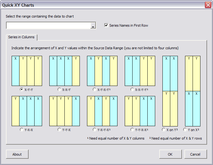
On my web site, I’ve described VBA procedures that construct XY charts from regular but nonstandard data arrangements. Such procedures allow the user to chart from existing tables without rearranging the data and without suffering through tedious copying and pasting or repetitive range selection in the Source Data dialog. I’ve recently designed a utility to exploit these procedures.
The Quick XY Charts utility is designed to work in Excel versions 2000, 2002, and 2003; it has not been tested in any Macintosh version or in Excel 97 or 2007, it may or may not work on these versions. The Quick XY Charts utility is a beta version, available at no cost in exchange for useful feedback. Ultimately it will be incorporated into a commercial Advanced Charting utility. The Quick XY Charts dialog is shown below:
The Quick XY Charts utility is available at Quick XY Charts Utility, which also has instructions for its installation and use.
I welcome any comments and suggestions, and will probably implement most reasonable feature requests. Bear in mind that this is a nights-and-weekends kind of project.
I’m also working on tools for building box and whisker charts, dot plots, waterfall charts, and more. I’ll post here to announce new modules when they become available, and at some point I’ll post an outline of the Advanced Charting utility which will contain these smaller tools.
John
Works great on Excel 2003 but under Excel 2004 for Mac I get a
Compile Error in Hidden Module:
MMenuAndTools
Hui…
What a great utility! I forwarded the URL to my whole group!
The only limitation that I’ve found is that the data needs to be selectable with one click-and-drag.
If your data is seperated it doesn’t work. For example, say your X data is in Column A, Rows1-10, and your Y datasets are in Columns C and E, Rows 1-10. If you CTRL-select your data and use your utility, you get a “Run-time error ‘1004: Unable to set the ColorIndex Property of the Border Class”.
Thanks for the feedback so far.
1. Ian: I can look into this problem. As I stated, I am not likely to go too far to support Excel 97 or Mac Excel. Both use an older version of VBA, and I suspect this may be the cause of your error. This does not mean I won’t at least look into it.
2. Al: The validation required for discontiguous data ranges is huge, larger than I thought when I began this project. I really want to develop this capability, because there are times when you need to use discontiguous data. It needs some quality time so I can come up with something clever. I do have a couple ideas….
I can at least trap for your error: I think the problem is that the recognized data range has one column, and it can therefore only apply X values (no Y values), so there is no border to be formatted.
Jon,
I think the user interface is very well done. It simplifies the experience for users who would otherwise be confused by the options.
Mike –
Thanks for the comment. Before I was a programmer, I was a consumer of other programmers’ work, and most of it was pretty bad. The code usually wasn’t too terrible, I guess, but the interfaces were generally hard to figure out. So I try to concentrate on the interfaces in my projects. I thought the little pictures were a pretty good way to help the user visualize their ranges, especially when there is the sample workbook with matching colors.
Al –
So I decided I wanted discontiguous ranges after all. The bit that validates the range only added half a dozen lines to the program. However, adding discontiguous ranges to a chart is not as flexible as adding contiguous ranges. I’m using parts of the object model that I usually avoid. And I’ll have to rebuild the whole part that handles creating the charts. But maybe by next week there will be a follow up version that you can beat on.
Ian –
No luck yet on the Mac issue. Maybe I’ll have some of the Mac people out there test a menu module for me, and tell me where exactly it breaks. According to my web site stats, Macs account for around 2% of the visitors to my site, so I hope you’ll understand if I do the discontiguous range thing first.
Jon,
>…other than big-mouth comments to the posts of others
Duh! Now I can continue to post new stuff and perhaps sleep better ;)
>The Quick XY Charts utility is a beta version, available at no cost in exchange for useful feedback.
That reminds me about two large corporate’s ‘strategies:
Google – Their products never leave the beta stage
MSFT – Whenever they release a new Service Pack they explicit state that it’s for free
If You will turn it into a commercial utility then I suggest that You:
– compile a helpfile for it.
– create an installation package.
– compile an EULA (including a statement that the utility does not work with any Linux OS!)
In my experience don’t spend time to create a ‘bullet proof’ protection in the utility. Users who pay for an utility rarely want to ‘distribute’ it for free. If You need a strong protection create a COM Add-in.
Good luck with the utility.
Kind regards,
Dennis
Ps: The above feedback is for free.
>…other than big-mouth comments to the posts of others
Jon, I usually appreciate your “big-mouth” comments. I’ve only been working with VBA for about a year and it helps to have someone challenge my reasoning. As long as it’s done with good intentions that is…
Charles Chickering
Jon,
No in depth feedback other than the fact that two seconds of looking at your post title and graphic made my heart jump. One continual complaint I hear around here (and have myself) is of Excel’s limited graphing and charting. Sometimes we do graphs and charts in statistical s/w like R (say it like a pirate would!!), SAS, and others. However few people have time and motivation to take on learning these packages. Even fewer can justify the cost of licencsing and training for the likes of SAS. This always brings us back to R (free), but then who has the time to do the self-study (no centralized support).
Anyways, I will try to get you some more specific feedback soon, but I am genuinely excited.
-Jason
Very nice, Jon. As long as you’re cleaning up loose ends, don’t forget to add accelerator keys for the UserForm controls. And you should probably set the Default property for the OK button (so you can press Enter to execute it).
After using Excel 2007 almost exclusively, I gotta say that those Excel 2003 charts are ugly!!
Thanks for the continued feedback.
Dennis: Special thanks for your “free” feedback!
– A help file would be nice, but I’m aiming for self-evident. With the Office 2003 help system, Microsoft set the precedent. But I’ll work out something.
– Of course I’ll have an installation package, but this is still in prototype stage.
– EULA, yeah, I didn’t think of that, but I should.
– Protection: I’ve found that most of the time if I tell people a workbook is password protected, they just assume I’m so much smarter than they are (he he!) that they’ll never break it. Even if the password is something lame like “password”. Bottom line: I don’t fret about it much. I found a little system that makes it hard but not impossible to break, and that’s good enough.
John:
I had thought the OK button was Default, but I must have missed it. I’ll do that and the accelerator keys when I fix the tab order (Jan Karel’s suggestion). The accelerator keys will be interesting given that I have basically two characters to work with (X & Y), maybe I’ll just prefix each label with “A”, “B”, etc.
“After using Excel 2007 almost exclusively, I gotta say that those Excel 2003 charts are ugly!!”
Have they gotten to you, John? I heard you like the ribbon now, too. The appearance is nicer, I guess, but the behavior is way worse. Yeah, I agree the default charts are pretty ugly. I usually fix mine up a bit.
Chris Gemignani of Juice Analytics has posted a Clean Charts utility (http://www.juiceanalytics.com/weblog/?p=161). I haven’t really worked with it much, too busy, but his attitude about charting and information display is right on, so it should be a step in the right direction.
John
Please don’t fret on the Mac version, Altough I have a Mac and run excel on it, That would account for about 2% of my time, I just thought i would try it, to give you some feedback
I am nearly 50% Xl 2007 at the moment with bit of 2003.
Hui…
Jon,
* I’d set the checkbox ‘Series Names in the First Row’ by default to False, since Excel generally is quite good at recognising series titles. If the user knows better, he’d be able to set it to True.
* What about a small routine to find the min and max values of the total of the series in both the X and Y direction and scaling both axes to match with these values? I’d recon, you’d only in rare occasions find the Major and Minor Unit very inagreeable. And with a checkbox you can give user the possibility to turn this on/off.
I use exclusively XY Charts consisting of time series (real world and modelled). My data structure would be to complex for your Quick XY Charts. I am just finalizing a Chart Add-In (personal use). I’ve decided against even the smallest formatting in VBA. As a side effect of this, I’ve seen a lot of my data charted as default by Excel 2000. And it’s not that bad! Its ugly grey background and its default colorset are surprisingly effective when it comes to presenting data. What also speaks in favour of it: I am not distracted by the imperfections I’d see on any formatting I’d apply…
Gerrit –
The utility is not able to make use of Excel’s title recognition capability, since it bypasses the Chart Wizard. There is some detection I built in, but it’s rudimentary; it only looks for text, for example, and not for different kinds of numbers, such as dates. If you think it doesn’t behave well, let me know how it does behave and send a copy of your data, and I’ll decide whether it’s a bug or by design.
The chart scaling is something I use for specific projects, but it’s not something that I would put into a general charting utility like this one. As a user I’d prefer to mmake the chart first, then apply the scale fixer if I needed it.
Funny thing, I hate the default colors and formatting in Excel, but I have never implemented a custom palette for my personal use, only if a client wanted it. I also don’t use user-defined charts, but I think running multiple Excel versions on the same computer has hosed the shared resources (chart galleries etc.). I use a few general purpose routines that clean up a chart, most notably to change the gray background to white and to make the gridlines light gray. I change other colors on a chart-by-chart basis.
Jon,
> If you think it doesn’t behave well, …
It’s nothing like that, I tested it with numbers only and found by default my first row of data used as series labels. I probably wouldn’t design it like that.
> … has hosed the shared resources (chart galleries etc.)
Aj! I did opt for applying Excel’s User-Defined Custom Types (within VBA). The Add-in can store a chart as User-Defined. And it can apply one of these on new data. Scaling and labelling is dealt with programmatically. Controlling the use of XLUSRGAL.XLS has been though. I deal with XLUSRGAL.XLS three times: when I find its full name, when I sava a template and when I apply one. Hardly any code involved, but i must admit I am insecure about the stability and portability of this implementation. Time will tell…
> It’s nothing like that, I tested it with numbers only and found by default my first row of data used as series labels. I probably wouldn’t design it like that.
It isn’t designed like that, I must have left out a detail. It’s in my issue list.
> applying Excel’s User-Defined Custom Types (within VBA).
In my experience, if I’m using VBA anyway, it’s better to start with a vanilla chart and apply formatting bit by bit than to rely on a user defined chart type to get it all right. Even back before I screwed up my own user gallery. The charts in the gallery are also not readily portable, though you can distribute a workbook with custom charts and a little code that will “install” custom types onto galleries on other computers. But when applying custom types, things like chart titles, axis titles, and data labels are overwritten by what’s in the stored custom type, and I seem to recall that textboxes and other shapes are not properly dealt with.