Whenever I make major changes to the layout, I like to put a post out there so you have an easy way to comment on it. You can always send an email too. You may notice that I’ve made some changes to the menu (sidebar). Namely,
- Recent “x” lists are now javascript expandable lists
- Categories are now in a dropdown and alphabetical and hierarchical
- The archive list is gone and replaced with a link to an archive page
Expandable Lists
In style.css under the only theme I use, I added this
display: none;
font-variant: normal;
font-weight: normal;
line-height: 100%;
list-style-type: none;
margin: 0;
padding: 0;
text-align: left;
}
I copied the “ul ul” right above it because I wanted all the stuff to be the same, I just wanted a way to differentiate between menu lists that I wanted to hide and those I didn’t. The “display:none” line is the only difference between this and the one above it. All of this is based on the Gemini template.
Then in index.php, I added this between the already existing script tags. If you don’t have script tags you can but them within the head tags.
if (!document.getElementById) return true;
a=document.getElementById(a);
a.style.display=(a.style.display==‘block’)?‘none’:‘block’;
return false;
}
Then in rap div, I have this:
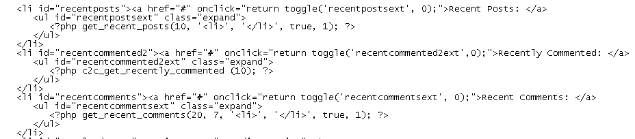
The function comes from Adrian Holovaty. It has too many arguments because I modified it from the original. I modified it because I never want an expanded list to shrink because another list is expanded.
By adding ‘class=”expand”‘ to the ul tag, I was able to choose which lists are expandable and which aren’t.
If you know anything about php and css, then you know that I don’t know anything. I’m happy to take your suggestions for the proper way to do this. If you don’t know anything, then assume this is the correct way at your own peril.
The Recent x lists are from Customizable Post Listings and Recent Comments/Recent Posts
Categories
The new categories dropdown is provided by Typedby.com.
Archives
I never use the date archives, so I’m happy that Jon pointed out that they suck. I’ve left the calendar part because it looks cool, but replaced the monthly listing with sortable archives provided by nicer-archives-for-wordpress. It looks pretty cool and I think will come in handy. I use the Search box almost exclusively. The Atomz search works really well and I can always find the post I want with a quick keyword search.
As always, tell me what you think. If I killed your favorite navigation method, be sure to speak up. We may be able to make a deal. With all this real estate savings the Google ads are now above the fold. I may be able to retire soon. Although I’m considering putting the search box up higher to get people to use it – it’s just that good.
I like it ! going all the way to the “login” link with all the categories was quite a scroll :-) I think it looks great and clean like that.
Dick, is there any way you can use cookies for us to set our own default expansions? Personally, I find the ‘recently commented’ the most useful – I can quickly see which topics are being talked about. I’d be happy for them to default to expanded!
Oh, and can the Google ads be put at the very bottom?
Speaking of the login link, where does it lead? I recall a month or so ago when you discussed having people register (to prevent spam) and mentioned that most already did so, I wondered “how would a person go about registering?” About a week ago, I finally noticed the register link and asked myself “what might be the benefits of registration?” Clicking on the link left me no wiser, as it just has two boxes for name and email. Being naturally cautious, and unable to imagine this site being any better than it already is, I went no further. But it’s been niggling at me.
Hi Dick. When changing between pages, can it remember which sections were expanded? I hate that every page has them collapsed again!
Well I tried out registration and it makes posting not work (the error says something about hashcash). Fortunately you can log out again.
Did you see that there was a blog spammer calling himself “credit repair”?
You may need to make it more difficult to register as right now it’s easy for a spammer to run a script that automatically registers for an account and then posts the spam.
Dick,
I too miss the expanded menus. It’s fine to expand them once, but having to do it every with every page change is not good.
Since the real estate you gain by collapsing the menus is filled with ads, the border looks more cluttered. I think it looked better before, but this one is not so important to me (certainly not worth delaying your retirement!). I think I’d move all the text links up and the ones with graphics to the bottom, so your search, login, etc., are nearer the top. Otherwise they get lost amid the graphics.
I’d like to request that you add some ActiveX controls. And while you’re at it, some Flash would be nice too. How about a splash screen, complete with a “skip introduction” button? Oh yeah, please make the site skinnable. And how about requiring that everyone sign in with MS Passport? Of course you’ll need a special version for WebTV viewers. How about a browser check to make sure that everyone is using an acceptable browser. And you should probably point out the recommended screen resolution for viewing this site. And last but not least: MIDI!
But seriously… you’re doing a great job with this blog, Dick.
Dick,
I also miss the recent lists. They were the first thing I looked for; what has changed since last time. Collapsing is a nuisance. Also I liked to see what links I’ve read – since I may not read them in the “right order”.
This is what I prefer to see:
1. Recent Posts
Date, Post title
2. Recent Comments
Date, Post title,
Commentator, Time
(I would skip the number of comments)
Apart from that I think the layout is great – good & clean. Easy to comment – no password needed.
Just some minor details, while I’m at it:
Recently Commented: the list would be easier to read if there would be just a very thin space between each comment.
Submit Comment: I like to preview my post before posting.
Othervise, I relly enjoy your blog and the level of the discussion.
Thanks!
Ola Sandstrom
Thanks for the comments everyone. Sorry I’ve been away, but I’ll try to address your points.
Cookies: Is it possible? Yes. Do I know how? No. Will I learn. Yes? Any JS people want to give me a hand with that, I’ll take it.
Move ads: When I first read this comment, I said “Yes, no problem, consider it done.” Since those ads have been ‘above the fold’ they have generated 3 times the revenue than the best day previous. I’m not in this for the money, but three times? The best I can say now is, “I’ll consider it”.
Login: It does absolutely nothing but store your information in a MySQL table. I could possibly use it for stuff, but so far, I haven’t. You don’t have to register to comment or do anything else.
Hashcash: I upgraded to the new hashcash, so I hope that takes care of any problems you may have had. I know I haven’t got any comment spam since I upgraded. Spammers don’t register, in fact they don’t even use the interface. The go straight to the php commands (or something like that). Many don’t even have email addresses, which is illegal when you go through the interface.
Flash, etc.: Just for that comment, I’m going to have a flash intro with really loud bagpipe music. And the ‘skip intro’ button will be an ActiveX control so you can’t use it in FF.
Thin space: I agree and I’ll see what I can do.
Preview: I have yet to see a WordPress site that has this. I don’t think anyone has ever developed it, but I’ve been looking for it for quite a while. If I see it, it will be implemented, because I think it’s a good idea. If you see it, please drop me a line.
Conclusion: I’m going to learn how to use cookies so it remembers your menus between pages, sessions, whatever. We’ll give that a go for a couple of weeks. If you still hate it, then back to static-always-showing-menus they go.
I should also mention that I intend to get an Excel related post out there one of these days. Just in case you thought I switched to StarOffice, or something.
Dick,
Looks like you “learned to use cookies.” The ” recent” menus are staying expanded. I’m impressed.
Thanks, Doug. Based on the time of my comment and what time I went to bed last night, I’d say my “cookie lesson” lasted about four hours.
You know what I like about Javascript? No run-time errors. If you have bad syntax, nothing works and you don’t know why. No stepping through the code to see what variables are doing. If anyone was reading between 9PM and 12PM USA-CST, you probably saw some crazy message boxes (those nutty javascripters call them alerts).