Junk Chart? Cover Art!

Yes, I have all of Edward Tufte’s beautiful books, as well as quite a few from Stephen Few and others. Yes, I know that you shouldn’t embellish charts with images and unnecessary bits for the sake of it. But even so, I just love this cover from The Economist that just arrived in the mail:

It’s not a junk chart when it’s cover art.

If only someone in the PowerBI community would create a custom visual for this, and upload it to the Office store. Actually, let’s go one bigger: If only Microsoft open-sourced the Excel visualization engine like they have done with PowerBI visuals.

Don’t know what I’m talking about? Microsoft enables external developers to create their own custom visuals into Power BI, and even better, to share those visuals with the wider PowerBI community. Heck, they’ve even published the code for all their own Microsoft visualizations to GitHub, so that developers can study them, learn from them, and improve on them. Meaning developers can create new charts that Microsoft haven’t got around to making yet, haven’t thought of yet, have stuffed up, or wouldn’t bother with.

Imagine how cool life would be if we could do this too.

Cue dream sequence

Say you’ve got some internal migration data sourced from a couple of Population Census tables. And say you want to see what net inflow and outflows look like in your home town. You go look on the ribbon for some suitable geographical chart to display the data, but find the cupboard is pretty bare:

So you head over to the Office store, and see something that looks promising, put together by some generous non-Microsoft developer with far too much time on his or her hands:

You download and import the visualization template into your Excel project, see it’s icon appear in the ribbon, click it, connect the resulting chart up to your own data, and reap the insights:

Man, that kind of custom functionality would be enough to make Jon Peltier do this:

Like my dream? Vote for it at UserVoice. Your vote matters.

Look Ma…No PowerPivot!

So back in 2015 when I was trying to write a book, I took time out to rant that despite every version of Excel since 2013 having the Data Model baked in as standard, it wasn’t a heck of a lot of use to you in the event that:

  1. You wanted to mash together say a UnitPrice from one Table with a SalesQuantity from another, in order to display the derived Total Revenue in a PivotTable; and
  2. You were a tightwad that didn’t happen to have one of the premium PowerPivot SKUs installed.

Because while you could create a relationship between two Tables without PowerPivot:

…the option to create a calculated field to multiply Qty against Price was greyed out.

Disheartened with the lack of functionality in the non-Premium-Excel space (and sternly talked-to by my wife about the need to shave and go out earn a crust) I flushed the nearly-finished manuscript down the toilet in disgust. But now that I’m flush again, I’ve dusted off that manuscript (it wasn’t really down the toilet) and am updating it, so that I can nearly-finish it all over again.

Anyways, I was subsequently looking at this DataModel thing again, and rewriting the bit that said how sucky it is that you need to pay a premium in order to do a pretty standard thing, when I came across this:

Wow…It IS possible. Tight-wad analysts of the world: You too can do PowerPivoty stuff, without paying a cent more. You heard it hear first. Or second, rather.
Thanks, Mike Girvin, from the bottom of my wallet. :-)

Look Ma…no PowerPivot:

I wonder what limitations this PowerPivot back door has, if any?

—UPDATE—
I found this from Chris Webb’s blog:
PowerPivot has been integrated into Excel, kind of. This means that the xVelocity (aka Vertipaq) engine is now native to Excel, and you can do all the basic PowerPivot stuff like loading vast amounts of data from multiple data sources and querying it via PivotTables directly in Excel, without installing any extra addins. PowerPivot does still exist as an optional extra however: you need it if you want to use the more advanced functionality that exists in PowerPivot today, such as filtering data before import, using diagram view, defining hierarchies and perspectives and so on.

And further down the page there’s some great commentary between Chris and Colin Banflied, including this from Colin:

  • xVelocity is divorced from PowerPivot, and built into Excel
  • PowerPivot is now simply a UI to administer the data model.

I’d always thought that while any edition of Office 2013/2016 can interact with a PowerPivot Excel Workbook (open it, click on slicers, change the pivot table etc.), if you wanted to “author” the Model you would need the correct version of Office, which includes the Power Pivot authoring functionality i.e. the PowerPivot window, which lets you define relationships/measures etc. But to some degree it appears not. Which has got me wondering…to what extent is PowerPivot just a UI for the DataModel baked in to every model of Excel? Sure, it can help you filter data before import, but so can PowerQuery, which is free in every version of Excel 2013 or later. Meaning there’s probably nothing stopping a savvy Excel VBA developer from simply rolling their own UI to help users of any post 2010 version of Excel do 99% of what they’d likely otherwise need PowerPivot for.

To PowerBI Premium, or not to PowerBI Premium…

…that is the question.

Heck, never mind PowerBI…I’ve only recently started using PowerPivot and PowerQuery. (Not because I’m a slow adopter mind, but rather because the places I’ve been working have been slow adopters.) And yet here I am considering waging war on a new front entirely. Will PowerBI let me make considerable further gains without imposing considerable future cost to my organization’s long-term budget? Or can a large part of what PowerBI offers be achieved at much lower cost using my modern version of Excel, in conjunction with models and dashboards being built by my colleagues using the SQL Server stack – technology we already own?

On that first point, I found Matt Allington’s post Which To Use – PowerBI Or Excel? immensely helpful. On that second point, being a purely Excel guy, I’ve never learned much more about SQL Server other than how to write TQSL queries to get the data I need into a PivotTable. I’ve often heard other MS SQL Server terms such as SSRS, SSAS, and SSIS bandied around by IT types, but they have never really meant anything much to me, and so have always gone over my head. I’m just an Excel guy, after all. So here I come along talking about this thing called PowerBI that can be used to easily share data and insights, and my colleague doing stuff in the SQL stack says “Hmm…sounds awfully like this SSRS/SSAS/SSIS thing that I’m using. Compared to SSRS/SSAS/SSIS, what exactly *is* PowerBI?”

Not being an expert in either product, I couldn’t answer. So I did the next best thing: got the boss to pay for getting it certified on our IT system, and then got it installed on all my unit’s PCs, so that she could find out, and then explain it to me. It took my colleague just 5 minutes to understand what PowerBI is…or in her words:

OMG. I know what this PowerBI thing is. It’s easy.

So there’s your answer: PowerBI is much easier and quicker than developing in the SQL Server stack. But of course, while you can easily develop reports using the completely free client tool (i.e. PowerBI Desktop), you’ve still got to share those reports with end users. So what does that cost?  $9.99 per user per month, regardless whether that user is a Rob Collie/Matt Allington type, or the cleaner (and I’m not talking about Harvey Keitel here). Yup, everybody has to have the pro license in order to consume shared reports, regardless of whether they are star developers, or occasional peekers.

That $9.99 per user per month is incredible value if you’re providing dashboards with the kind of people like us: Folk who put the ‘intelligence’ in Business Intelligence’.  But that is pretty expensive across a whole bunch of non-self-service BI types, who only want to look at things occasionally that are already filtered to show only what is relevant to them. And who perhaps only glance at a handful of reports, a handful of times per year.  So it’s hard to justify an organisational roll-out at great cost of a promising new technology. Currently, I can produce and distribute on-demand static reports for these folk for free, using Excel, VBA, and Outlook. When you don’t intend to click on filters, a PDF will work just fine.

This left me puzzled as to how to justify a much easier development tool to the bean counters. Quite coincidentally, yesterday MS announced the release of their PowerBI Premium plan. I thought this might help the business case for our organisation, but unfortunately it offers even worse value for mid-sized organisations than the $9.99-per-month flat rate that I’ll already struggle to get across the line with. Under the premium plan, you still pay that the $9.99-per-month flat rate for each developer, as this gives them the pro version of PowerBI that they need to create shareable reports. But in addition you also effectively buy a lump of capacity on a reporting server (either on premise or in the cloud) big enough to handle the load from servicing the demands of the folk actually consuming these reports. But those lumps are pretty big: they come in $60,000-per-year clumps. Yikes!

You can take a look at the pricing via Microsofts online calculator here. Here’s a cut-down view of how it looks:

Let’s look at the default view shown in the calculator above: An organisation of 5000 users, 20% of which are pro, 35% ‘Frequent’, and the remaining 45% ‘Occasional’. MS estimate the number of nodes you’d consume given this mix is 3, at $4,995/Node/Month. When you do the math, 45% of that $25k total is due to the Pro User licesces, and the remaining 55% is effictively the cost of sharing the reports with the wider organisation.

The bottom line here is that:

  • Premium is an add-on to PowerBI Pro.You still need pro licences for your developers.
  • Setting aside performance benefits, Premium is effectively the cost of sharing your reports with users without Pro licences.
  • The break-even point between the old plan and this enterprise plan under Microsoft’s modelling is 625 users.
  • You are not licensed per user, but for capacity. So as guavaq says over at the powerbi community site, if your users and data sets do not require a lot of compute power, you could potentially have a large userbase on the base level hardware (BUT IT ALL DEPENDS on your workloads and users). In other words, that break-even point above is only a very rough guestimate.

I agree with Matt Allington’s excellent post-mortum of this pricing announcement that while this might offer better value for very large customers, it’s completely unaffordable for medium-sized organisations. The middle guy is left out in the cold.

So how do MS work out the number of nodes you’re likely to need, given your Total User count and the split between user types? I did a bit of reverse engineering to determine that Microsoft’s calculator is based on:

  • 1 node for every 1000 pro users
  • 1 node for every 1430 Frequent users
  • 1 nodes for every 3030 Occasional users

Note the disclaimer from MS below the calculator:  This calculator provides a rough and conservative estimate based on simple usage logic. Actual needs to support a given workload could significantly vary based on data models, data volumes, number of queries and their complexities, refresh rates, usage distribution and pattern changes over time, and other factors. This estimate should be regarded only as guidance and is not providing any guarantee of performance.

With these node calculations in hand, I rolled my own calculator, using Excel. Try it out in the web app below. (Orange cells are input cells).


So will we proceed down the PowerBI path? Maybe. But I’m tempted to stick with my current ‘old-school’ approach of building Dashboards in Excel, and then using VBA to automatically filter them, PDF them, and email them to the cleaners. Rather than being taken to the cleaners, courtesy of Microsoft’s licensing.

You?


Seven (Excel) Samurai – The Tour.

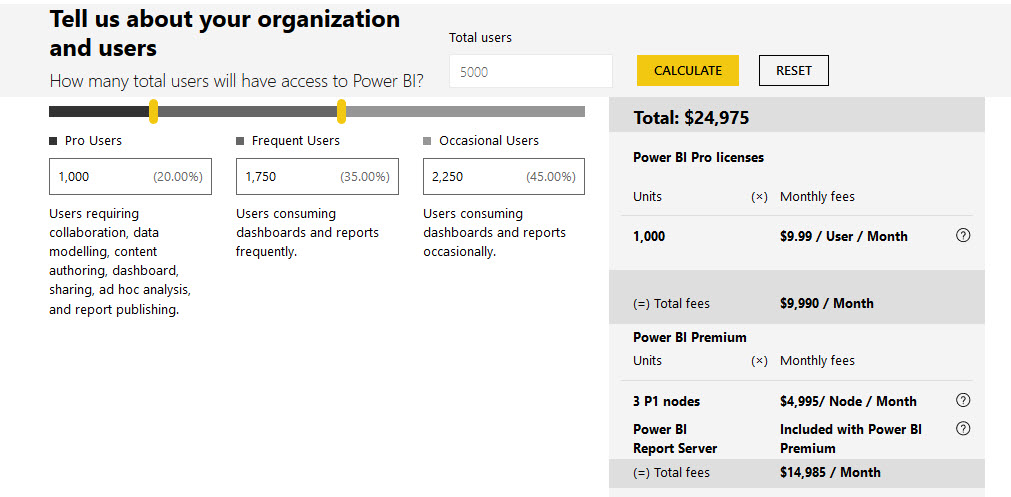
Next week, seven world-leading Excel MVPs – or The Seven Samurai, as I like to call them ­– are heading to Sydney and Auckland to show you how to slice your Excel data like never before. They’ve already massacred Melbourne. They’ll be butchering Brisbane between Wednesday 4th – Thursday 5th May. Then storming Sydney on Mon 8 – Tuesday 9 May. And then they annex Auckland later that same week, between Thursday 11 – Friday 12 May. If you want to catch them on tour, then here’s a link to all you need to know.

What’s that? Haven’t seen the movie, and want to know what you’re letting yourself in for? Well, here’s a brief plot synopsis:

 The year is 2017. It is the agile period of Excel history. Our saga follows the story of a remote village of accountants who hire seven Dēta Ronin (masterless data Samurai) to combat bad practices that threaten to steal the accountant’s productivity after the next financial quarter.

Just look at them. Smiling assassins, the lot of them. God help the accountant that doesn’t do exactly what they say.

I saw a similar movie this time last year: The Dirty (Excel) Dozen. I laughed. I cried. I pivoted. I *power* pivoted. Heck, I even power-queried, power-BI’d, and power-networked. And learnt some stuff that saved me so much time back at work that now I can fill in the hours between hitting Refresh and hitting Refresh again with power-naps.  I came out much better off. (And because I went last year, I also get a 30% discount this year. You can too, if you went last year).

This latest release is clearly targeted at the accountant market. Now I’m no accountant, but I’m going anyway, and perhaps you should too – regardless of whether you are an accountant or something sexier. After all, it’s not your money we’re spending here…it’s the divisional Training Budget. And we all know that if you don’t spend the Training Budget in full this year, you’ll get a smaller Training Budget to not spend next year. So you owe it to your division to spend it on something. And that something should be on Excel productivity, not some touchy-feely soft-skills finishing school crap. So literally take one for the team, and ask your boss for the readies and the release time today.

Now, if the boss is a bean-counter, you might need to put some fluff around that request. So let’s pretend we *are* accountants just for a moment, and see how the business case stacks up: We’d be getting 19 CPD hours (whatever the hell they are) just from sitting there behind our quiet accountant personas, plus we’d get to learn all sorts of accountanty stuff about Excel, PowerQuery, PowerPivot, VBA, and PowerBI from the aforementioned Samurai. Case closed.

Now snap out of it. We’re bean drinkers, you and I. Not bean counters. So we’re going for other reasons that the boss need not be burdened with. I don’t know about you, but I’m going because Auckland is 643.3 kilometres away from my day job in Wellington. Meaning I get to spend two full days NOT looking at the crappy spreadsheets I’ve spent the last few months developing. Not to mention that this 643.3 km learning mecca is in a northerly direction, away from the Antarctic ice caps and permanent hurricanes. Yup, it’s respite care, Excel conference style. Far away from the Excel hell that I find myself immersed in, today. Oh, and while I’m up there, I’ll be attending Ken Puls’ presentation on Making your data mobile with PowerBI at the Auckland PowerBI User Group. Maybe I’ll see you there, too.

So just who are these seven samurai?

You can find their bios here, if you speak fluent accountant. I’ve translated it into Jeff-Speak for the rest of us.

Liam Bastick, an experienced modeller. What kind of modelling, his bio doesn’t elaborate on. But I’m thinking underwear. Which is good, as I too like to build financial models about the apparel industry.


 Chandoo, who like many other global superstars before him only needs one name. Although I’m not sure Chandoo will actually be able to make it: His sense of direction is pretty questionable. Just look at that background…does that look like New Zealand to you? Not even close, buddy.


 Roger Govier, who no doubt will be packing his red jersey and perhaps overstaying his tourist visa in the vane hope that he’ll see some of his Welsh compatriots finally trounce the All Blacks at the upcoming Lions tour of New Zealand. (The last time being when I was born. I’m now 46. *Sniggers*)


Ingeborg Hawighorst, who’s from New Plymouth – a province so devious and deceitful that that the whole place pretended it was Japan in The Last Samurai.


 Jon Peltier, who in this photo is saying ‘chart’ instead of ‘cheese’. (I plan to teach him how to say “Good Chart” in Maori. He loves ka pai charts)


Ken Puls, who in this photo is saying ‘C’mon and take the damn photo already, data monkey. It’s the little button on the left. No, my left’.


Mynda Treacy, who put the ‘dash’ in ‘dashboard’ with her one hour webinars.


I’m glad that Auckland is the last stop of their southern hemisphere tour. By then, they will have (no doubt) got their presentations down pat, (hopefully) will have their Dutch-courage-driven drinking under control, and probably abandoned attempts to peek up each other’s kimonos. But it’s not just these Samurai that I’m looking forward to heckling. There’s going to be some folk from the Microsoft Mothership there as well. Here they are, consuming some ‘old-school’ data, the Excel 2003 way:

You going? Give me a shout out in the comments, and we’ll CONCATENATE. You thinking of going, but haven’t quite committed? Shout out below anyway, and perhaps one of the Samurai will drop by and talk you around. Probably at knifepoint.


New Excel and PowerBI user groups in Wellington

Do you live in Wellington, practically *live* in Micosoft Excel, day in, day out, and want an opportunity to pick up tips, tricks, hacks, and code from other Excellers? Have some tricks of your own to pass on? Need a second opinion on an approach you’re taking with a spreadsheet, or help untangling the monster mission-critical minefield of an XLSX file you just inherited?

If so, then boy do I have a group for you: I’ve just set up a dedicated Excel-focused meetup group at http://www.meetup.com/Wellington-Microsoft-Excel-Meetup/ that is just itching for folks like you to join. This Excel-centric group will pretty much cover the spectrum in terms of Excel’s incredibly deep functionality: Formulas, Tables, PivotTables, Charting, PowerPivot, PowerQuery, VBA, spreadsheet auditing and optimisation, dashboarding tips, information visualisation , the works.

I’m in the process of securing a venue for the first meetup, so expect to see more details soon. (And if you can help out with a venue, let me know).

At the same time I’ve come across Phil Seamark’s PowerBI group that has its first meetup on Wednesday at TradeMe. See http://www.meetup.com/Power-BI-User-Group-Wellington-NZ/ for details). No matter where your interest lies on the Excel/PowerPivot/PowerBI spectrum, between us we’ll have you covered. (I’ll be at the PowerBI event on Wednesday night at Trademe, and would love to see you there.)

So regardless of whether you’re a VLOOKUP virgin, or a VBA Virtuoso, a PivotTable pariah, or a PowerBI Professional, between these two groups we’ll have community led content, comment, and camaraderie relevant to you, your job, and your career.

So what are you waiting for? Sign up TODAY()

Why I’m going to Excel Summit South. (And why you should too).

At first I wasn’t going to. I live in Wellington, which is 636 km to the south. (395 miles, to those of you in the dark ages). And this being Middle Earth, to get there by road I would have had to run the gauntlet of Goblins, Orcs, and cliche tourists like Zack Barrasse likely driving on the wrong side of the road as he heads to Hobbiton behind a grin bigger than one face could safely hold:
Zack

Here’s a picture of me imagining I’m speeding around a corner only to find Zack heading the other way:
Jeff

And then even if I manage to avoid Zack, there’s no avoiding the famous Auckland traffic. I still haven’t gotten over how bad it was last time I was up there:
Auckland traffiic

(Don’t get me wrong…the traffic south of Auckland is not without its own challenges):

And then there’s the whole “Paying for Excel feels a little like the concept of paying for sex…I’m good enough at it these days that I really shouldn’t have to” thing. (Excel, that is.)

But then I read the program. And there is truly something for everyone. Even me, who’s a virtual demigod at it compared to the poor suckers around me who don’t use it at all and have no desire to start now. Not to mention the outstanding cast. These guys and gals are like the Dirty Dozen:
speakers2

Or at least, they would be, if there were one more of them. Oh wait, look: there’s two more of them below. Okay, so they’re like the Dirty Baker’s Dozen, then.
yigaledery_2 ben_rampsonThose two extras are a couple of guys called Yigel Edery and Ben Rampson from the Excel Project Team. These guys think they’re here to discuss the future of Excel. But I still live in the past – along with 99% of the rest of us – so I’ll make sure they find some time to answer all my tricky questions, like “How ’bout refreshing the Conditional Formatting Dialog. Have you ever had to actually use it yourselves? Huh? Huh?” …and… Where the hell are my Dynamic PivotTable References already? We’ve got ’em for Tables, but not for PivotTables. Have you ever tried to integrate PivotTables into a formula-driven spreadsheet? Huh? Huh? …and… Why does every ‘new’ Excel feature have the prefix ‘Formally Known As’? Have you ever tried to write a book about characters that kept changing their names half-way through? Huh? Huh?

Boy do I feel sorry for those guys: They’ll be dead keen to talk about the new extensions, while I’ll be dead keen to point out that the stairs that lead to them still are a little unsafe to use.  Let’s hope they’re still smiling like that when they get back on the plane.


I’ll also get to meet this guy, Ken Puls, Ken…who wrote the most useful Excel blogpost ever in the history of most useful blogposts ever on the strength of it’s excellent existential first line alone: Do you know why you are here? He’s moving on to something more future focused in his presentation: Do you know where you are going? (A little place called PowerQuery apparently, located in the hip new suburb of Get and Transform.) Can’t wait, because I know zipcode about it.


Mythbusters jon And following straight on from that, I’ll either get to meet the Myth-Buster shown left, or the Chart-Buster shown right. (Apparently speakers are provisional and may change.) At least one of those guys needs no introduction: He’s Jon Peltier, and he’s a regular addition to my Google Search Terms whenever I try to squeeze out a good chart.  And I owe him an entire beer of gratitude thanks to the best macro I never paid for. He’s going to pick up where Ken left off: Using Ken’s Powerquery data to build a Dashboard.


jelen I also finally get to meet Bill Jelen. I’m gonna ask him nicely to autograph my stack of Excel books…even the ones he didn’t write. (He didn’t write like 0.01% of them, so it won’t take him long).

The only problem is that Bill’s talk coincides with another from Ken on PowerQuery. Damn. But maybe I’ll just have to skip Ken’s sequel, because Bill’s gonna dive deep into Data Visualisations (yes, it’s spelt with an s down here), Conditional Formatting, and PivotTables.


ZackAnd of course, Zack isn’t here merely to look down Hobbits’ holes. He’s also here to talk about Tables, and perhaps to drink me under one afterwards.


charles And I’m super-excited to be meeting Charles Williams, who’s like the Phar Lap of Fast Excel. The Edmund Hillary of Excel’s capillaries. The Ernest Rutherford of Excel under-the-hood. If you’ve got spreadsheets that take about as long to open as the running time of your average installment of The Hobbit, then you need to read this, and then you need to come meet this guy.


And that’s just a select few of the wizened, Excel-scarred faces that I’ll see there. There’s a whole bunch of other international stars and local heroes coming too (including from that sleepy continent-sized Island that lies to the West of New Zealand) that I just can’t wait to INDEX and MATCH.

So yes, I’ve got my ticket. And I suggest you get yours pronto, because – as we say down here – it’s going to be O for Owesome.

You going? Give me a shout out in the comments, and we’ll CONCATENATE. You thinking of going, but haven’t quite committed? Shout out below anyway, and perhaps one of the Dirty Baker’s Dozen will drop by and talk you around.

Filtering PivotTables with VBA? Deselect Slicers first!

I’m in the final stages of coding up a commercial add-in that gives you lot more filtering options for PivotTables at your fingertips than you get out of the box. Here’s how it looks, along with the PivotTable its connected to and a native Slicer for comparison:
 
Pre Invert


As you can see, it offers you a lot more tricks than a native Slicer – including a nifty ‘Invert Filter’ function. It also lets you see a lot more items displayed in it compared to a Slicer: 22 items are visible in mine, vs just 17 in the correspondingly sized Slicer. And that’s one of the many beefs I have with Slicers…they take up far too much screen real estate for the scant options they offer. In fact, my version takes up no screen real-estate most of the time: it launches simply by double-clicking the PivotTable field header, and you can dismiss it when you’re done to free up space if you want:
 
Slicer Dismissed
 
 
So about that Invert Filter function. I love clicking on that sucker over and over again. It takes about 7 seconds to invert my sample PivotTable that has 1000 items in it (12 items of which are selected in this example). That’s actually pretty fast as far as inverting a PivotTable, because you need to change the .visible status of all 1000 PivotItems, and as per a previous post that’s very slow to do unless you get tricky. And 7 seconds is a vast improvement on the method Microsoft gave you…none. I can’t comprehend why simple options like these are not built in to Slicers and Tables, but your filtering pain is (hopefully) my financial gain. (Yep, this works on Tables too.)

If I click that Invert Filter label, then here’s the after-effect:
 
Inverted


Beautiful: 7 seconds, and she’s turned completely inside out. Unless that is, that Slicer happens to be selected. Then it takes a full minute. Why? No idea. Moral of the story: if you’re writing code to filter PivotTables, then you probably want to make sure any Slicers for that field are deselected first. Not disconnected…you can leave ’em in place quite happily, and the code won’t suffer.

Anyways, that’s the first look at my new baby. It does a lot more than just this inverting trick, too. Among other tricks, it lets you filter PivotTables based on external ranges, and gives you some absolutely fantastic new tools for filtering PivotFields based on just about any tricky search conditions you might want to string together – but that’s a subject for my next post.